Mortality with Meep: q_x - UPDATED WITH CONTENT FROM STU
by meep
Here we go — my new video series starts out easy:
So: q_x — the one-year probability for those age x under a certain mortality table.
Whenever I calculate, I’m starting with the q_x’s and I go from there.
PLACES TO GRAB MORTALITY TABLES
If you would like to look at some mortality tables, I can recommend a few places.
The easiest for newbies to look at and play with are the current year Social Security mortality tables. You will see it says “period life table” and you can see life tables from about a decade.
There is a more involved mortality study with tables from Social Security, which can be found here: LIFE TABLES FOR THE UNITED STATES SOCIAL SECURITY AREA 1900-2100
– which has both calendar year and cohort mortality tables (I will discuss that in a later video). Go to the tables page to look at specific tables for specific years, life expectancy comparisons, etc.)
The Society of Actuaries has a big mortality table database. They’ve got just under 3000 tables currently, and not all of them are mortality tables. Some are mortality improvement scales. I will explain those later as well.
Finally, there’s mortality.org and usa.mortality.org. Mortality.org has mortality stats in various smoothings from a variety of countries, and some of the records they have are rather old. The U.S. tables have cohorts going back to 1852. The Netherlands have some that go back to 1777. Sweden goes back to the 17th century.
But to begin with, Let’s look at Social Security tables — we’ll compare calendar year 2015 against calendar year 2004.
THE SHAPE OF MORTALITY: 2004 and 2015
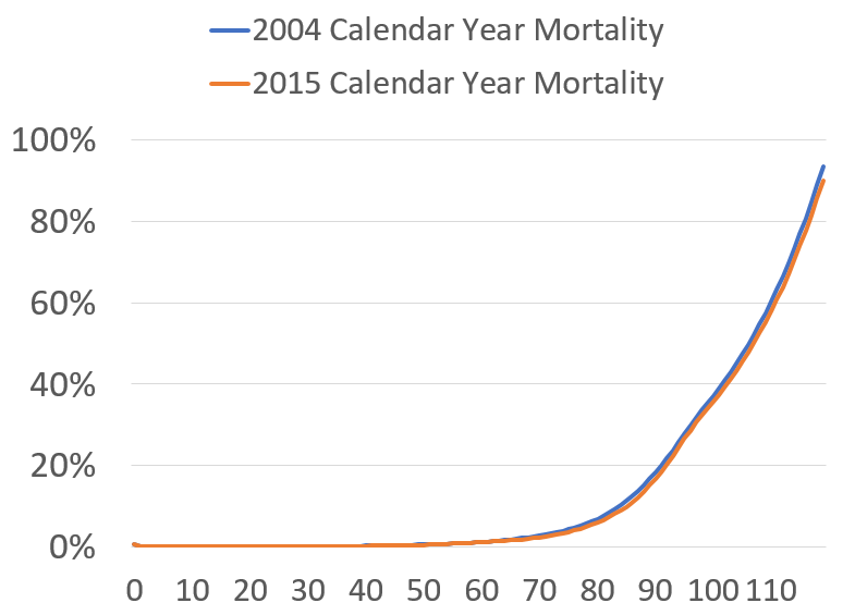
This is a fairly boring mortality graph – again, I’m graphing the 1-year death probabilities at each age for those calendar years. You may think that they look like a functional form can easily be fit to such a curve (note: not only can, but are… and that’s how the tables are made for very high ages.) But it’s also hard to see anything interesting. The older you are, in general, the higher the death rate.
FOCUSING ON MIDDLE AGE: AGE 30-AGE 70
So I decided to go to a part of the curve, somewhat middle-aged, because I know some funky stuff is going on there.

Look at that. Some seriously odd movements. But it’s still somewhat difficult to see. Up to age about 60, the one-year death rates are less than 1%, so even with me focusing in there, it can be difficult to see what’s going on.
So let’s take a ratio.
THE RATIO BETWEEN 2015 and 2004 MORTALITY RATES
Here’s the good stuff:

If the ratio is above 100%, it means mortality was worse in 2015 — and we see that for age 20-40… just as we’ve heard re: opioid, alcohol, and suicide deaths.
If the ratio is 100%, then it’s about the same — and we’re seeing that at age 60. Interesting. Some of the below-age-20 weirdness likely comes from precision issues because mortality rates are so low below age 20 that you get underflow issues.
If the ratio is below 100%, as we’d hope it would be, that means mortality has improved. At age 45 and 75, we’re seeing about 15% improvement between 2004 and 2015. Pretty nice.
Now, some of these ratios can be artifacts of how these tables are made. We’ll get to making tables…. eventually… but for right now we want to get used to thinking about mortality rates in general and what they mean.
Underlying spreadsheet is here.
UPDATE: BETTER GRAPH COURTESY OF STU
I showed Stu this post and the graphs, and he told me what I should do to make a better graph.
And I did it.
Here is the graph of the cumulative mortality improvement from 2004 to 2015:

There you go: 0% improvement means no change, negative numbers means it got worse (i.e. probability of death increased), and positive numbers means it got better.
And I emphasized the 0 line, so you can see where it switches over.
The interpretation is the same: yes, it really has gotten worse for ages 20-40.
Related Posts
Pools are more dangerous than Covid to small children
Mortality with Meep: Total U.S. Excess Mortality in 2020, by Race and Ethnicity
Dead is dead: Increased Alcohol-Related Deaths, U.S., 2020-2021
