Mortality with Meep: Excess Deaths And Coronavirus
by meep
Worry not, I’ll be back to beating up on Illinois in good time.
In the meantime, my “happier” topic of mortality trends and what it can tell us about current COVID effects.
I did a few videos recently, one on visualizing “excess deaths” and one on patterns one sees in data that are, essentially, meaningless for forecasting and decision-making purposes.
Excess Deaths from COVID-19: Not Just a Matter of Definitions
Here is the video version:
Links from video:
The Economist article with excess deaths – originally posted April 16, 2020
Tracking covid-19 excess deaths across countries — there has been at least one update since they originally published.
I know The Economist is pay-walled, so check out this tweet thread, and I will likely revisit his [and other] twitter accounts for updates as I do some of my own analysis.
So we have decided to aggregate data across countries. Using figures from
istat_it</a>, covering 6.7m of 10m people in Lombardy, we found excess mortality of 9,000 in the 4 weeks to March 28th, compared with about 4,000 officially from covid. (5/14) <a href="https://t.co/7pWQKWhwf2">pic.twitter.com/7pWQKWhwf2</a></p>— James Tozer (J_CD_T) April 16, 2020
Github repo with excess death data: https://github.com/sebastianhohmann/covid19_total_death – you can grab data sets for yourself, and do your own analysis [rather than wait around for me to get to it… I do have other work to do. Like beating up on Illinois.]
Lyman Stone on excess deaths in March 2020:Adding it all up here's what the comparison chart looks like.
— Lyman Expand the House Stone (@lymanstoneky) April 17, 2020
Italy is…. really really bad. pic.twitter.com/9c6NcmwDmx
But the data seem to lead to one conclusion.
COVID-19 Deaths Are Undercounted in Many Places
And, to the extent COVID-19 deaths are being overcounted, it’s not by much.
Here is a chart.

These were the week-by-week total deaths in New York City. The dashed line is the “expected” number of deaths — remember my baseline mortality post?
Total deaths for New York City [and some other places] have gone up by a lot. You can quibble about how COVID deaths are recorded [did they need to be tested positive before the death? Do you count it if it was a heart attack?], but dead is dead.
It is very tough to fudge the count of total dead people.
Interlude: Know Your Data 2 — Quirks When People Are Involved
Here is some info about a very funny-shaped graph of counting deaths.
If you don’t want to watch the video, here is the image I’m talking about. It’s the daily number of deaths reported due to COVID-19 in Sweden:

Guys, it is not the case that there is a greater incidence of COVID deaths on weekdays and fewer on weekends. Not to this amount of fluctuation. This is almost directly the result of how these deaths are reported, and, most importantly, when they’re reported. That’s one reason we generally look at weekly totals of deaths in normal times, not daily.
The IHME people know that, too, which is why they fit their models using smoothed death counts… because using the official numbers will get you a very unstable result. But more on that another time, if we revisit knowing your models.
Back To Excess Deaths
So, we’ve been getting more and more deaths data, and some places are showing clear patterns in jumps in total deaths:

That ran in the New York Times today, where they wrote:
At least 25,000 more people have died during the coronavirus pandemic over the last month than the official Covid-19 death counts report, a review of mortality data in 11 countries shows — providing a clearer, if still incomplete, picture of the toll of the crisis.
…..
These numbers undermine the notion that many people who have died from the virus may soon have died anyway. In Paris, more than twice the usual number of people have died each day, far more than the peak of a bad flu season. In New York City, the number is now four times the normal amount.
I will likely be talking about the mortality pattern by age at a later date…. this is raw for many people right now, and I would rather not be getting into the detail of the patterns yet. It is actually tied to age-related mortality patterns, and is not that crazy.
But I do agree: these are greatly accelerated deaths, even for the oldest people. Yes, a few of the people would have died this year from other causes. But a lot more died who would not have died for years. Yes, even the old folks with co-morbidities.
Here is a table from the NYT piece:

As I say in the first video, this table shows that New York City has probably done a very good job of enumerating the actual COVID deaths.
Many of those other places… well, I will note they didn’t mention the percentage difference in the table.
Let me calculate:
Spain: 63% of the excess deaths were identified as COVID-19
England & Wales: 62%
France: 62%
NYC: 77%
Netherlands: 54%
Istanbul: 48%
Jakarta: 8%
Belgium: 63%
Switzerland: 71%
Sweden: 105%
Quite the variation between locations. [Also, if you’re wondering about the “weird” math in the table with the subtractions, read my article about significant figures. Yes, the NYT did it correctly]
Also, maybe Sweden isn’t overcounting COVID-19 deaths. Sure, Sweden hasn’t done the lockdown policy other countries have, but a variation of only 5% when it’s 1000 deaths over one month. That’s about 29 deaths per day. You can get 5% variations easily. Remember, this is just excess over “expected” – you get variations every week and every month, even in “normal” years. That’s how it goes.
Back to the NYT article:
It is unusual for mortality data to be released so quickly, demographers say, but many countries are working to provide more comprehensive and timely information because of the urgency of the coronavirus outbreak. The data is limited and, if anything, excess deaths are underestimated because not all deaths have been reported.
Remember the “know your data” from above. This isn’t just a matter of people dying alone and their bodies not being found months later [that does happen]. Mostly, it’s just normal administrative stuff. Individuals have to report the deaths, and there may be details they need to get together for death certificates… and then there’s a lag between death certificates and reporting that to other government groups.
In any case: in specific hard-hit places, it’s pretty clear that many COVID-19 deaths are not being recognized as COVID deaths.
Yes, there will be increased deaths due to lockdown orders [especially drug overdoses and suicide] and some decreased categories [traffic deaths]. But, these are unlikely to hit the same age profiles we’re seeing [which is in line with the usual shape of mortality… just at a high multiplier], and I’m very skeptical that they’re increasing by 100%. I can easily believe a 100% increase in raw mortality due to a pandemic, and that is very mild compared to the Black Death, which wiped out 30-50% of populations in European countries in the 14th century. That’s very different from killing an extra 1% [one full percentage point] of the population… this is not to minimize: that’s double our normal mortality.
But not all the U.S. is New York City.
So What About the Excess Mortality?
I’ve been picking up other writers’ comments on the switch to excess mortality as the metric to look at. Here is a take from Reason. Jacob Sullum writes What Do ‘Missing Deaths’ Imply About the Impact of COVID-19?
While this analysis adds to our understanding of the epidemic’s impact, the significance of the undercounting described by the Times should not be exaggerated. It has little bearing on the overall fatality rate among people infected by the COVID-19 virus or the number of life-years typically lost to the disease.
It also doesn’t tell you the relative risk of being in NYC’s crowded subways or on its jostling sidewalks, shoved into small restaurants, and, in general, bumping up against who knows how many people on a regular day — compared to most areas in the U.S.
Is NYC really an appropriate model for the suburban sprawl of most of the U.S.?
I do find excess mortality a useful metric, far more reliable than official COVID death counts. In places where there is a severe rate of hospitalizations, the COVID deaths seem to be undercounted.
However, they’re testing out the concept on extremely hard-hit areas. I note that I haven’t (yet) seen equivalent graphs for less stark situations. My understanding is that both Texas and California, both with larger populations than New York state, have had far fewer cases. They are also not bunched up so much around one city.
I will be digging up what data I can – so far the focus has been on the hard-hit places, and that makes sense: the issue is how bad it can get. The reason for the lockdowns is that we didn’t want to be as bad as Lombardy or Spain. You can get overrun with cases.
But now some breathing room was achieved via shutdowns, and some states [not New York] are slowly opening up again. Heck, even Gov. Cuomo notes that New York will be managed in a regional way.
Yes, New York City has been very hard hit:
I have been irritated and provoked by
Efffable</a> into extending my New York vital stats series back to 1956, in order to demonstrate the basic non-event-ness of the TERRIBLE 1957 Asian Flu compared to the extraordinarily massive death spike associated with COVID-19. <a href="https://t.co/vvC1DpMWpe">pic.twitter.com/vvC1DpMWpe</a></p>— Lyman Expand the House Stone (lymanstoneky) April 21, 2020
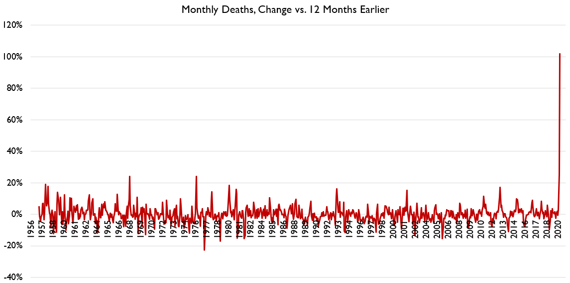
But let us see the same graphs for other localities. I’m thinking you are mainly going to see the very stark results in densely populated cities… and, unfortunately, nursing homes. Prisons, too, but not as bad as nursing homes.
But the nursing home mortality issue is something for another time.
The point is that there really is a huge increase in deaths… at least in some specific locations. Whether all locations would see such spikes absent the policies being carried out… I don’t know. Yet.
Related Posts
Read the News with Meep: On Suicide Trends by Race (and Sex) in 2021 (and Earlier)
Pools are more dangerous than Covid to small children
Cold Kills: Some Comparisons of Heat and Cold Deaths 1999-2020
