Mortality with Meep: Excess Deaths and COVID-19
by meep
I have finally got some mortality data I semi-trust, from the CDC. It has numbers of official COVID deaths, but, more importantly, they also have total deaths from any cause by week… and also the same numbers for 2017 through 2019, so one can make direct comparisons.
If you’d like to play with the numbers yourself, you can play with the CDC’s visualization of excess deaths or you can check out the spreadsheet I made from the data [I extracted the data on May 6, 2020, at 7pm, which is important to indicate as this data keeps getting updated].
Video explainers on 2020 excess deaths and visualizing them
So here is my video showing the features of the CDC pages, and how you can play with the numbers there:
The two CDC page links:
Provisional Death Counts for Coronavirus Disease (COVID-19)
Excess Deaths Associated with COVID-19: Visualization
And here is my video looking at my spreadsheet with two different visualizations of excess mortality by state [and New York City]:
My spreadsheet: Excess_Deaths_Associated_with_COVID-19.xlsx
Let’s dive into the data.
COVID-19 deaths really are significant… in some places
There are various ways I could visualize this, but I’m using one of my favorites that incorporates [roughly] the geographic relationship between states but without the distorting effects of the geographic area of the states. Ideally, I would have a shape-distorted map where the states were in size relative to their populations, but that’s beyond my abilities in Excel.
[More to the point: I know I could do it in R, but I want to share an Excel spreadsheet that many people could play with]
The graphic type is called a tile grid map, and I got the original Excel setup from PolicyViz, and I’ve changed it over the years to suit my purposes.
I set it up so that states “disappear” as their data level drops below anything I can do something with.
So here are two snapshots from the visualization:
Before COVID-19:

In the middle:
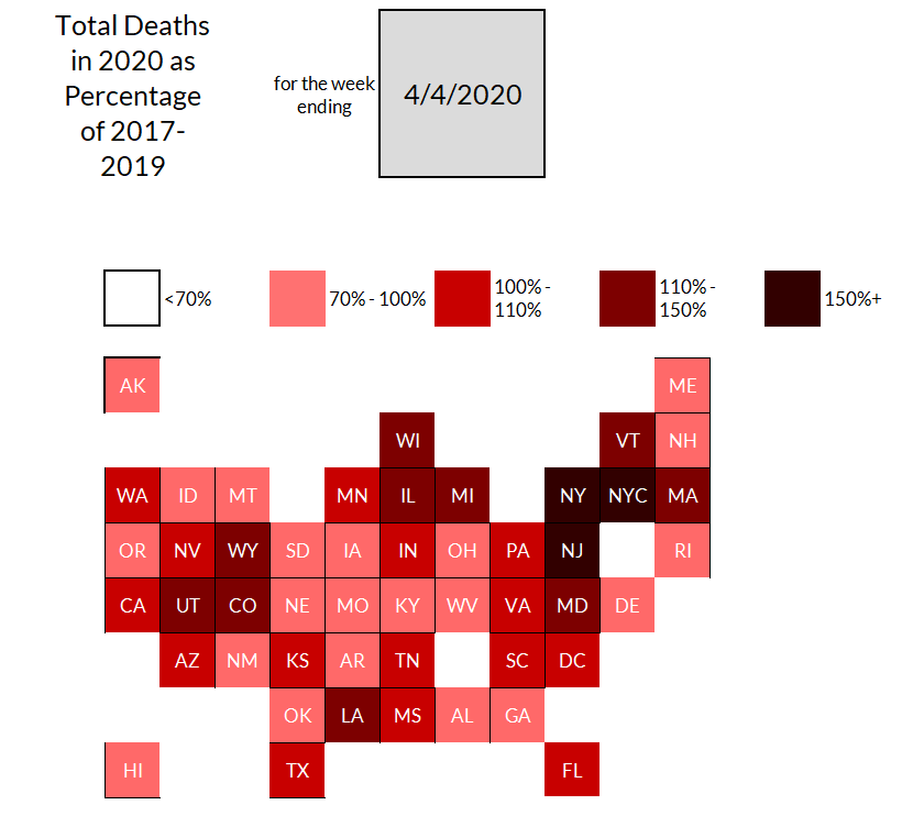
Before COVID-19 really hit with excess deaths, the main heightened mortality you see are for states with relatively small populations, or populations that can fluctuate with snowbird trends. I can bet Wyoming death counts vary a bit depending on whether the skiing there is good that winter.
But look at the dark trio: New York City, New York [the state excluding the city], and New Jersey. The mortality levels are way higher than explained by random fluctuations. That is a serious mortality spike.
However, other places… not so much. Perhaps they just haven’t gotten their mortality spike yet.
Unfortunately, I do not have good data for Connecticut, but then, it is small compared to New York and Massachusetts, which border it.
I hope to revisit this data set to see how it’s developed.
A different visualization of mortality spikes
I also used conditional formatting on the table of the ratios of total deaths in 2020 to average deaths [from 2017-2019] to get this:

No, that’s not the whole table, but it does capture the dark trio, as per the tile grid map.
Excess mortality shows the impact
Guys, I know many people suspect the COVID death numbers coming out, so excess mortality is one of the best indicators of heightened effects of COVID-19. It really has hit the northeast of the U.S. hard, and perhaps the rest of the country has not really seen the effects yet.
It is easy to dismiss New York City due to its unique characteristics: very high density compared to the rest of the U.S., a more international population than anywhere else with a lot of international travelers passing through, and very high mass transit usage.
But look at New Jersey, the rest of New York state, Pennsylvania, and more.
It’s not just the cities getting hit, though many are hit hardest.
I plan on revisiting this data set in a month or two, so we can see how the mortality trend has progressed.
Related Posts
Movember Inspiration: My Dad and the Sex Gap in Mortality
Deaths from Heat and Cold: Deception and Update for U.S. 1999-2022
Top Causes of Death by Age Group, 2020: Death Rates
