Mortality with Meep: U.S. Excess Mortality by Age Group in 2020, Absolute and Percentage
by meep
In my prior post, I showed total mortality by week in 2020, showed an average from 2017-2019, and showed excess mortality as a percentage.
Now let’s look at how excess mortality differed by age group. I pulled data from the CDC, and I decided to compare against the 2015-2019 average (so two extra years of experience).
To be sure, the population shifts in age structure and size, yadda yadda, but over 5 years our population hasn’t changed all that much. Having the two extra years also helps tamp down the extra deaths from the bad 2017-2018 flu season. The age groupings are also a little different, so that there are fewer groupings, but at this level I’m given the death counts for each of the large groups.
So here’s a redone graph:
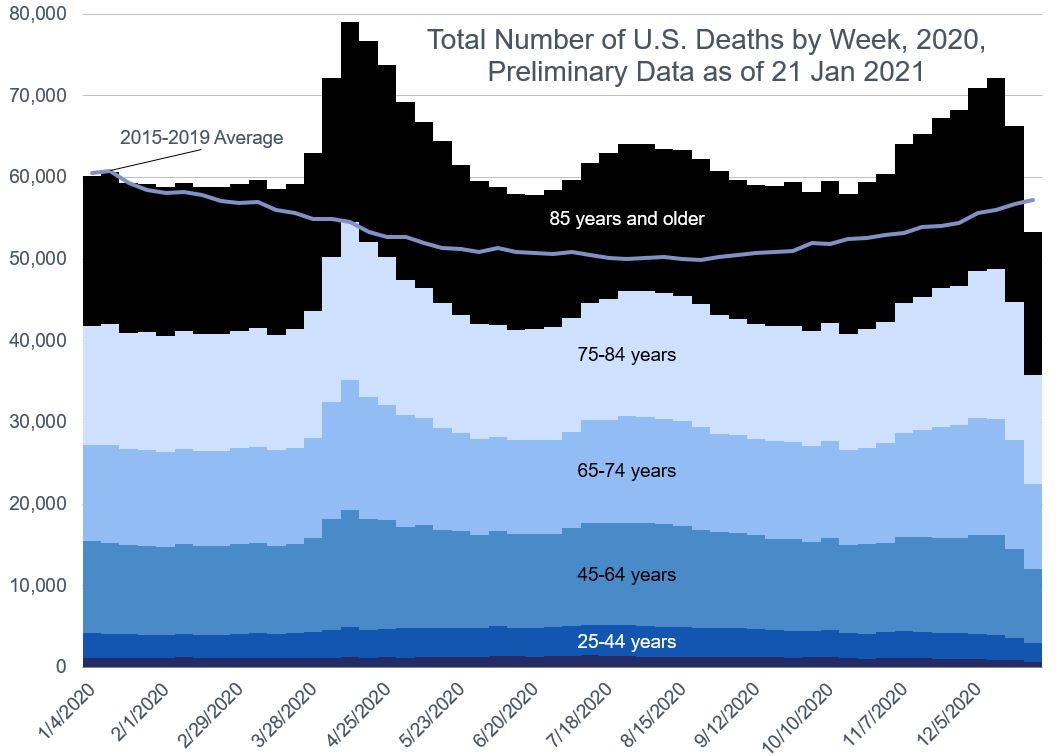
Essentially, it looks the same as before – the main place the averages differed somewhat were the begin/end of year weeks, where the 2017-2018 flu season bumped up deaths.
Total excess mortality by age
With the new data set, now we can show how excess deaths broke out by age group:

I want to mention a few of the items here: low deaths at the beginning of the year, the anomalies around October, and the drop-off at the end.
Low deaths at the beginning of the year: this still is showing an artifact of the bad flu deaths in January 2018. But on top of that, the 2019-2020 flu season was pretty quiet. (And flu activity right now is extremely low).
Around October, it looks like excess deaths pops down… and then pops up again. That’s because I’m using the unweighted death counts (most of the CDC dashboards use the projected amounts, and it hides a lot of data issues, and I’d rather just slice & dice the raw data. I can do my own projections.) Recall from my videos in the last post that North Carolina data has lagged more than 3 months. (It’s disgusting)
The drop off at the end of the year is very easy: there’s always some lag in death reporting, so the last few weeks of the year greatly undercount deaths.
Percentage Excess Deaths: Age 65+
I have six age groupings in this data, so let’s split it up in two subgroups: those under age 65 and those over.
First, let’s look at the seniors.

We clearly see the three-wave pattern in this data. In that first wave, we see mortality take a similar trajectory for all three, all peaking at about 50% excess mortality.
However, there is divergence after: the oldest age group’s (age 85+) excess mortality is not as extreme as those age 65-74 and age 75-84. It may be that policies put into place to protect nursing home residents (mostly over age 80) helped to reduce the COVID impact on this age group. That said, the qualitative trend is about the same for all three age groups.
Percentage Excess Deaths: Under Age 65
This one is not so clear:
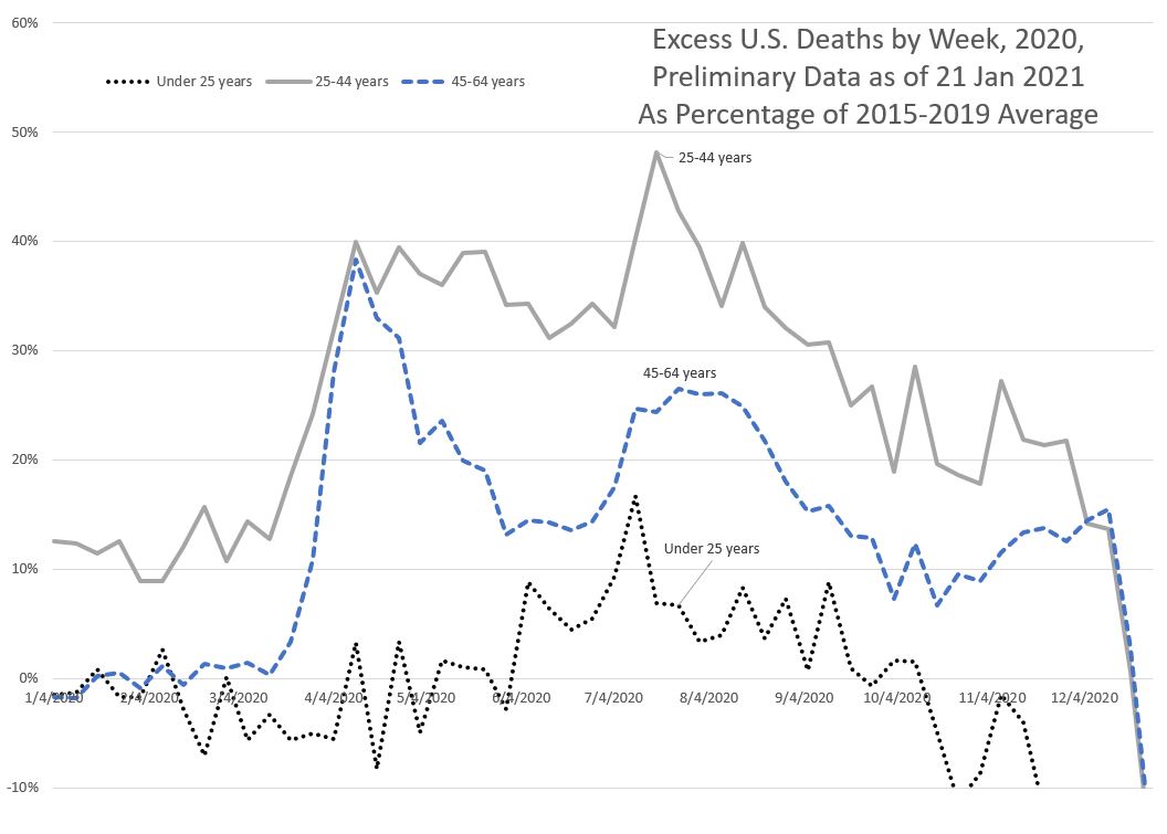
First, we need to keep in mind that the number of deaths for each of the age groups — for the under age 25 group, they average about 1,200 deaths per week (in 2015-2019). For the over age 85 group, the average is 16,650 deaths per week. Well over ten times the number of deaths among the oldest than among the youngest.
For the under age 25 group, at the “peak” of their excess deaths in the summer, that’s only 200 deaths. Notice there’s no wave structure of any kind for this youngest age group.
For the middle-aged folks, age 45-64, you can see that three-wave structure. Makes sense – on the “wrong” side of 45, that’s when the normal age-related frailty really starts kicking in.
But it’s that young adult group, from age 25 to 44, that concerns me a great deal. There is no wave structure, but there’s a great deal of excess mortality. You get that rapid wave in the spring, as with the older adults, but after that, it stays elevated at a level about as high as that initial wave — maybe that’s COVID, but maybe it’s a bunch of other things, such as increased homicide, suicide, and drug overdoses.
When we look at the cumulative excess mortality, it turns out that the age 25-44 have shown 25% excess mortality (note: This is including the “negative” excess deaths where it’s mainly data missing), followed closely by the 65-74 age group, with 23% excess mortality.
This very high excess mortality for young adults has not gotten as much attention as many of the other groupings out there — any deaths of children at all are always most upsetting, and then the oldest are dying in the greatest numbers. It is much easier for people to think in terms of absolute numbers as opposed to relative comparisons as you see in percentages.
I have only begun to touch the surface of the mortality patterns we’ve seen thus far. I have other dimensions I’ll like to dig into more in upcoming posts, including how different ages fared in different states.
Sources
Original data source: Weekly counts of deaths by jurisdiction and age group from the National Center for Health Statistics
Related Posts
Movember Fundraising: Do It For Stu!
Meep Hits the Road and Plays the Oldies: Today - Silly(ish) Mortality Posts!
Mortality with Meep: q_x - UPDATED WITH CONTENT FROM STU
