COVID and Simpson's Paradox: Why So Many Vaccinated People are Among the Current Wave of Hospitalizations
by meep
That’s some paradox, that Simpson’s Paradox.
(and it comes up all the time in real life)
With the notice that the fully-vaccinated Texas governor has tested positive for COVID, I thought I’d do my own post on why we see so many fully-vaccinated people test positive for COVID.
A quick excerpt from the linked article:
Abbott, a Republican, is fully vaccinated against the virus, his office said in a statement, adding that he is tested daily and this is his first positive result.
He is currently isolated in the governor’s mansion and is receiving Regeneron’s monoclonal antibody treatment, the statement said. Abbott is in good health and not currently experiencing any symptoms.
So, he is tested daily… what is the false positive rate on these tests? How many days has he been tested? (for all I know, they tested him multiple times and all the tests came back positive, reducing the chances of a false positive, but I have no idea. That info isn’t there.)
While he may eventually develop symptoms, it’s noted he has none. He’s just tested daily out of an abundance of caution, I’m sure. He is also receiving prophylactic treatment, but it may be wasted, given his vaccinated status.
All that said, it’s his business that he’s getting treatment even though he’s showing no symptoms.
The main issue right now is the media sensation of “breakthrough cases” — of people who have been vaccinated and subsequently test positive for COVID. This can be important even if they never develop symptoms, if they are able to spread the virus to other people. That’s a population-level risk, and important for public policy, especially if you’ve got huge swathes of non-vaccinated people at risk (I’m not talking about children, who have extremely low risk.)
But what individuals generally want to know is their risk of a serious outcome: hospitalization or death.
I will start with two other people’s explanations. Note: my explanation is going to be exactly the same, in terms of the logic and math. I tend to be wordy, and I’m going to take you step-by-step so you can understand the analysis.
But if you don’t need my step-by-step, the two explanations, from Matt Shapiro using a simplified model, and from Prof. Jeffrey S. Morris using data from Israel, are complete by themselves.
Matt Shapiro explains the base rate fallacy
Matt Shapiro, aka PoliMath, did a video explaining what he’s calling the “base rate fallacy” back at the end of June:
He steps through his visualization in this post: Why the Vaccinated Account for 50% of COVID Infections In Israel — go there for his diagrams. I will be making my own.
Basically, when you have a very large percentage of people vaccinated, even if the vaccine is very effective, yes, you can easily end up with more vaccinated people in the hospital than non-vaccinated people.
PoliMath’s explanation uses a simple model just looking at percentages, but let’s use real data from a country that has a high vaccination rate: Israel.
Prof. Jeffrey S. Morris explains the Simpson’s Paradox embedded in Israeli experience
The second is a twitter thread by Prof. Jeffrey S. Morris, starting with this tweet:
Many are confused by results that >1/2 of hospitalized in Israel are vaccinated, thinking this means vaccines don't work. I downloaded actual Israeli data https://t.co/63JXw026hp and show why these data provide strong evidence vaccines strongly protect vs. serious disease (1/8)
— Prof Jeffrey S Morris (@jsm2334) August 17, 2021
I had his thread unrolled here. I will be taking some of the statistics he’s reading out to do a different display. He provided tables, with relative risk rates.
Professor Morris did a post here, further elaborating on the calculations he made.
I think a lot of people will be able to understand the numbers better with graphs than tables. Especially since he crams so many numbers into the same table, though they’re all different things (number of people, percentages, and rates per 100,000). It can be difficult to see what you need to compare.
Numbers and Graphs from Israel: Higher Number of Severe Cases for the Vaccinated
For the record: I was having trouble reading the information from the Israeli COVID data dashboard, as it’s in Hebrew. I did use Google Translate, which helped, but when it’s downloadable data, I have trouble understanding which data means what, and it’s important to make distinctions.
So for all the following graphs, I’m trusting Professor Morris read off the relevant statistics appropriately. Given that the numbers do hang together, and I was able to replicate his calculations from the given data, let us work through this. All the data are based on people age 12 and older as: 1, vaccines aren’t available for those under age 12 and 2, there are no severe cases for those under age 12 in Israel as of the moment of the data draw. Finally, the vaccines approved in Israel are Moderna and Pfizer, right now.
Throughout the following, we are going to be aggregating populations to compare severe case rates. As we shall see, simply comparing counts is not going to be sufficient.
Here’s our first graph, with 515 total hospitalizations for COVID (currently), where 301 of those hospitalized were vaccinated and 214 were not vaccinated. (In all the following, we’re not using the “partially vaccinated” category. I don’t care which we throw them into, because the math works out the same.)

Ah hah! vaccinations don’t work!
Well, okay. That’s simply the number of cases, and we’re not comparing rates yet.
Comparing severe case rates between populations
First, how many people are vaccinated vs. non-vaccinated?
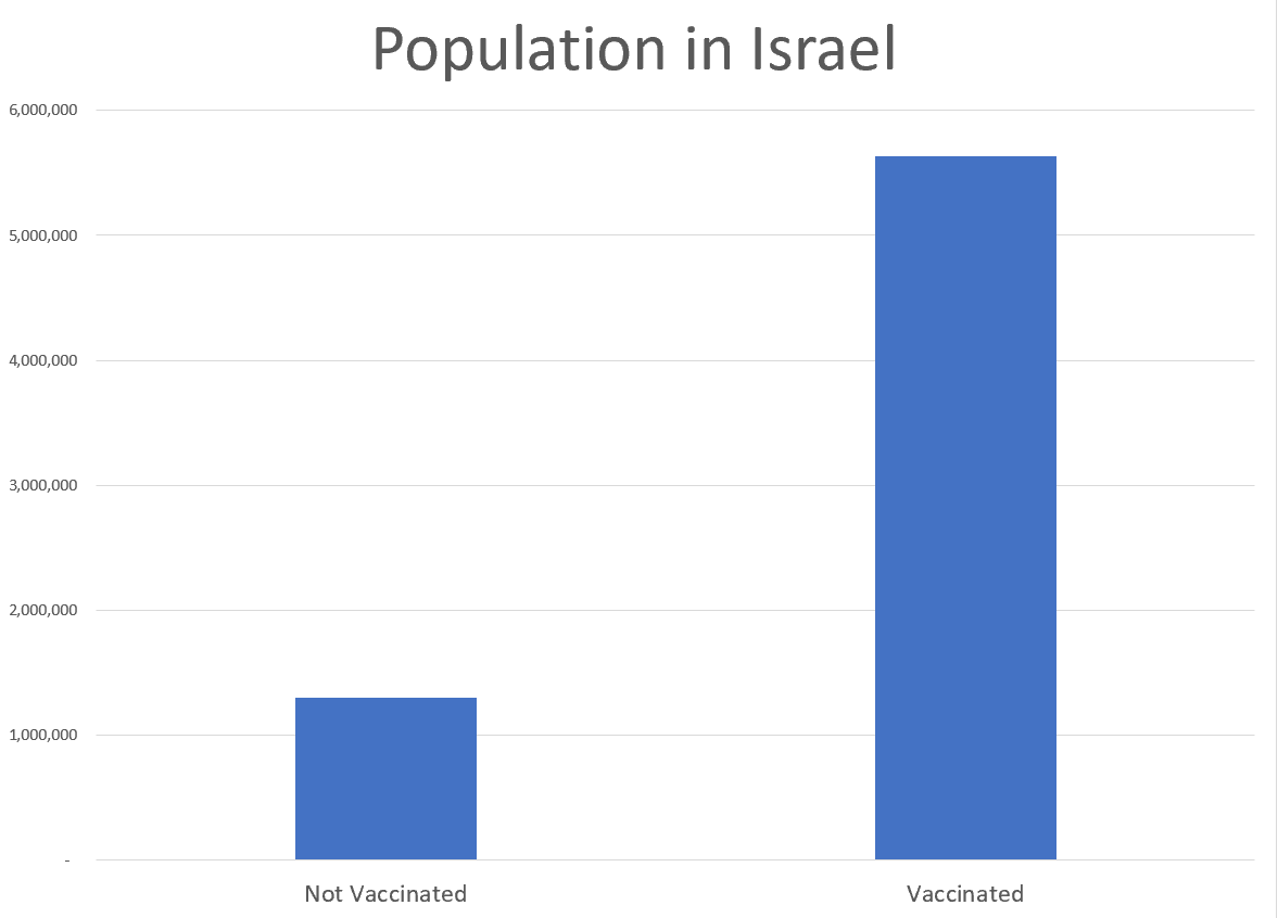
Hmmm, about 20% of the population is not vaccinated. Let’s compare the percentages of non-vaxxed vs. vaxxed for both the population and severe cases:
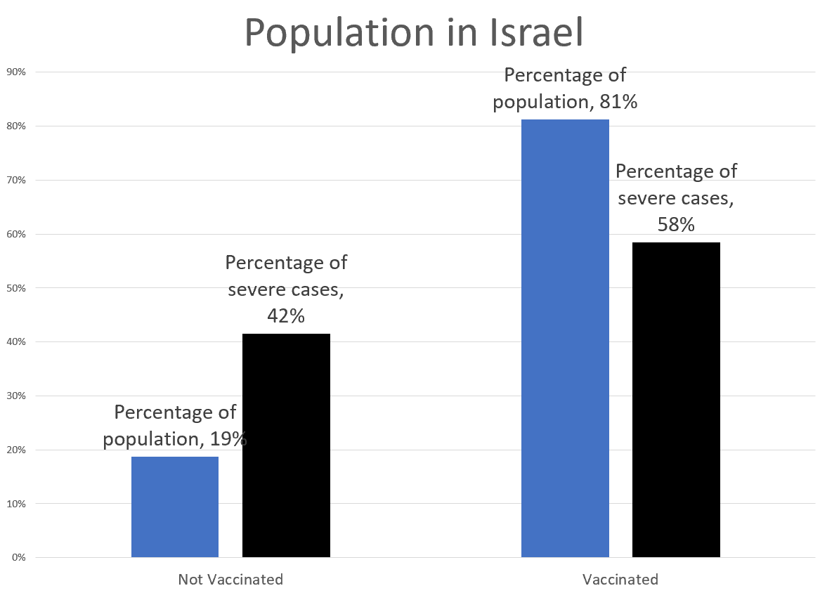
Ah, so while the majority of severe cases are vaccinated people, when we look at the percentage of the population, obviously the risk has been reduced. How to measure that?
Very simple — let’s look at severe case rates (to make them reasonable-looking numbers, we measure these rates in per 100,000 people (just as we do with mortality rates.))
So, for example, to get the rate for non-vaccinated people, we take the 214 severe cases of non-vaccinated people, divide by the population of 1.3 million non-vaccinated people, and then multiply by 100,000 to get our proper rate: 16.4 per 100,000. We do a similar operation for the vaccinated folks (5.3 per 100K).
Here’s a graph:

The rate for vaccinated people is only 33% of the rate for non-vaccinated people, so that’s a 67% risk reduction. (We do a ratio of the new rate (5.3) by the old rate (16.4) to get the 33% — so the risk reduction is 100% minus that 33% = 67%.
Just from this high-level analysis, we see that the vaccines reduce risk at least 67%. That’s not fabulous, but it’s not a zero effect, and it certainly has removed the mistaken idea that vaccinated people have a higher risk of being hospitalized with COVID.
Looking at subpopulations
But we heard that the vaccines were 80-90% effective! While 67% is in spitting range, it’s not what we were told!
So hold up — let’s break out the Israeli population into two groups, we’ll call young (age 12-50) and old (age 50+). The reason will become very clear once you see this graph:

And now Simpson’s paradox has peeped in its nose.
Simpson’s paradox pops up in health outcomes all the time
Both of these age groups have risk reductions of 85%+ — how can their combo get us to only a 67% risk reduction?
I’ve written about Simpson’s paradox many times before (you can scroll to the bottom of the post to get the links), but here’s the main way it pops up: when you’ve got really steep differences between subpopulations and the subpopulations are of very different sizes, the overall population average will be very different from simply looking at the average of the two populations.
Basically:
- The base risk rates for each group are extremely different (3.9 per 100K for young, and 91.9 per 100K for old)
- The percentage each subpopulation makes up in the larger population is very different (67% young, 33% old)
- The vaccination rates are very different by population (76% young, 92% old)
When you have so many different interacting rates, well, duh. Weighted averages, which is how you go from the subpopulation to the full population, do not behave the same way as simply averaging two numbers.
These sorts of patterns happen all the time in real life.
It especially happens when we look at health outcomes. People do not realize just how fragile old people are, compared to young people. I often have to split out mortality trends by sex, but sex differences have got nothing on age. The only major split that I know of is smoker/non-smoker, and that gap, much bigger than the sex gap or racial gap (smaller than the sex gap), is nowhere near as big.
That’s why we do age-adjusted death rates, partly. But it’s really why we prefer to look at mortality trends where we have at least 10-year age groupings. We never just look at raw death rates, because the age composition of the underlying population will really drive that.
Ultimate graph: COVID severe case rates by age groups
So that is all leading up to this:
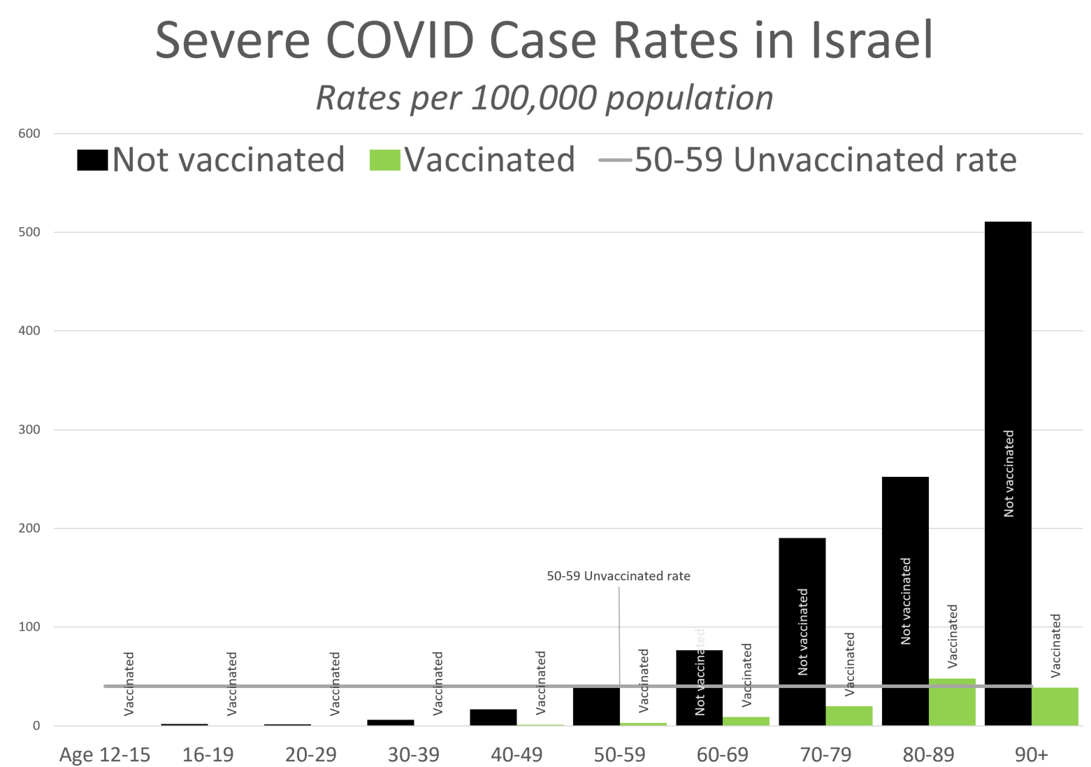
I decided to compare against the severe case rate for those age 50-59 (Prof. Morris uses 30-39 as his base to compare against). You can see that those who are age 90+ and vaccinated have a severe case rate similar to that of people 40 years younger.
Just to graph the risk reduction rate by age group (I’m cutting off the kids, because really, I should have error bars on all of these, but I don’t want to take that time — I’m not an academic. Just know that empirical 100% risk reduction for the kids could get very reduced if there were only one juvenile severe case of COVID):

There you have it — for this slice of time, the beginning of August 2021, Israel shows that the vaccines reduced risk 80%+, for all age groups.
Yes, if you just do an aggregation at the whole population level, it looks like a 67% reduction. That’s the “magic” of Simpson’s Paradox. For any given age group, the percentage reduction is much larger. But due to the relative risks by age, even with such high reductions, the overall population result shows a smaller improvement.
Takeaway: COVID vaccines greatly reduce risk
This is the main takeaway: the COVID vaccines greatly reduce the risk of adverse outcomes.
By the way, this is also true of the annual flu vaccines, which range in efficacy based on how well the vaccine that year matches up with the strains circulating, and which strains are circulating (some strains, even if you formulated the vaccine perfectly, still infect.) I could give you flu/pneumonia death rates by age groups, and you would see that flu/pneumonia is a big killer of the elderly. Get your flu vaccines, please.
But, we should also expect a lot of people hospitalized with COVID to be vaccinated old folks. Just because of the huge risk slope by age, which will still exist after vaccination.
One of the big problems we have is that media folks tend to suck at quantitative reasoning. To be fair, look at all the steps I had to go through above.
Another big problem is that “The vaccines do greatly reduce risk” message isn’t as sensational, and doesn’t get the clicks that “OMG! VACCINATED PEOPLE ARE BEING HOSPITALIZED!”
The final problem is that the public health people have really sucked at messaging over the past year and a half. Even I have tuned them out at this point. This is why I have to keep going back to first principles, to check related rates. I don’t trust their messaging, due to its inconsistency, and the obvious political calculations involved in the messaging (note: this is not unique to the CDC and the United States— I’m reading international news, and many countries have this same problem.)
But one of the main problems is this: too many public policy folks, and the public in general, are acting like any COVID risk above zero is unacceptable (but being blind to all the other risks they’re taking on, to avoid the one risk.)
Even with fabulous vaccines, there is going to be an age slope for adverse health outcomes. That is going to lead to results in the aggregate that if the oldest groups are the most vaccinated, yes, you’re going to be seeing a lot of hospitalized vaccinated old people.
My own advice is this: vaccination does cut the risk for an individual by a lot (for most of the available vaccines), so if you can get vaccinated, I recommend doing it. I got the Johnson & Johnson vaccine back in April, as that’s the one I could get at the time. I know many more people who have had the Pfizer vaccine, and a few with Moderna. Yes, there are some side effects, but feeling crappy for a day was worth even a 50% risk reduction, for me. I am thinking about getting Pfizer or Moderna vaccination, in addition, but I’m not jumping at that yet. I’ve got at least one vaccination, and don’t want to do mix & match right now.
All that said, it’s up to you, if you’re not vaccinated. I know some people have medical reasons they can’t get the vaccine. (There are vaccines people in my family are unable to take, due to Stu’s cancer treatment, for example. Not just Stu, but the rest of us, can’t have live attenuated virus vaccines. That’s not relevant for COVID, but is for MMR.) There can be other reasons. That’s not for me to make.
But don’t use the excuse: “The vaccines don’t work!” because you see that many vaccinated people still get COVID. As shown above, real-life data are showing the Moderna and Pfizer vaccines in use in Israel are giving 80%+ risk reduction.
If you want 100% risk reduction, you are being unreasonable.
Yes, many public policy folks are being unreasonable, but that doesn’t mean you need to be, too.
Old posts involving Simpson’s Paradox
One of these predates STUMP (but not marypat.org):
- 28 Sept 2000: Sexing your Meep, or, A little foray into Bayesian inference
- 13 May 2018: Mornings with Meep: Happy Mothers Day!
- 24 Nov 2018: Geeking Out: On Life Expectancy and Conditional Expectation
- 28 Jan 2021: Mortality with Meep: Total U.S. Excess Mortality in 2020, by Race and Ethnicity
Hope you enjoyed this!
Related Posts
Happy Bobby Bonilla Day for 2022!
Actuaries on Social Security: Bruce Schobel on Reforms, Robert Myers on History, and Richard Foster on Medicare/ACA
Happy Thanksgiving 2022! Deciphering Historical Death and Actuarial Humor Books
