These are a few of my favorite graphs
by meep
I did a presentation on data visualization yesterday. I’m about to do a college visit trip today with one of my children, so I’ll do a quick post showing some of my favorite graphs.
No, I’m not about to break out in song. I just think some of these are neat is all.
Jitter chart of public pension returns versus assumed returns
The following comes from One Bad Year? Comparing the Long-Term Public Pension Fund Returns Against Assumptions:
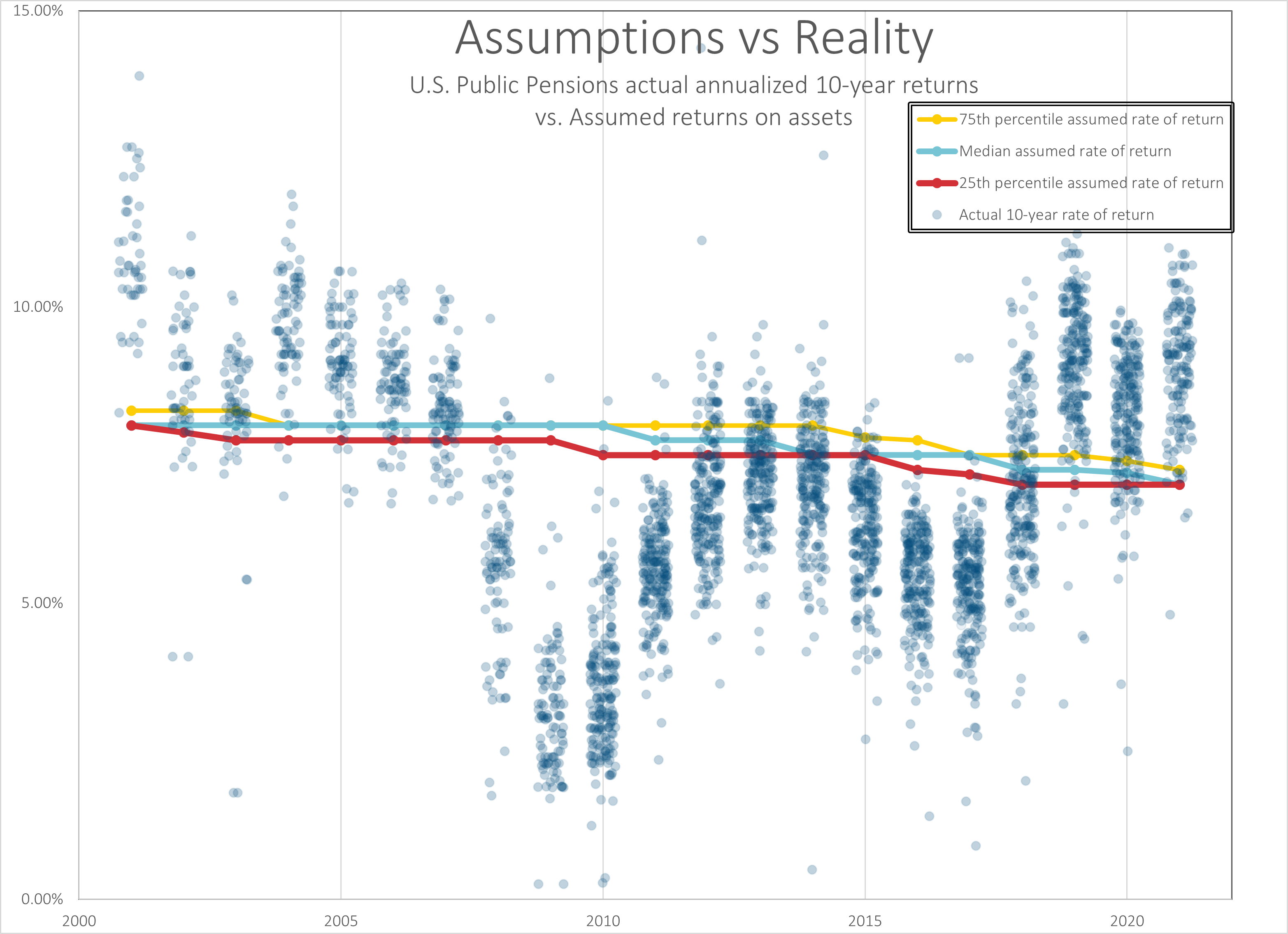
Hmmm, still needs some work
I can see how to improve it (I would make the three lines in the middle thicker, and maybe change their colors), but I don’t have time for editing right now.
The point of the graph is to show 10-year investment returns (these aren’t 1-year returns, by the way, which are obviously more volatile) versus the rates used to value liabilities in these pension plans. The argument has been that in the long run, the assets on average make the targeted returns.
[peering at the graph]
Mmmhmm.
Here is a video where I explain how to make a chart like that in Excel.
Pretty much all the graphs you see in the blog are made in Excel.
Sometimes I draw on top of the graphs, but I’m generally not doing anything fancy. I don’t have time to do anything fancy.
Animated tile grid maps
I love tile grid maps. I first came across them when I found Jon Schwabish’s site PolicyViz years ago — I asked him about ways to graph the evolution of the unfunded liability of Illinois pensions (because some portions go positive, and Excel was being a bitch about that with stacked column graphs, and he commiserated with me but didn’t really have a fix at the time.)
I downloaded one of his free files from a blog post, but then I bought one of his Excel downloads… which no longer exists it seems. Oh well. Well, I have many spreadsheets where I took his original tile grid map and put more colors into it (he used only 2, then I expanded it to 5…. then I expanded it to 9! MWA HA HA HA! FEEL THE POWER!]
Anyway, I did this:
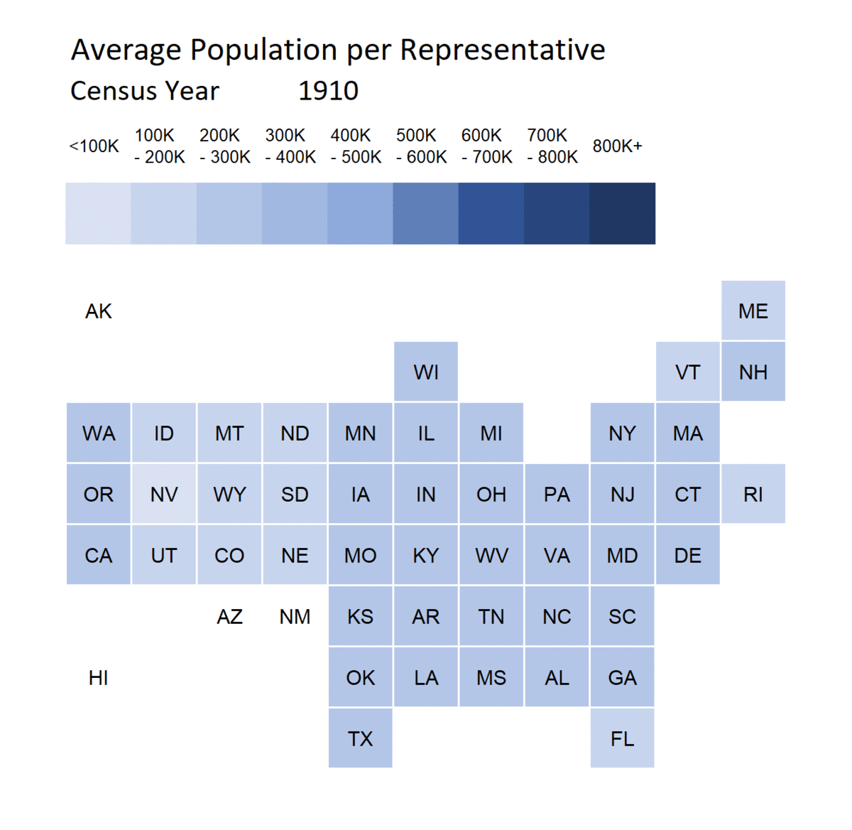
If you want to know more about tile grid maps, I have a whole post here: Meep’s Data Visualization Evolution: Tile Grid Maps
If you want a spreadsheet to play with that has that tile grid map in it (it has both a 5-color and 9-color version in there), you can get it at the substack version of this post. [scroll down – you’ll see it in situ]
Simple line graph for mortality trend
This is a very simple graph – just a line graph. It comes from my post Movember 2022: Men and Drug Overdoses (and Giving Tuesday!)

So why do I like this graph so much?
It’s not because of the trend, goodness knows.
But it’s because it really makes the point – drug overdoses have been on a bad mortality trend, and they jumped up a lot during the pandemic.
This graph was the first one where I really edited it specifically so it would jump out if you were looking at it on a phone. I usually read posts on a laptop, which is a different experience, but around this time, substack had come out with a native app, and I looked at my posts… and the graphs looked awful on mobile devices, especially my iPod touch (which isn’t made anymore).
I thickened the lines, removed gridlines, de-emphasized the axis labels — anything to make the trend pop. I made sure the drug ODs line was red and on top of the other two lines.
I edited that graph more than I edited the text around it.
I wanted it to stand out.
BOOM.
Anyway, that’s an Excel graph. Using the Society of Actuaries theme (thanks, SOA! It’s a great theme!)
Themes (and Templates)
One last thing, and I’ll go. I use a variety of themes in my spreadsheets to make my graphs look pretty.
I often use the Society of Actuaries theme. I got it by presenting at a conference many years ago – and I noticed what happened when I built graphs using default settings. “Ooooh, that looks nice,” I thought and investigated themes in Microsoft Office documents.
You can use themes in Word. You can use themes in Excel. In those, you can use only one theme per document. In Powerpoint, you can go theme-happy. It can get a bit nuts (I try to avoid crossing the themes.)
But I never use the Office default theme. That’s just ugly.
Back in Christmas 2021, I built some pretty themes from Blake R Mills’s MetBrewer project: Merry Christmas! Excel Gifts — Some Beautiful Themes from Great Art and Warnings on Errors
Here are videos on using the themes:
You can download them here:
https://www.dropbox.com/s/62ouurpl403edq9/Excel%20MetBrewer.zip?dl=0
If you don’t like the ones I put together, here’s how to make your own:
There’s more in the post which you can check out – Merry Christmas! Excel Gifts — Some Beautiful Themes from Great Art and Warnings on Errors – but those are the two main things if you’d like to play with themes.
Enjoy!
