Data Visualization: People and Books in 1946
by meep
Last month, my local library had its fundraising book sale, and I always manage to pick up some amazing finds. This title caught my eye, published in 1946:
I see People and Books, A Study of Reading and Book-Buying Habits is available at Amazon in used copy, and given who the intended audience was, I bet Link & Hopf had many copies made. This is what the back of the cover looks like:
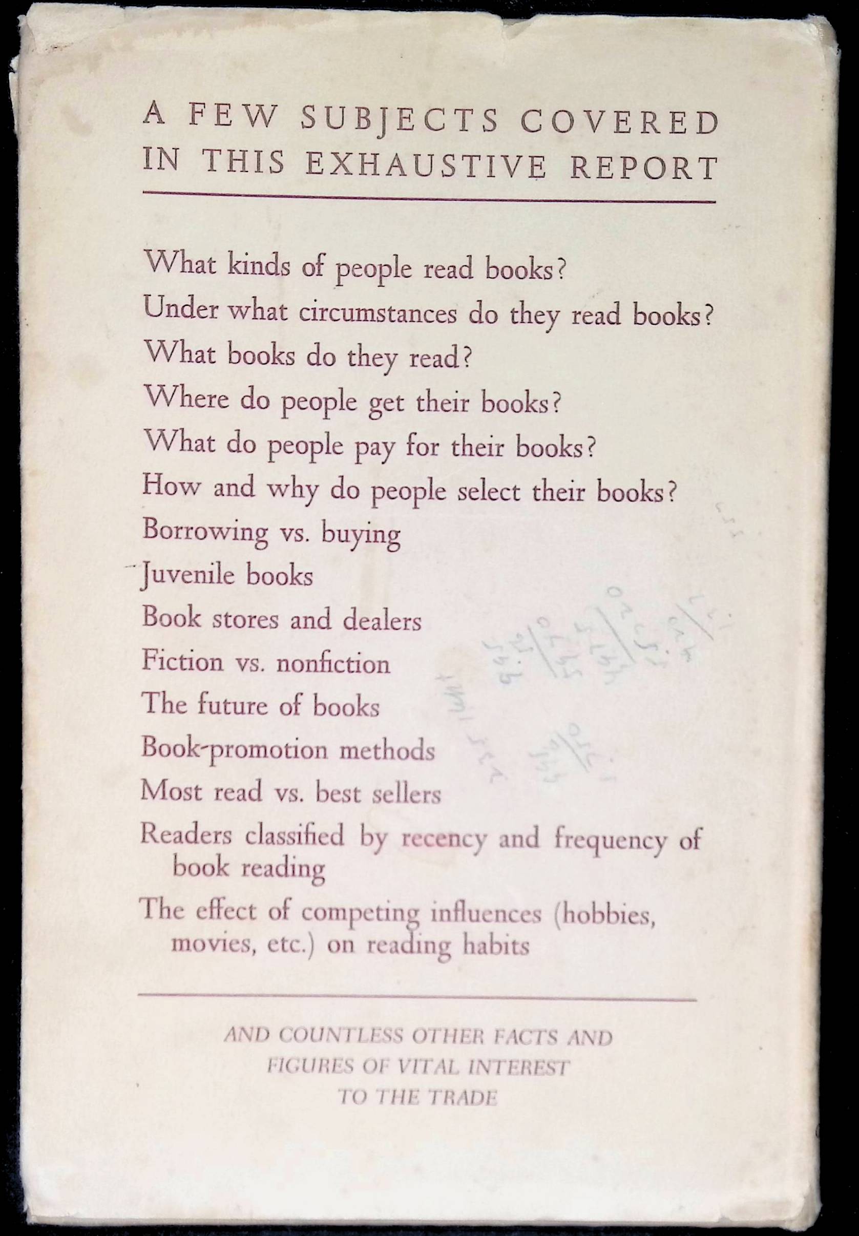
In short, they did market research for book publishers — and you better believe the publishers would be interested in this.
So why was I interested?
Data visualization in 1946 books
This.

I randomly opened the book and it fell on that page. I was all YES!
The short version is this: Link & Hopf did consumer surveys and interviews to figure out the current state of the reading market and tried to figure out the competing activities for readers’ time. What was likely to happen to future book-buying?
Note that this is right after the end of World War II, and this came up in the book. I will get to that later.
My interest was in the graphs: there were 6 color plates in the book. I knew these were expensive to produce, and I was curious as to what they chose to print in color.
This is a beautiful pie chart, by the way, for all that I hate pie charts:
Labels directly in the slices
Not too many slices
Good aesthetics in the arrangement of the slices, angle-wise
The slice your audience is most interested in, book reading, has a color emphasis with the black fill and the white text
One can “read” the result of this pie chart immediately: the slice your audience cares about the most is the smallest.
This is how to do a pie chart.
Importance in establishing credibility
This was the first one:

I found this an odd choice when I first saw it. Given how much it would cost to insert a color page into the book, why waste it on this?
But I think the point of this was to establish their credibility.
Hopf & Link surveyed a total of 4,000 adult consumers for their study, and they wanted to show how they selected their samples. This map comes from a whole methodology section concerning income levels, education levels, etc.
This particular area of Lancaster was used as an example of where they would go to find households of the lowest 30% income/education levels of the town. Part of the issue, they mentioned, was some of the disruption caused by WWII. They were using 1940 Census information, but by 1945, when they were doing surveys, many things had changed.
Defining the Readers: Active, Inactive, and Non-Reader
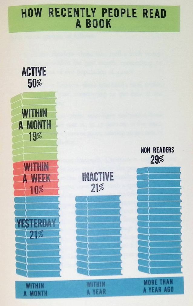
By “inactive” readers, they mean they read a book within the past year, but not within the past month.
By “non-readers”, they mean it had been more than a year since they read a book.
They decided that it was good enough that “active” readers read a book within the past month and not get pickier than that.
Now, I don’t really like the design of this graph, in terms of the use of color. I think it might confuse people a little.
One good thing: there is no axis marked here. The “data labels” do all the work here.
When everything had to be designed by hand, and more ink was more expensive, you didn’t put something on a graph if it didn’t add to the information. We’re so used to the “default” having axes and gridlines and a bunch of stuff graphs don’t actually need.
Readership by Education
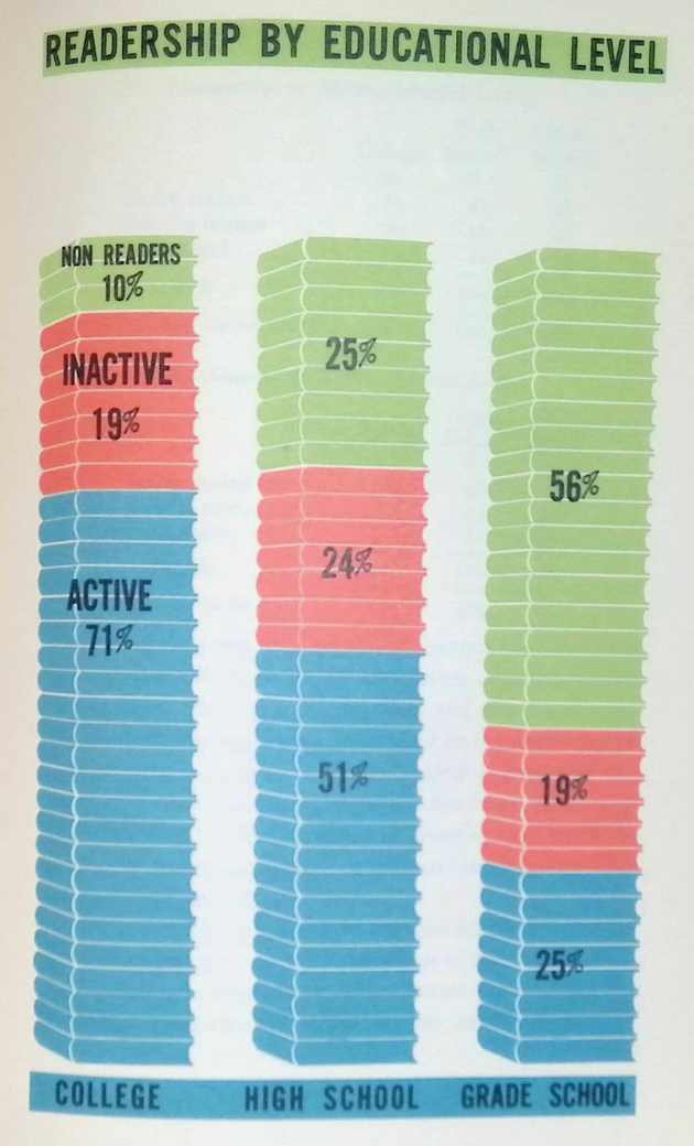
It would be interesting to compare these stats against now.
Remember — these are adults being surveyed. Now, they did stratified surveys, so they didn’t have samples that were representative of the U.S. population as a whole at the time. They had about equal number of surveys of what they considered upper-income, middle-income, and lower-income respondents, and the education breakout was what you’d expect-ish.
But college was even less likely back then than it is now. For the upper-income group, only 53% were college-educated; for middle-income, 26%; for lower-income, 9%.
Grade-school-only education levels (meaning, not high-school graduates) go the other way: high income: 10%, middle income: 24%, lower income: 52%.
I do like this graph design: consistent use of color, simple labeling, and very easy to “read”.
Note: no legends, no axes, no gridlines. None of that stuff is needed.
No, this design is not precise due to the use of “books” as the units in the stacked column graph. However, nobody cares. It doesn’t need to be precise. That’s not the point here.
Readership by Age

So you may think this looks weird, but you need to remember what it was like in 1946… and look above at the educational table and think.
My great-grandfather who was my maternal grandmother’s father dropped out of school around 4th grade to work on the family farm. He was illiterate. (He ended up marrying a schoolteacher, go figure. But he never learned to read.)
The U.S. had been transitioning from a more agricultural economy to a more industrial one. Education levels were much lower for prior generations — and the researchers noted that and checked that in their own crosstabs.
This was important for forecasting future book-buying public — they wanted to show that the book-reading habit wasn’t a function of age so much as one of education. The reason the seniors in their sample were less likely to be active readers as they had much lower education levels than young adults at the time. Many of them had grade school-only educations, like my great-granddad.
Again, I know there are precision problems here in graphing, but that’s not the point of these graphs.
One can “read” the trend easily. The main problem is that it’s misleading because the driver is really education and not age.
Hobbyists and their books

Just a non-graph interlude. Most of the survey data in this book are presented as above – textual tables.
(I picked this one, just because I thought it was interesting that they considered hobby books as a possible growth area.)
This book is 166 pages long, with tables like this on many of the pages. There are loads of survey results and a discussion of their meanings.
The thing is this: it was expensive to print color graphs. Only 6 were chosen. I’ve shown you 5 so far.
How readers obtained books
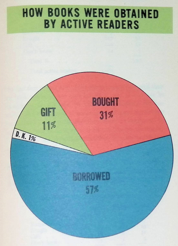
So true. I am a book super-user, as it were… but the bulk of the books I read are borrowed from the Westchester County libraries.
Obviously, if you’re a publisher, you’re concerned about how many of your books are going to be bought by individuals versus libraries.
Conclusions for Book Trends (1946)
The whole point of this consumer survey was to try to figure out where the post-WWII book market was going.
I pulled out two bits, because one was somewhat getting at an issue:

Oh, I didn’t mention they also surveyed booksellers. But there were no cool graphs for them. Their ultimate conclusion was that there might be a short-term drop-off in book sales with the end of the war, but they forecast ultimate growth (and yes, it surely did.)
But this one flabbergasted me:
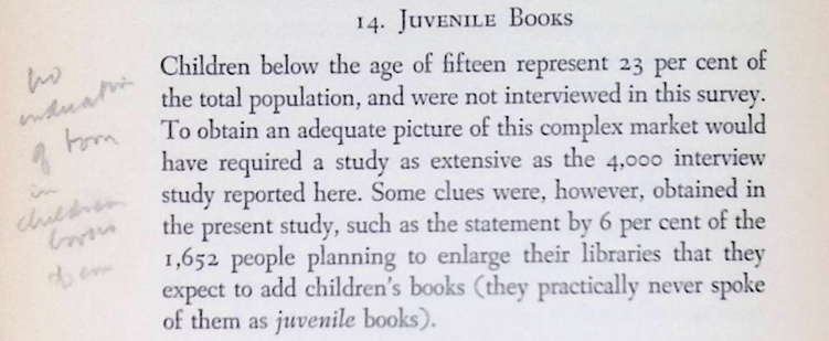
Because, of course, the “juvenile book” market is huge. If anything, publishers can make more from children’s books as they can keep selling the same book to a new crop of kids every year.
In hindsight, we know there was a Baby Boom about to give a huge rising tide to children’s book publishers over decades – well into my smaller generation.
(I’m not sure what that penciled comment says… “no estimation of form in children’s books of course”? Ah, the mysteries that come from library sales.)
Well, this was the age before Scholastic Book sales, to be sure.
Lessons from Old DataViz
Just as Tufte likes to rail about Powerpoint and its default style on slides (I start with empty slides, myself), too many people take the default options on graphs, no matter the data visualization system (but mostly Excel).
Back in 1946, these charts had to be hand-designed. Yes, they had drafting tools, templates, and those sorts of things. They weren’t drawn free-hand.
Every element was consciously chosen because somebody was going to have to draw or color it in. They didn’t put in things they didn’t need. Like legends, axes, leader lines, gridlines, and more.
They were careful in choosing which charts to put in full color.
But mostly, they made sure things weren’t too complex and could be “read”.
With current technology, it’s too easy to generate a hot mess by default.
Don’t do that.
Check out old, simple graphs for examples of what to do right.
Related Posts
Geeking Out: Florence Nightingale, Data Visualization Pioneer - and Redoing Her Famous Graph
Sunday Sumo: Some Winning Moves on the Middle Day
Geeking Out: House of Representatives Apportionment Visualization 1910-2010
