Numerical Interlude: Linguistic Diversity in the U.S.
by meep
Yes, I will get to a Public Pension Math Primer… eventually. I just want to have a little fun, and explain how I like to work.
But let’s jump right into it and look at a graph:

What is this, you may wonder? Well, this comes from a map I recently saw on Slate
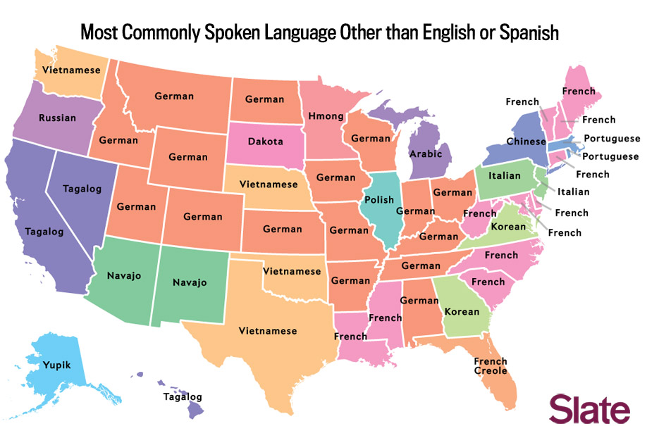
Now, I had seen the original map without an explanation of how he created this one, but I’m still unhappy with how he built his map. Ben Blatt links to this file as his ‘raw data’ — but I have an issue with this. Those data are old! To be sure, it’s not like language use is a quick-moving statistic, but I enjoy looking at the most recent data, even if there are some deficiencies.
Whenever I want the most recent data released by the U.S. Census Bureau, I go here: The American FactFinder and I go to the Advanced Search.
What’s nice is that many/most of the Census data sets that are already summarized have a table identifier. I pulled this table: B16001: LANGUAGE SPOKEN AT HOME BY ABILITY TO SPEAK ENGLISH FOR THE POPULATION 5 YEARS AND OVER – Universe: Population 5 years and over
I got it for the 1-year estimates from the ACS (American Community Survey), for 2012 (the most recently available year). Notes: only 40 states and Washington D.C. were covered by this table. So I don’t have the “full” data that Ben Blatt used. But it looks like that in this table, unlike Blatt’s data, there already was a combination of related languages (such as Chinese vs. Mandarin — all folded into Chinese).
Anyway, you can go to the FactFinder yourself to get the table (and get it for different years and different periods — the 1-year estimates are going to vary a lot more from year-to-year than the 3-year estimates.) Or you can just check out the Google Spreadsheet containing my raw data and calculations — if you go to the “Notes” tab, you will see links to the original data source as well as some other notes that may help.
Now, it wasn’t just my displeasure with Blatt’s data set that annoyed me — it’s that the map made no indication how prevalent was the use of these non-English/Spanish languages. And even if Spanish is the most often non-English language spoken, you still don’t know how prevalent it is. Thus my bar graph at the top.
Now, even with only 41 entities, it’s difficult to really look at them, so here are the top ten states for language diversity:

A little bit on what I did here: I exaggerated the vertical scale by starting it at 50% — in every state, at least 50% of the over-age-5 population speak only English. California has the lowest percentage of English-only speakers at 55%. But this gives you an idea of how dominant Spanish is (or isn’t) in these states. Unsurprisingly (to me), there is a lot of language diversity in NY and NJ that doesn’t have as much to do with Spanish use as having a wide variety of languages spoken, especially Asian ones.
(I don’t want to get into this side discussion, but if you want to know what I used to measure diversity, it was the Herfindahl index, which is often used to check for monopolies in markets.
I have no political point to make with these graphs. I just thought it was interesting to look at, especially since it ties in with research I did recently for my day job. For example, while there is a high percentage of Spanish speakers in many states, many of them also speak English fluently. This is not as true as those who speak Asian languages…. and the reason is not that the Spanish speakers are better, or anything like that, but that many of the Spanish-speakers have been in the U.S. for far longer than the Asian language speakers. There has been a wave of Asian immigration to the U.S., but it has really picked up in the past decade, unlike Hispanic immigration, which has had a really strong flow for 50+ years.
While Mexico is the predominant source of immigrants “in force”, as it were, new (legal) immigrants to the U.S. are more overwhelmingly coming from Asia. More and more of the U.S. Hispanic population is a native born population, while the Asian population is still more heavily immigrant. Just thought that was an interesting pattern.
Finally, a map that I’m not sure will work well. I have a fairly ugly Excel spreadsheet behind this one, but figured it would be worth trying out.
For those states I’m missing, I have forced them all into “0%” for everything and will be the lightest-colored states. FWIW, I’m sure their percentage of English-only speakers is probably very high.
First, by percentage of those who only speak English:

Second, those who speak Spanish at home (and may or may not speak English) — highest percentage there is about 30% in Texas:

Finally, those who speak a non-English/Spanish language:

If Hawaii were on this map, it would have the highest percentage, at 9%. As it is, the highest percentage is 3%, in New Mexico, for Navaho.
All of a sudden, the linguistic diversity doesn’t sound all that diverse, does it?
Related Posts
Labor force participation rates, part 3: Older folks (55 and up)
Labor force participation rates, part 2: Younger Years (under 25) - Bad news?
English Grad Students and Adjuncts: If You Don't Have Options, You Have No Leverage
