Mortality Monday: How Many People Will Die in the U.S. in 2017?
by meep
Or, rather, how many will die between July 2016 and July 2017? In the U.S.?
Approximately.
Let’s build up this estimate.
ESTIMATED MORTALITY RATES: CALENDAR YEAR 2020
To begin with, I will use the Social Security projected calendar year mortality table for 2020 (The report with the technical details is here.)
That study was originally published in 2005, so the actual mortality trends will be different. I prefer using 2020 as my calendar base, rather than blending it with 2010, because this is just a blog.
I’m going to do only so much work, ya know.
This is what death rates look like by age and sex, based on this table:
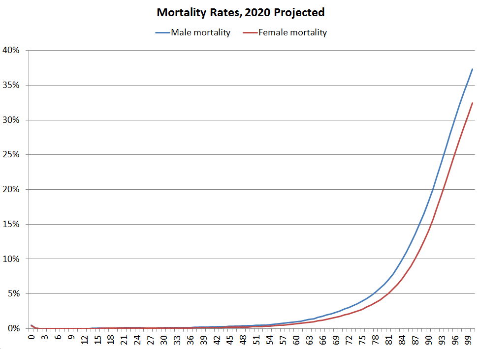
I’m not going to focus in on the “stupid period” I like to point out, but obviously, in general, mortality rates really take off in the 70s. These rates represent the probability of dying in the next year.
I cut off the mortality table above age 100 – it just keeps going up until near 100% – but you will see very few people of those ages dying… because there are few people that even make it to those ages.
POPULATION ESTIMATES: JULY 2016
I will be using the U.S. Census projections by age and sex for July 2016. I am using projections released in 2014.
Here’s a graph:

I didn’t feel like doing the “pyramid” graph a lot of people do (mainly because it won’t add much to the final presentation… because I didn’t feel like talking about male v. female longevity for this post. I’ll do it another time.)
Some features to point out:
- Note the drop in numbers from age 69 vs age 70 for July 2016
- Also age 73 versus 74
- Peak population is at age 25/26
- Local maximum at age 56
Some of this is due to combined effect of births/immigration/and death rates (why the local maximum is at 56 instead of a slightly higher age). The drop offs with the age 69 v. 70 and 73 v. 74 have everything to do with the end and the begin of WWII, not mortality rates.
At higher ages, though, it’s death rates, not births, that dominate the age structure of the population.
COMBINE FOR FINAL ESTIMATION
So you have an odd age structure for the population, with steadliy increasing mortality for adults (ignoring infant mortality).
Here’s the final death projection:

So notice the “weird” spike of deaths at age 69 and 73 — that comes from the age distribution disparities we saw earlier.
The overall total death peak occurs at age 86, the same for men and overall, but the peak age for deaths for women is 88/89. Using these estimates, you get the same number of infant deaths as deaths of people around age 53.
Also, an estimated 2.9 million people are dead (from July 2016 – July 2017), or about 0.9% of the population dies within that period.
Anyway, something to think about on a Monday.
Enjoy!
Related Posts
Mortality with Meep: Were COVID Deaths Grossly Overcounted?
COVID News Round-up: Suicides, Increasing Deaths, Duty to Die, and Dolly Parton
A Tale of Know Your Data: The Mystery of the Excess Connecticut Summer Deaths
