Taxing Tuesday: What's the Real Tax Rate?
by meep
There was a piece out in the NYT about the supposed historical trend of all taxes paid by people at various income levels.
It was an excerpt from a new book, but as with Piketty’s big book, I have no intention of getting the book or reading it. I just want their “data”.
I’m not linking to the NYT piece, but I will link to the Actuarial Outpost thread on it.
Because I just want to grab this:
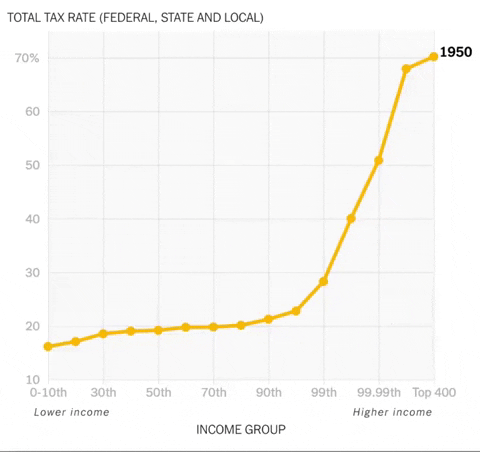
You see that 1950 spike? That the highest income folks were supposedly paying 70% of their income out in taxes?
Bullshit.
This is the claim:
They have constructed a historical database that tracks the tax payments of households at different points along the income spectrum going back to 1913, when the federal income tax began.
I have a story, from my college days, with regards to constructed data.
TURTLES ALL THE WAY DOWN
When I was in college [back in 1992 or 1993], I joined a math modeling seminar, where we thought we’d be looking at different models, yadda yadda. What we really did was help the professor put together a rebuttal against a paper that had been presented to CITES.
The paper was by a team of Cuban and Japanese scientists/mathematicians, who were promoting a sea turtle population model, to make the argument that they should be allowed to start a sea turtle fishery off the the coast of Cuba.
[The prof told us not to worry too much about the importance of the paper we were putting together — he said that the decision had already been made, it’s totally political, but it would be nice if our paper did support the decision already made. I learned a lot from this project, and institutional politics like this was one of the lessons.]
One of the biggest sticking points of the model was to have any reliable data of sea turtle population, in terms of age, sex, and count.
If I remember correctly, the data they actually had was of turtle count & size of turtles. I didn’t get to see that data (that was one warning sign).
They said they had fitted their model, so that one could infer the age of turtle by its size. I thought that meant they had tagged some turtles, measured their size over a number of years, and then figured out their growth curves.
Nope. That’s not what they did.
There was a table in an appendix of supposed “data” of the turtle populations, which was just a table of numbers. I decided to graph the “data”, and realized that it was a bit too smooth in pattern to be raw data. I took the formulaic model they had… and it fit perfectly. Their “data” was just the output of their model. Oh, and the model hadn’t been fit to much of anything. I dug into their sources, found they had used a fish growth model (which, in case you weren’t aware, is not appropriate for reptile growth, aquatic or not.)
Once I realized all their “data” were simply things that were produced by models they created, I found that sort of behavior all over the paper.
One thing I’ve always been on the lookout for is lack of raw data. Even when it’s not so blatant as to present data that is simply model output, usually you get some form of “massaged” data, if you get any data at all. When people transform data to make it “usable”, too often they transform it using assumptions that are actually the results they want to show.
Then there’s the case of changing definitions of various portions of the data, as well as stitching together data from different sources.
The bizarre (to me) taxation levels of the 1950s are a case in point: I do not believe they are using a constant definition of “income”. I doubt that the top people by income were really paying 70% of their gross income to taxes. 70% after all the exemptions, deductions, etc. in the old tax code? Sure. It was written that way.
But if the definition of income changes over time, there’s not much comparability here.
REAL NUMBERS: NOT TO BE HAD
Tax Foundation makes a graph based off federal income tax stats:

Here is some detail of why this graph does not match the animation above:
There are obviously several large differences between this IRS data and the new data being debated, which comes from a new book by economists Emmanuel Saez and Gabriel Zucman.
First, the IRS only considers the federal individual income tax. The data currently being discussed includes not just the federal individual income tax, but all federal, state, and local taxes. Some of these taxes, such as the corporate tax, are more progressive than the income tax. Other taxes, such as sales and excise taxes, are less progressive.
Second, the IRS data uses adjusted gross income as the income measurement. AGI is a rather narrow income measure that leaves out important sources of income for taxpayers at the bottom of the distribution, such as transfer payments, and for taxpayers at the top of the distribution, such as unrealized capital income.
And finally, the 2017 data does not account for changes made by the new tax law passed at the end of 2017, the Tax Cuts and Jobs Act. Data for 2018 will likely show a drop in average taxes rates across all income levels, but a somewhat larger drop for the highest-income earners.
Except those being bitten by the SALT cap, of course.
There are many things to question in the data created for the book, including their definition of income and whether it includes transfer payments (Social Security payments included? Welfare benefits? EITC?)
But the biggest question I have is the source of the “total tax” number. One can have a well-defined data set, such as federal individual income tax. But if you look at, say, corporate income taxes, which specific people do you allocate those taxes to? All stockholders pro-rata? And how do you appropriately distribute that among income levels?
My big question relates to finding all the non-federal income taxes. Not all state and local taxes are in federal tax returns, for instance. I doubt itemization has remained level throughout income tax history… and SALT itemization definitely isn’t uniform across the states.
I do not have the time… and I don’t even know if their raw, non-transformed data are available. I am not paid to dig through somebody else’s research.
I will just say that if you’re trying to tell me that the 1% paid 70% of their “income” out in taxes back in ye Golden Era, you need to do a lot of work to convince me of that.
NEW JERSEY PUMPKIN TAX POLICE
And now for something completely different:
Pumpkins used for decoration are subject to Sales Tax.
— NJ Div of Taxation (@nj_taxation) October 15, 2019
Pumpkins used for food or in food preparation are tax free. pic.twitter.com/bZzyAVsQb1
You’d better not be taking food pumpkins and decorating them!
YOU TAX CHEAT
Some people did not agree.
Do they tax the lettuce I buy but never eat?
— Shy the Warrenista Witch (@Aztec4Life13) October 16, 2019
— (@OcnadPawnbroker) October 17, 2019
What is, Taxation is theft
— Robert B (@PatriotBeez) October 17, 2019
NJ will only use this to attack family farms and supermarkets.
— Random Guy (@NNJ_Taxman) October 17, 2019
But if u feel guilty Murphy would love it if you completed line 50 on your NJ 1040 pic.twitter.com/TZeN7kX26j
Always the State.
— Random Guy (@NNJ_Taxman) October 17, 2019
Dont make me work think here.
I'm gonna get helicoptered because Ill explain NJ's position and ppl will read it as Im advocating for the tax.
Im not going there.
Yeah, I do some work thinking for free, but to explain something I really dislike?
Pay me.
Now I need to know if the pumpkin tax was incorporated in the book data.
TAX STORIES
- CRA combating underground economy with Home Depot purchase records – basically, coming after the cash businesses for not paying taxes
- Shut up, you unbelievable Connecticut crybabies – I don’t know why the writer says “unbelievable”
- Tax Foundation: Repealing the Federal Tax Exemption for Credit Unions
- Chicago Tribune: Mayor Lori Lightfoot proposes tripling ride-share tax on solo rides in or out of downtown Chicago
- Chicago City Wire: Chicago City Council’s Progressive Caucus Tax proposals would set us back over 100 years, financial expert says
- Daily Wire: Beto O’Rourke Admits He’ll Take Tax Exempt Status Away From Mosques, Historically Black Colleges
- WSJ: Nations Press Ahead to Coordinate Corporate Taxes
- Chicago Magazine: Could Chicago Stomach a City Income Tax?
- Kausfiles: What’s More Important Than Progressive Taxes?
- Survey Shows Significant Support For Graduated Income Tax in Illinois
- Illinois Governor Signs Tax Law to Attract New IT Investment
- PROGRESSIVE INCOME TAX UNCERTAINTY LIKELY TO PUT BRAKES ON ILLINOIS’ WEAK HOUSING RECOVERY
- Chicago residents don’t want to raise property taxes to balance the budget, city survey says
- Tax breaks for seniors could widen gap between CT’s rich and poor
- Brad Weisenstein: Illinois is shrinking as taxes drive a mass exodus
Huzzah.
TAXING TWEETS
This slide appears to show Saez's breakdown. I'm skeptical of their stats for top 400 for reasons associated with how they misuse the Forbes list elsewhere, but set that aside & state/local regressivity is almost all sales tax & smaller than the progressive categories. pic.twitter.com/qky01NU2Ld
— Phil Magness (@PhilWMagness) October 7, 2019
Correct. The Piketty-Saez-Zucman denominators are all screwed up. This problem becomes even worse for all years prior to 1962. https://t.co/I7zicxEAWC
— Phil Magness (@PhilWMagness) October 7, 2019
For, say, the top 1%, the tax rate is total taxes paid by the top 1% divided by national income earned by the top 1%. If the denominator overstated the income received by the top 1% (it does), the estimated tax rate will be lower than it really is
— Scott Winship (@swinshi) October 7, 2019
Democrats continue to push for $620 billion tax cut – of which
— Brian Riedl (@Brian_Riedl) October 22, 2019
—96% would go to the richest 20% of earners,
—56% would go to the richest 1%.
It turns out that wealthy families vote blue, and — campaign rhetoric aside — elected Dems cater to them.https://t.co/S152dfa87L
(He’s referring to the SALT cap)
California Craziness 1/2:
— steve hilton (@SteveHiltonx) October 22, 2019
- they massively increase the gas tax
- they clamp down on local production (so now we have to import from SAUDI ARABIA)
- and then they launch an investigation into why gas prices are so high
https://t.co/T1WBSwCpse
Abhijit Banerjee, one of this year’s econ memorial Nobel prize winners, says you spur demand in the economy by raising taxes, not cutting them: “You are giving incentives to the rich who are already sitting on tons of cash.” https://t.co/VhyMtydhRR
— Catherine Rampell (@crampell) October 22, 2019
Well, it definitely leads to rich folks paying for the services of people like me. Thanks!
Sorry
amyklobuchar</a>, but Elizabeth Warren is not handing out “free stuff.” That is a Republican talking point. She is going to tax the greatest fortunes in America, those who are worth over $50 million, to pay for the bulk of her plans. <a href="https://twitter.com/hashtag/TwoCentWealthTax?src=hash&ref_src=twsrc%5Etfw">#TwoCentWealthTax</a> <a href="https://twitter.com/hashtag/Warren2020?src=hash&ref_src=twsrc%5Etfw">#Warren2020</a></p>— Ryan Knight (ProudResister) October 22, 2019
Pretty sure that’s not enough money.
NEWS: Elizabeth Warren has now completely allocated the $2.75 trillion in expected revenue from proposed wealth tax.
— Josh Jamerson (@joshjame) October 21, 2019
—$1.25T: higher ed (tuition-free college, debt cancelation, more)
—$700B: universal childcare
—$800B: k-12 education, announced today https://t.co/NGSzLwRsRR
To make room under the wealth tax for the $800B k-12 plan out today, Warren had to find alternative revenue for three plans previously covered by the wealth tax ($100B opioids, $7B small business, $20B on election security).https://t.co/NGSzLwRsRR
— Josh Jamerson (@joshjame) October 21, 2019
So Warren’s entire wealth tax is being spent on children/education, from infancy through college https://t.co/0DFrD4YOHQ
— Molly Hensley-Clancy (@mollyhc) October 21, 2019
Um. The wealth tax is unconstitutional. https://t.co/cqMp7LnAUh
— RBe (@RBPundit) October 21, 2019
Picky picky.
How much should we tax the rich? Economists have advised Sens. Elizabeth and Bernie Sanders that 60% is the ideal rate. https://t.co/ipGX1jSmZI pic.twitter.com/Z64TFR5PZN
— CNBC (@CNBC) October 22, 2019
You first.
H. Now Gavin and his cabal want to start stealing the gas tax that was supposed to go for road improvements to fund rail.https://t.co/CrzxIuOGLd
I. So you tell usGavinNewsom</a> why the gas tax is so high. The answer? Democrats.<br><br>5/5 End</p>— I Hate The Media (ihatethemedia) October 22, 2019
Asking Warren how she’s going to pay for her healthcare plan is a "gotcha" question?! My gosh.
— Matt Whitlock (@mattdizwhitlock) October 16, 2019
She’s standing next to Bernie (who wrote the bill she supports) who openly ADMITS it will raise taxes, but pressing Warren to admit that is "bait." https://t.co/6B4svjdi5m pic.twitter.com/BatQhlda3Z
Related Posts
Taxing Tuesday: The French People are Revolting (UPDATED)
Public Finance: Full Accrual Accounting and Governmental Accounting Standards Board Testimony
Puerto Rico Quick-take: You Found How Much Just Lying Around?
