Mortality Basics with Meep: Median, Mode, and Mean Age at Death and Life Expectancy
by meep
I am writing this in response to something incredibly stupid.
Dear lord, this is so incredibly stupid (and yes, I know
mattyglesias</a> is making fun of Tucker, but if he's not doing that... it's still stupid)<br><br>yes, I'm writing about a blog post about this.<br><br>Just some basic info about life expectancy vs. mean, median, and mode age of death <a href="https://t.co/Gihh8fPKbO">https://t.co/Gihh8fPKbO</a></p>— Mary Pat Campbell (meepbobeep) July 7, 2021
What follows will not be about COVID deaths at all, but just about comparing median age at death, modal age at death (that is, the age when most people die in a given year), mean age at death (aka, average age of everybody who died), and life expectancy.
All four numbers are usually different, and some are very different.
First important note: calendar year not cohort
When we make these comparisons, at least in the media, it’s based on calendar year experience.
It has nothing to do with cohort, that is following the people born in a specific year. If you want to do retirement planning for yourself, you want to consider cohort, not calendar, mortality for projections.
So for all of the following, I will be using calendar year 2019 experience for the U.S.
I will be looking at whole-number age (no rounding, so Age Last Birthday) for all the stats, because it makes it really easy to do the calculations. I could do something more complicated, like assuming uniform distribution of deaths in a year, but for this demonstration, it’s not as important.
Age at death distribution for 2019
I pulled this information from WONDER at CDC, which has a full year of 2019 data.
Of the 2,854,838 deaths in 2019, we don’t have the ages of 147 of them. I will just ignore those 147 deaths.
There are also 30,731 deaths at age 100+, and I will treat those as having died at age 100. You will soon see that it won’t make a big difference.
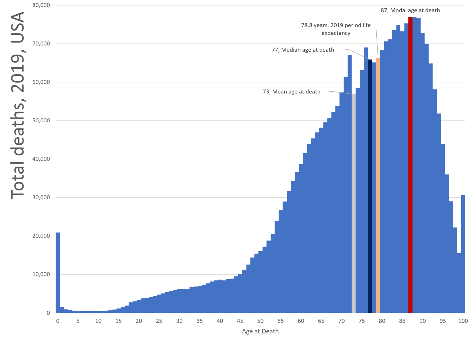
Here is a graph of the deaths for 2019, with key ages labeled. I will explain what they mean below.

Modal age at death: 87 years old
This one is the easiest to determine just looking at the graph: at what age is the largest number of deaths?
Age 87 just barely edges out age 88 for the mode. There were 76,921 deaths at age 87 in 2019, and 76,891 deaths at age 88.
Obviously, as people get older, the mortality rate gets higher. But, as people die off, there are fewer and fewer people at that age to be hit with that high mortality rate. After the mode, the number of deaths falls off precipitously.
Median age at death: 77 years old
This is where 50% of the deaths are higher and lower than this age.
This measure is pretty stable (as we shall soon see), in that an uptick in infant mortality or very old age mortality will not have a large effect on this measure. However, it really isn’t very meaningful… nor is the modal age at death. Same for the next measure.
Mean age at death: 73 years old
The mean age of death is the average age of death over all people who died in 2019. This measure can get pushed or pulled around by early deaths or late deaths. It might be a little higher if I had the full distribution of deaths over age 100, but it wouldn’t move all that much.
But like median and modal ages for death in 2019, the mean age of death tells us little about mortality trends.
The reason that these three measures aren’t very meaningful for considering mortality trends is that they’re all dependent on the number of deaths in a particular age bin in that year.
The number of deaths in each age bin is dependent on the mortality rate for that age and the number of people alive in that bin to begin with. If you have a lot of people in certain age bins compared to others — say a baby boom followed by a baby bust and then a boom again — that will have an effect on the death distribution, even if the mortality rates don’t change. And of course, the mortality rates have changed over time.
The effect of birth patterns: death spikes
There are two “weird” spikes in the data — the first at age 72, where the number of deaths drops by a lot for age 73 in comparison. What’s up with that?
It’s not because those age 73 have a lower mortality rate than those age 72 — the mortality rate at age 73 is 15% than that at age 72.
But there were 27% fewer people age 73 than age 72 in 2019. Let’s figure out when they were born…. 1946 and 1947.

Notice the two spikes — births dropped at the very beginning of WWII, and then there was a big one-year boom in 1947 (not 1946, actually). The reasoning is very simple: the men went away. The women didn’t have babies. When the men came back… there was some pent-up demand, which spiked in 1947 and then fell back.
By the way, note that fertility rates didn’t peak until the late 1950s.
Immigration didn’t have much of an effect on the age structure of the population, as other nations were similarly affected.
Life expectancy: 78.8 years old
From the CDC press release in December 2020:
As a result, life expectancy at birth for the U.S. population increased 0.1 year from 2018 to 78.8 years in 2019.
As I’ve mentioned many times before, there is some meaning to tracking the period life expectancy from birth, even if it has little meaning to the person planning their retirement.
Nerdy explanation: Mortality with Meep: Cohort vs. Period Mortality Tables
Quick explanation: Mortality with Meep: U.S. Life Expectancy Fell 2.4% in 2020, and Death Rates Increased 16.1%
Note that the life expectancy calculation is not dependent on the age structure of the population at all. It’s just an expected value using the mortality rate from each age bin from that year. Age distribution has no effect on this measure.
Similarly, age-adjusted mortality rates are not affected by the age distribution, because one forces the age distribution to be a certain way to do your weighted average.
Comparison against 1999
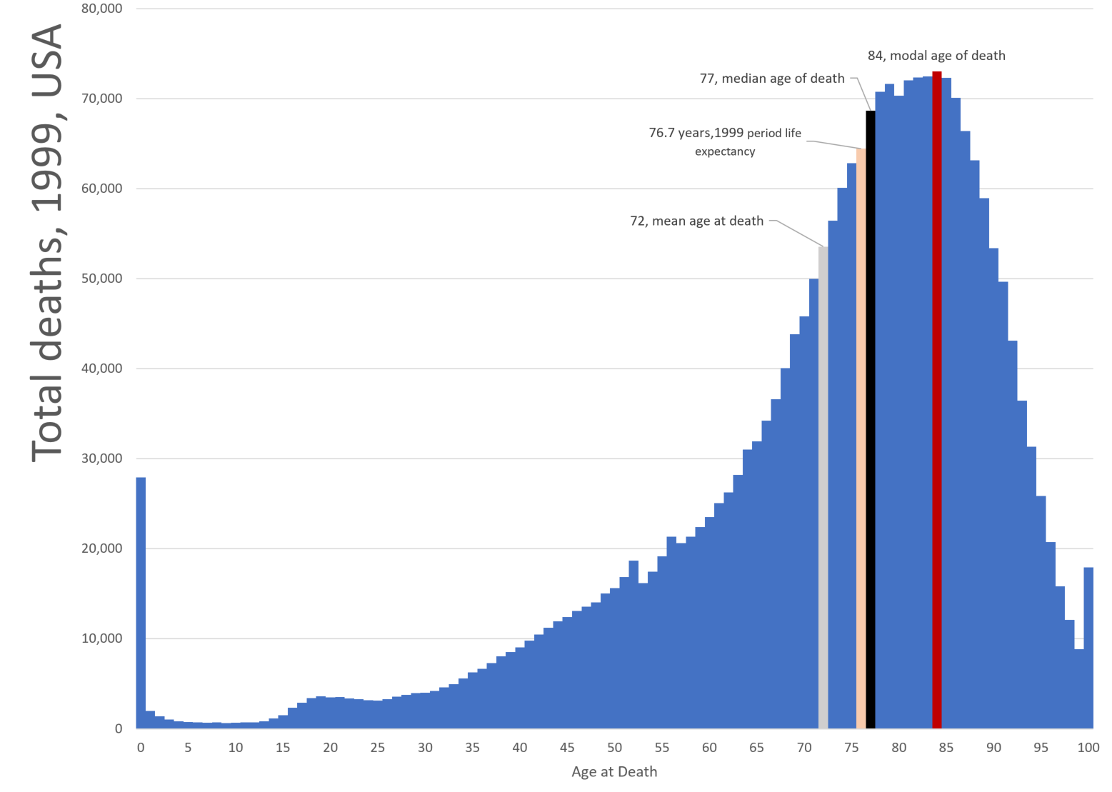
I thought you’d find it interesting to see what the death distribution looked like 20 years before:

mode: 84
median: 77
mean: 72
life expectancy: 76.7
(and those two weird spikes are 20 years earlier)
Note: 1999 median & 2019 median are the same. As I said, the median may not move around a lot, though many things about the death distribution are changing.
Mean moved up 1 year, mode moved up 3 years, and life expectancy moved up 2 years.
So what does this mean for COVID deaths?
Well, what did the median death age and life expectancy differences tell us in 2019?
Not much, not really. The median depends on the age distribution of the living population in addition to mortality rates. Life expectancy is driven by mortality rates by age alone.
But seriously, comparing life expectancy against the mean, median, or mode tells you very little.
I’m also very suspicious that the stats quoted on Tucker Carlson’s show are right at all (yes, life expectancy dropped, but I don’t think life expectancy in Ohio is that low).
Yes, COVID primarily killed old folks. There was excess mortality for younger folks that was driven by non-COVID causes (which I’ll be getting back to soon — stuff like car accidents and drug overdoses).
I can make that argument based directly on increases in deaths for those age ranges, and comparing against official COVID deaths.
I don’t need to use two entirely different and non-comparable death statistics.
I know Tucker is gonna Tucker, but this is really stupid.
Related Posts
Mortality Monday: Chicago Shootings
Spanish flu v. COVID-19: Comparing the Numbers and Forgetting the Lessons
U.S. COVID Mortality: Winter is Coming
