Movember 2022: Prostate Cancer - Geography and Race/Ethnicity
by meep
Here’s my last Movember-related post before I get back to “regular” death.
Movember Fundraiser
First, here are the places you can donate to the Movember Foundation, which supports men’s health, specifically focusing on prostate cancer, testicular cancer, and men’s mental health:
- Mary Pat Campbell’s MoSpace – a place to donate at Movember itself
- My Movember facebook fundraiser – my officially linked fundraiser, if this works better for you
Yes, November itself is over right now, but the fundraiser is up for a little while longer (and they’ll surely take your money… heh).
As I write this, I’m only $41 away from my fundraising target. Come on, make meep happy! You want me to be happy, right?
Well, if you don’t want me to be happy, I’ve got some stuff to keep me happy:
Things that bring me joy
— Mary Pat Campbell (@meepbobeep) December 1, 2022
10. Information Graphic Visionaries books — and inserts! and historical info graphics!
AWESOME STUFF!https://t.co/0mhxGlrD49 pic.twitter.com/EXj0JTJdfz
A tale of two prostate cancer geographic trends
I decided to see if I could find any notable patterns in age-adjusted death trends in prostate cancer, geographically, and something nagged at me:
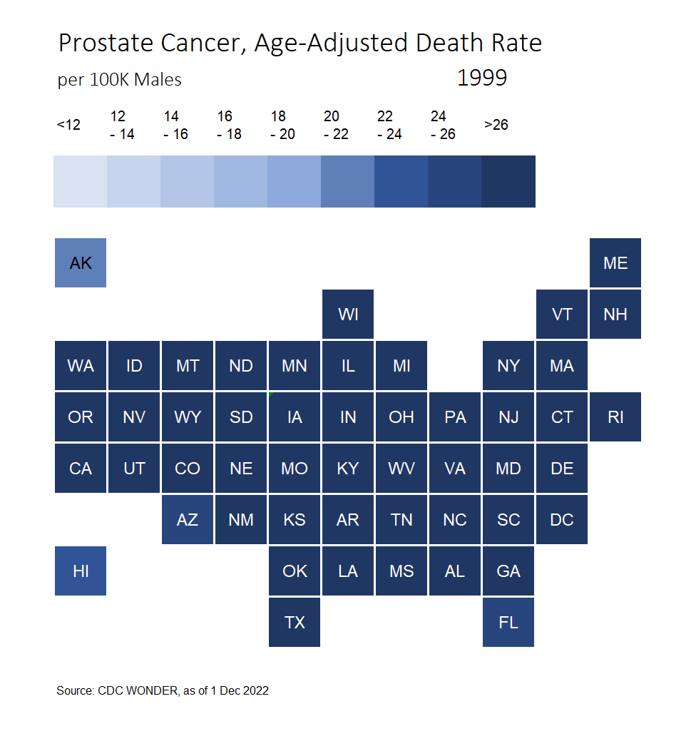
In particular, any time I see DC sticking out, along with some southeastern states, I’m going to assume this trend may actually be about race, and not much else. The reason I say that the states (plus DC) that had persistently high prostate cancer death rates also have very high percentages of their populations as black compared to the overall U.S. Perhaps this is simply reflecting a very large racial gap in prostate cancer mortality.
So I mapped out the same trend, but only for non-Hispanic white men:

(By the way, when you see word pop up in place of DC or AK, or any small state, that is simply the word “Suppressed” or “Unreliable” — in short, too few deaths to reliably calculate a rate.)
Now, there are some interesting patterns going on here, and in particular out west. It may be that men in the rural, mountainous west of Idaho and Montana are having a difficult time getting screened and treated. But once we focus solely on white men, the higher-than-average death rates of the southeast disappear.
The racial gap in prostate cancer mortality
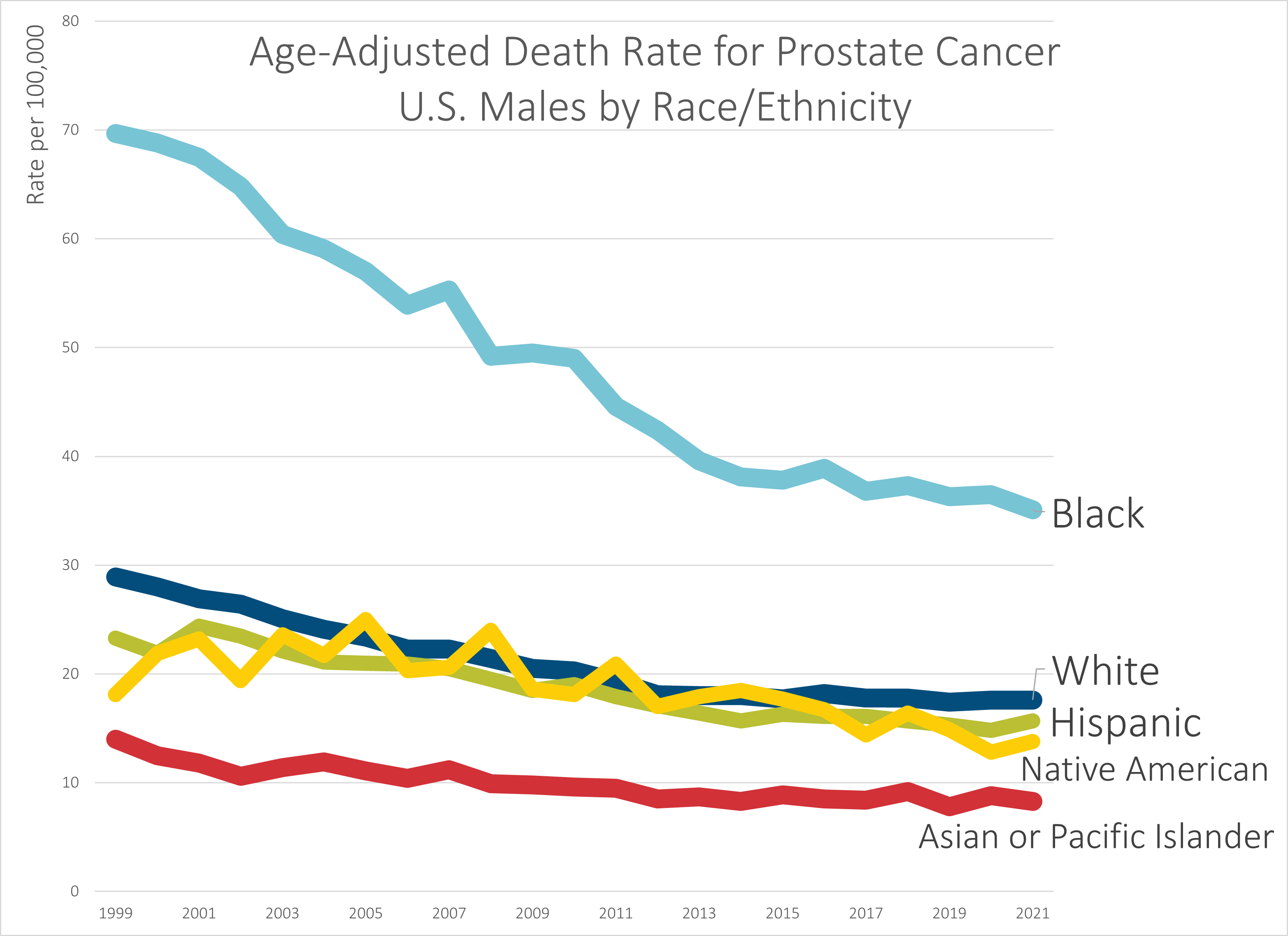
Here is the headline news on prostate cancer: black men have much higher death rates than all other groups.
That said, let’s do some comparisons of improvements in death rates.
From 1999-2021, prostate cancer age-adjusted death rates for U.S. males have dropped the following amounts by group:
- Black – 50%
- White – 39%
- Hispanic – 33%
- Native American – 24%
- Asian or Pacific Islander – 41%
So, the good news is the gap has been narrowing, as wide as it has been. While they’ve all been decreasing in trend, Black men have seen a more rapidly decreasing rate. I hope that continues (and I think that the recommendation on prostate cancer screening should be reconsidered to improve this for all the groups).
But the main news is that I believe the biggest driver in the difference between states’ rates has been the racial/ethnic mix in those states more than anything else.
As I noted on Twitter, not everybody is as familiar with how disparate the states are in their racial/ethnic mixes as I am, so it may help to peruse one of the racial dot-plot maps out there based on the most recent Census data. Here is one such map, by Ben Schmidt. It will also help you to understand how “clumpy” the U.S. population is, and how empty most of the land is, especially west of the Mississippi River.
This leads me to my last point.
You need to check your assumptions and seek alternative explanations
This is not about Movember, but about drawing inferences in general.
People are pattern-recognizing and -seeking creatures extraordinaire(s), and they especially like to go for a pattern that fits explanations they like.
That does not mean it’s true.
One of the things I generally do when I’m looking at patterns is to try to generate all the potential cause-effect chains I can think of that may explain the fact pattern I see, rather than just stop on the obvious, or, more deadly than that, the one I’d like to be true. (this is called confirmation bias.)
As I’ve found out in exploring the issue of confirmation bias, this has been literally deadly:
Confirmation bias doesn’t necessarily mean explicitly ignoring contradictory or disconfirming evidence. Usually, all that is involved is not deliberately seeking out anything that would show flaws in the predetermined decision. Kevin Dunbar, who studies how scientists actually do science in the lab, had found many times that scientists would go to a certain point to explain away anomalous results, but would simply label such results as outliers or throw them away and not publish them. Imagine if Penzias and
Wilson kept masking out that universal background radiation?Another example of this bias can be found in Professor Michael A. Robert’s study of the 2003 Columbia space shuttle disaster. Managers at NASA had already decided that foam strikes weren’t dangerous to the shuttles, and set up a system that would keep confirming that decision while not seeking out anything that might show those strikes to be dangerous.
Launch cameras weren’t maintained properly, so they couldn’t get a good estimate of how much damage had occurred to Columbia upon launch. Previous foam strikes didn’t end in disaster (but they were much smaller than the strike that ultimately destroyed Columbia). One engineer did think there was a danger, but he was actively ignored by the mission managers, while an expert who didn’t think the strikes were a problem was consulted.
They didn’t want to hear there was a problem, and thus there was no problem.
Then the shuttle disintegrated upon reentry. That’s a problem that’s hard to ignore.
I have made remarks as to my disagreement with respect to PSA screening. I have opinions based on other mortality statistics I’ve looked at as well, drawing conclusions different from others. We shall see.
I am willing to entertain alternative explanations, but there needs to be way to test or disconfirm explanations. In this post, I posited there may be a racial connection and thus decided to pull out one racial group that would have enough deaths in most of the states in order to track that trend (the other groups generally would have too few deaths in too many states, due to the geographic disparities as mentioned before.) Once I pulled that apart, I could see that yes, the southeastern trend was being driven by their higher percentage of Black population.
In actuarial work, it’s not good enough to see that there’s a geographic disparity. The states differ along many dimensions, and within the states themselves they have disparities. You may be finding racial/ethnic disparities — or educational disparities, or economic disparities, or rural/urban splits, or some quirks of ease of transportation, or even the type of natural disasters that hit that state (depending on what you’re looking at).
I’m used to having to investigate these things, so I don’t assume and I consider the variables it might be.
For prostate cancer, there’s detection and there’s treatment. Those are aspects we can control and influence via policy. Then there are things less controllable, such as people’s lifestyles — to the extent that influences propensity to cancer (no clue on that part). Then there are things we can’t do anything about (currently) — people’s genetic propensity to cancer. We could do DNA testing for that and let people know. But it’s just the odds. We can’t control much there. Yet.
In any case, we’ve come a long way with the parts we can control – screening and treatment are more effective than ever.
Update on fundraising total and final links
Here’s my fundraising history and where things stand now:

It’s been a tough year for everybody, so even if I don’t make my target, this is pretty good.
But… there’s still some time!
So that you don’t have to scroll up, here are the links for the fundraiser (either one will work):
- Mary Pat Campbell’s MoSpace – a place to donate at Movember itself
- My Movember facebook fundraiser – my officially linked fundraiser, if this works better for you
Thanks!
Related Posts
Mortality with Meep: Cause of Death Trend -- Heart Disease -- 1999-2020
Mortality with Meep: Likelihood of Senate Control Changing Due to Death
Sunday Skeleton: MEMENTO MORI!
