Breaking the 12 Days of Christmas Cost Scandal Wide Open!
by meep
…..or not.
As per yesterday’s post, the PNC Christmas Price Index really counts up the cost of all the presents on the 12th day of Christmas and not the cost of the entire song.
Having found the official site of the PNC Christmas Price Index, I was ready to rain down righteous math on their heads….
….and then I read this in their FAQ:
What is the Christmas Price Index®, anyway?
The PNC Christmas Price Index (PNC CPI) shows the current cost for one set of each of the gifts given in the song, “The Twelve Days of Christmas.”
What is the “True Cost of Christmas?”
The True Cost of Christmas is the cumulative cost of all the gifts when you count each repetition in the song, reflecting the cost of 364 gifts. This cost has measured even wider fluctuations over the years.
Well dang.
But just because I haven’t flogged my video enough, here ya go again:
NOT DOING THE KIDDIES’ HOMEWORK
On the website, they’ve got some exercises for kids to do to help learn about price indices and inflation. It’s a cute little exercise, and I think if one could extend it to items that the kids know better, that would be cool. (For example, should you have the price of an iPhone in your consumer price index basket? Would you include the latest one? Do you need to take the features & memory into account?) (Separately, I found an error in their exercise sheets… but I leave it up to the reader to find it, too! If you download my spreadsheet, I highlight the error.)
But bah. I’m just going to grab their data for each component (which can be found in the interactive graph on their page) and do a bunch of graphs! WHEE!
GRAPHING THE CHRISTMAS PRICE INDEX BY COMPONENT
I’m going to start out with the Christmas Price Index, which is just the 12th day’s cost (as it has each set of gifts once).
Here it is.

It’s difficult to interpret, because there are so many elements…and Excel isn’t that great with its default color palette choices when there are multiple elements. I will just tell you that the swans are the most expensive part of the index… let’s do a break out by percentage and line graphs to see that:

You see that the swans started out at 70% of the index! The second element, by 2017, was the dancing ladies.
Just notice how some elements add essentially 0 to the index, as they’re wiped out by the other costs. But some others are steadily increasing. HMMMM.
GOODS VS. SERVICES
If you delve into the underlying data, you’ll see that certain items have really sticky prices. In my last post, I was a bit skeptical, but when I read where they got their info, it became clear that they’re looking at retail prices from somewhere, and many suppliers are loathe to change prices on items when people become used to certain goods being at certain prices…
…but that services have a way of escalating, especially for skilled services.
So I split the 12 days of Christmas into two groups: goods vs. services. The goods come in the first 7 days, what with all the birds, gold, and a tree. The services are the maids, ladies, lords, pipers, and drummers. Let’s do it as an area graph first:
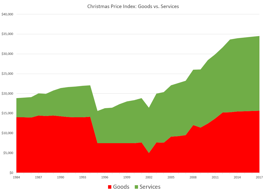
Hmmm, interesting. The goods (in red) seem to go up and down… but it’s not clear what’s happening with services. Let’s turn that into a line graph.
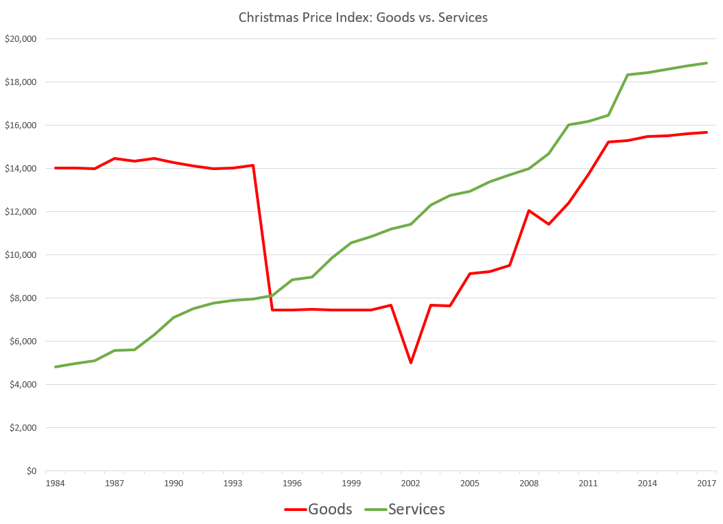
Ah! The goods’ value can drop down and move up drastically… but the services cost has inexorably grown.
A DIVERSION ABOUT MILKMAIDS
It is at this point that I mention I think the milking maids are mispriced – they’re just putting it at unskilled labor cost, which they term being worth minimum wage. Ah, but how many jobs really pay minimum wage?
In 2016, 79.9 million workers age 16 and older in the United States were paid at hourly rates, representing 58.7 percent of all wage and salary workers. Among those paid by the hour, 701,000 workers earned exactly the prevailing federal minimum wage of $7.25 per hour. About 1.5 million had wages below the federal minimum. Together, these 2.2 million workers with wages at or below the federal minimum made up 2.7 percent of all hourly paid workers.
Now, of course, not all hourly paid workers are unskilled, but I imagine the grouping of “unskilled” labor is a lot more than 3% of the hourly paid workforce.
In any case, people generally don’t milk cows by hand anymore – that was true when I was a kid (I remember all the milking machine videos from educational TV. Charlotte’s Web was more interesting re: farming than the industrial farm vids I saw. I’d rather see a candy making factory if we’re going to watch machines.)
My point is, they should be calling up some hippie dairy farm that advertises artisanal raw milk, with the cows hand-milked by genuine milkmaids, and find out what those milkmaids are paid.
TOTAL COST GRAPHS
Now, of course, that was just the costs from the 12th day. If we include the costs of all 12 days, the weighting of components differs somewhat — those swans weigh a lot heavier on the cost, as they appear on 6 days (the 7th, 8th, 9th, 10th, 11th, and 12th days), whereas all those leaping lords, etc., appear on fewer days.
So here’s the total cost graph:
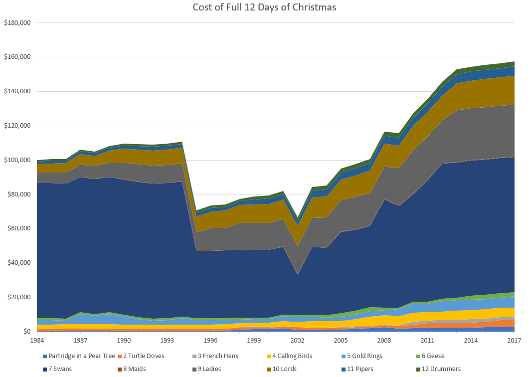
That area for the swans is a lot bigger now.
And here is the goods vs services split:
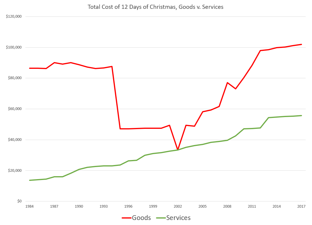
So we see the goods, appearing on more days (and including the extremely pricey swans), are driving the results more than services when we account for all 12 days of gift-giving.
Spreadsheet is available here.
Watch out for those Swans! They’re pricey!
Related Posts
Stat Crunching: Labor Force Participation Rate Trends, Prime Working Years
Sunday Silliness: Soda Tax, Sierpinski Spreadsheet, and Swinish Puns
Foolery for 2019: I Hate the NY State Legislature (and more)
