Public Pensions Quicktake: Pension Underfunding vs. State GDP
by meep
Recently, Equable put out a report on public pensions in the U.S. called State of Pensions 2020.
Most of the graphs and conclusions they draw are not unusual to me, especially one line that came out of their press release that many places covering the report glommed onto: that public pensions were in a poor place before the pandemic hit.
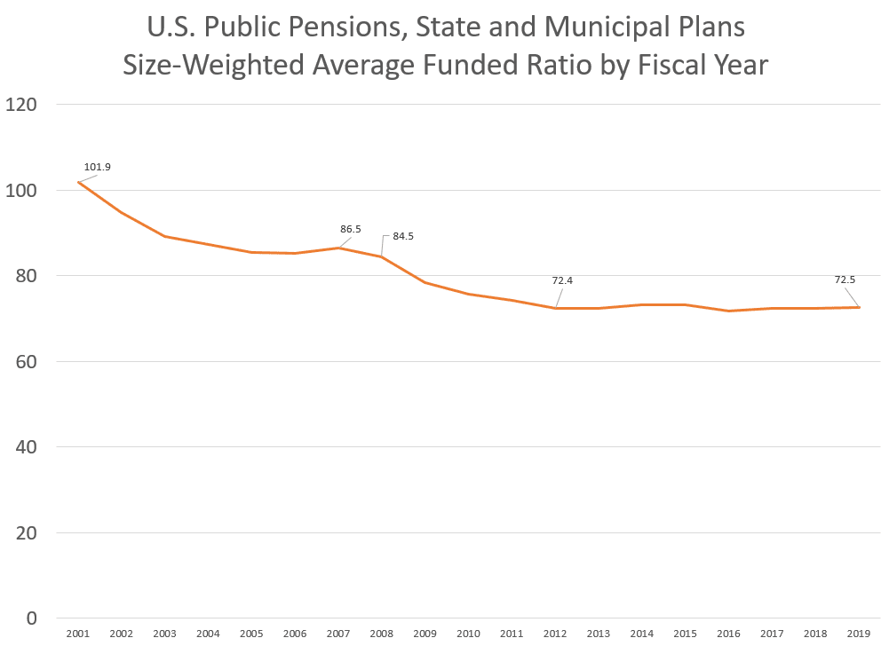
They had had a decade of a bull market… and they didn’t improve the situation at all over that period (as a group — some pensions did better.)
Funded Ratio and Percentage of GDP
It was this graph that grabbed my attention, because I have so rarely seen such a strong linear trend in real life data, especially financial data.
I redid the graph so that you can see the best fit line:

That’s a fairly high R^2, though let us think through why this may be close to a linear relationship.
First, there obviously should be a negative correlation between the FR (funded ratio) and the UL/GDP — the higher the funded ratio, the lower the unfunded liability (for the same total liability).
Interpreting the Linear Fit
Now, I’m not happy with the UL/GDP being the “independent” variable. Let’s switch axes:

Okay, now the funded ratio is the horizontal (x) value and the UL/GDP is the vertical (y) value. The R^2 is the same (it doesn’t matter if you switch the axes), but the line’s formula has changed because we switched x & y.
The formula given is: y = -0.2751x + 26.79
This means: for every additional 10 percentage points the funded ratio increases, the UL/GDP ratio decreases by 2.75 percentage points.
Or, to be more negative, for every 10 percentage points the funded ratio drops, the UL/GDP ratio increases by 2.75 percentage points.
I have tried figuring out the dynamics of this relationship, but I really need multiple years to get a grasp of this. One of the key issues is the total pension liability, not merely the unfunded part. I hope Equable continues to do this report into the future, so I can do some more analysis on the development of this.
This line is obviously just an approximation to think through the connections between these.
For states above the line in this diagram, the unfunded liability is a much larger percentage of its GDP for its fundedness status compared to the trendline. This can indicate the affordability of paying off that unfunded liability.
The Bad End of the Line
Let’s close in on the states with the worst funded ratios, most of which should not be surprises:

I’ve switched the axes back to what they were, because it’s easier to look at (for me).
We have New Jersey sitting at 40% funded, with the 60% of the unfunded representing almost 19% of New Jersey GDP.
Kentucky has a higher funded ratio of 46%, and its unfunded liability is about 18% of its GDP.
Illinois has a funded ratio of 48%, and its unfunded liability is about 16% of its GDP.
Now, as we have often heard, that unfunded liability isn’t due all at once, so perhaps that debt level for that GDP level is sustainable. No state (except the few that are well-funded) pays off its unfunded liability all in one year, that’s ridiculous! Right?
Thing is, none of those three states are paying off UL that much… heck, even when the funded ratio has barely improved, their unfunded amounts have increased.
For all three of those states, the total liability grows each year, and even if they manage to hold the funded ratio level, the unfunded liability will also grow. Heck, the funded ratio can improve and the unfunded liability grow at the same time.
Equable has an answer for the nation as a whole, but I doubt the nation as a whole is going to take on all the states’ unfunded liabilities. If you go to the link, you will see those unfunded liabilities have grown a lot in recent years, with respect to GDP.
And what happens in a year like 2020 (and 2021 and…) where the GDP drops by a lot? What happens to the “affordability” of those pension liabilities then?
Something to think about.
For my fellow pension people, look at the whole report from Equable.
(Oh, and thanks to Equable for sharing the data from their report — I’m going to see if I can do more with this.)
Related Posts
Sunday Sumo: Some Winning Moves on the Middle Day
Which Public Pension Funds Have the Highest Holdings of Alternative Assets? Has It Paid Off?
Pennsylvania Pension Trends: Assets
