Geeking Out: House of Representatives Apportionment Visualization 1910-2010
by meep
The Census Bureau sent out a bulletin:
Interactive Apportionment Map Now Available
The U.S. Census Bureau launched a new online map today ahead of the 2020 Census apportionment results release. The “Historical Apportionment Data Map” currently displays apportionment results for each census from 1910 to 2010. 2020 Census apportionment results will be added to the map as they become available.
The interactive map includes the following types of data for each census from 1910 to 2010:
Number of seats in the U.S. House of Representatives
Changes to each state’s number of seats in the U.S. House of Representatives
Population per representative for each state
Resident population of each state
Percentage change in resident population for each state
Population density of each state
If you’d like to try out what the Census Bureau put together, the interactive map is here.
I don’t much like that visualization, so I’m going to do my own. Thankfully, all the data are available at that same link.
This is based on the decadal Census, so you have the Census of 1920, say, and then the apportionment occurred in 1921, and the new number of reps would be for the 1922 election and then you’d have the House of Reps starting in 1923 having the new number of reps.
So in all of the following, I’m talking about the Census of year N which affected the number of Reps in the Congress in year N+3.
Number of Representatives
I am not getting into the whole apportionment algorithm right now (we can get into that when the 2020 numbers come out), but the minimum number of representatives for a state is 1, and then the reps are supposed to be approximately proportional to the state’s population (again, I’m ignoring who is or is not included in that enumeration of a state’s population).
For our first graph, let’s look at a histogram Census-by-Census, which shows the number of states having certain numbers of reps as a result.
Here’s the graph:

Observations:
- The number of states having 1-5 reps jumps from 17 to 23 from 1950 to 1960. We expected it to jump by at least two, as Alaska and Hawaii were added as states in 1959. But obviously four other states lost out reps due to the addition of these states (as well as other population changes).
- By 2010, 24 states had only 1-5 representatives.
- The “large” states with over 20 reps went from four in 1910 up to six in 1940, and then dropped back down to 4 in 2000. We will see what four states those are in 2000/2010 in just a moment.
Here is an even simpler graph:

Using a simple break at 10 representatives, the resulting split is fairly stable. Other than the big discontinuity in 1960, it doesn’t move much.
Another way to visualize this distribution:
But this visualization doesn’t show you how the population is changing state-to-state over 100 years, and, more importantly, how many people are represented per representative.
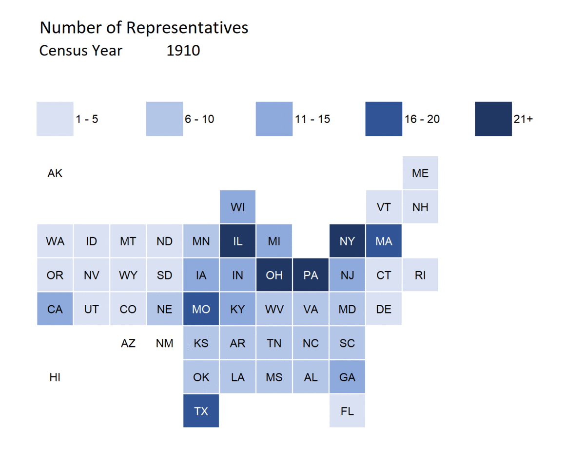
So you can see how the dominating states change in the House of Representatives:
- in 1910, it was Illinois, Ohio, Pennsylvania, and New York
- in 2010, it was New York, California, Texas, and Florida
While New York was a large state throughout this visualization, Ohio, Pennsylvania, and Illinois dropped out and California, Texas, and Florida rose up.
Number of People Represented (per representative)
Before getting into the following, I will disclose that I’m on board with the Uncap the House folks — I think that the House of Representatives needs to be expanded beyond 435 members.
To give you an idea of the problem, first I will give you a box-and-whisker plot of this distribution from 1910 to 2010:

Let me explain what you’re looking at.
For each census year, the rectangle ranges from the 25th percentile to the 75th percentile, with a horizontal line in the box showing where the median (50th percentile) landed.
From each rectangle, “whiskers” extend that are about 1.5 times the interquartile distance (that is, 25th to 75th percentile distance)… not quite, because it is still dependant on the data. The dots outside that range might be considered “outliers” and are individually plotted.
So what does this really mean?
There are two big observations:
First big observation
Because the total number of representatives hasn’t increased with the increasing U.S. population, the average number of people per representative has increased a lot in one century.
It went from about 200,000 in 1910 up to 700,000 in 2010.
One can argue that with modern forms of information-sharing and travel, it’s okay that the number of people covered by one representative has increased by over three times.
Second big observation
There has been a large dispersion in the number of people represented by one representative for many years.
The biggest dispersion has pretty much always been among the states with only one representative. Even the smallest state in population gets one, and from 1910 to 1950, that state was Nevada. In 1960, Alaska entered as the state with the lowest population. Since then, it’s been Montana, Wyoming, and Rhode Island. So that’s the lower end.
But the states with the largest number of people represented by a single rep are also the states with only one or two reps.
From 1990 – 2010, Montana has been the state with the highest population for its single representative — reaching almost one million people in 2010.
Animated tile grid map of population per representative
So let’s see this animated over time:
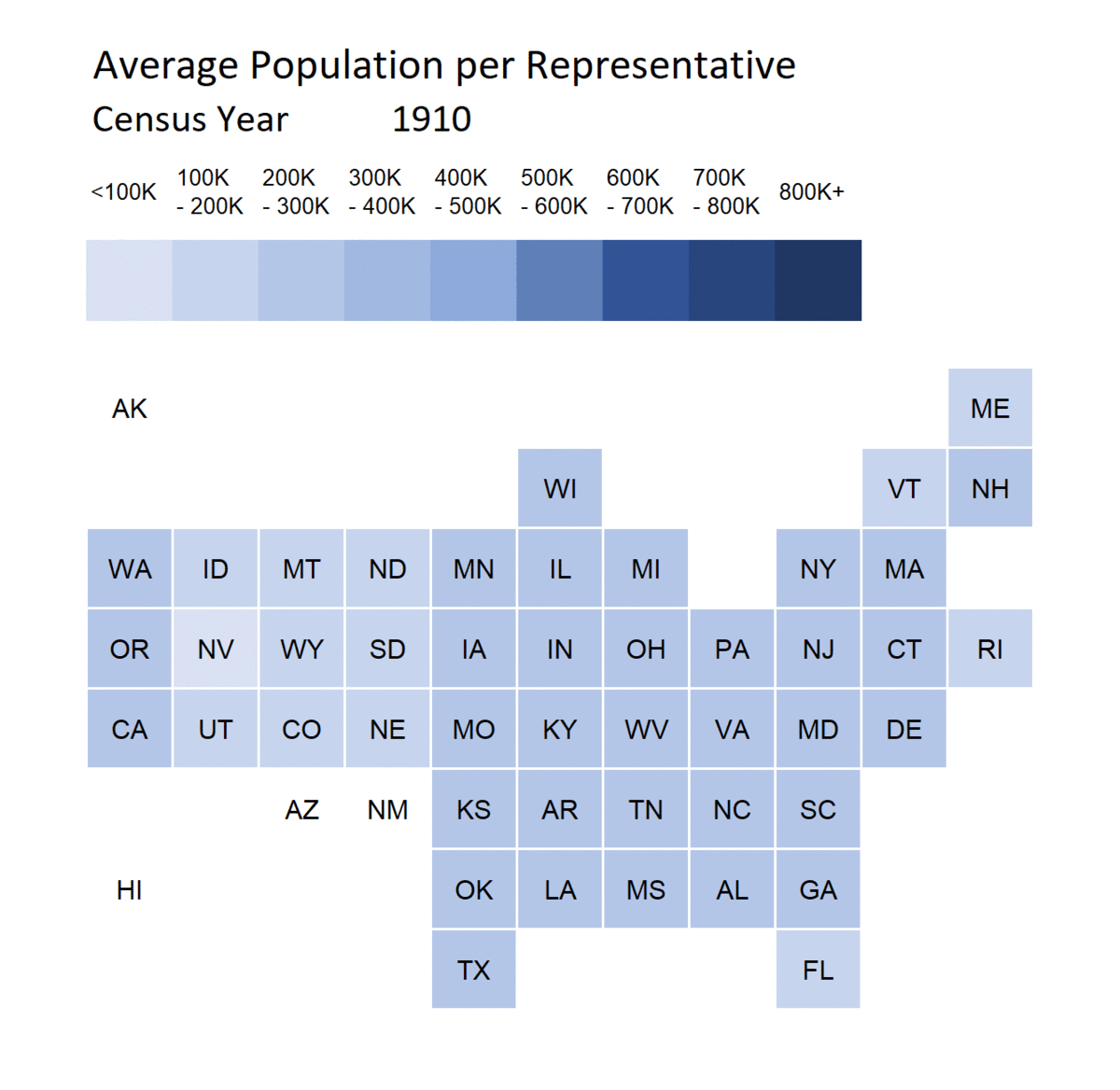
Notice that you don’t really see huge disparities between states so much as the general increase of people per representative.
Okay, and Wyoming and Rhode Island got a good deal in 2010.
Let’s uncap the House!
I have no clue whether the following campaign would favor any particular political party, nor do I care.
I think there are aspects of the British parliamentary system that we should bring to the U.S., the primary one being: having too little space for all the members of parliament to sit.

Well, in the House of Commons, at least. I have no clue about the House of Lords.
Yes, it’s a great way to spread disease.
I have a further idea that the House of Reps would have a revolving geographic location, so that it’s not always in D.C. I think it should be forced to have sessions not only in D.C., but also, let us say, Seattle, Phoenix, Lincoln, Montgomery, Manchester, … and I could generate more places they should be meeting.
But that may be a bit too modern of an idea. Let’s just start with at least doubling the number of representatives in the House. And not increasing the space for their desks.
Related Posts
Sunday Sumo: Some Winning Moves on the Middle Day
Mornings with Meep: Data Visualization
Use Data Visualization Responsibly
