Mortality Basics with Meep: Age-Adjusted Death Rates v. Crude Death Rates for U.S. 1968-2020
by meep
I have been complaining even before 2020 about how media generally talks about mortality trends, generally using life expectancy as their hook.
Here are a few posts where I do that:
- Mortality with Meep: U.S. Life Expectancy Fell 2.4% in 2020, and Death Rates Increased 16.1%
- Mortality with Meep: the Society of Actuaries Studies 2020 Excess Mortality, Life Expectancy Rebuttal, and More
- Mortality with Meep: Cohort vs. Period Mortality Tables
- Geeking Out: On Life Expectancy and Conditional Expectation
One of the difficulties, of course, is that “life expectancy” is a concept most people do not understand to begin with, but it’s in units they’re familiar with — years.
The other difficulty is that one is trying to capture changes in death rates at all sorts of ages into a single number for each year.
A better measure is age-adjusted death rates which does try to make different calendar years comparable to each other, by collapsing a whole bunch of death rate changes into a single number for each year.
The math involved is actually very simple, and we’ll start with crude death rates, which is the simplest method in capturing a mortality trend.
The goal: explain this graph – U.S. death rates 1968-2020
Here is the graph:

It covers more than 50 years, and you can see the two types of rates are extremely different from each other, the farther you get away from the “reference year” for the age adjustment. In this case, I’m using a standard 2000 reference weights (aka the ones used in CDC WONDER).
That said, the year-to-year movements are similar: if the crude rate goes up, generally the age-adjusted rate goes up; if the crude rate goes down, generally the age-adjusted rate goes down.
The issue is the magnitude of movement for each line. (Also, we will see later, the lines are able to diverge in their movements in special situations.)
Crude death rate = number of deaths divided by total population
First, we measure death rates by deaths per 100,000 in population per full year. We use 100,000 people as the base for our rate, because it works simply with percentages and the way we like to group in thousands.
If you have a death rate of 1,000 per 100,000 people (for a year), that means 1% of the population dies per year.
Now, you may be wondering why we don’t simply use percentages, instead of numbers like 1,000 to represent 1%.
That’s because 1% is a very high mortality rate for age groups under “old folks”.
The age at which one has a greater than 1% level of mortality is reaching into seniorhood. If you check out the Social Security life tables from 2017, men don’t reach that death probability til age 59 and women at age 66.
Because we care about mortality trends for children, who tend to have death rates of 0.01%, it’s a lot easier to say 10 per 100,000 people as their death rates instead of trying to use percentages. We avoid a lot of decimal points and zeroes that way.
In any case, the way to calculate the crude death rate is total number of deaths divided by total number of people (that’s always an estimate), and then multiply by 100,000 to get the rate in the units we want.
In general, if we are comparing two consecutive calendar years for their mortality differences, looking at their crude death rates is just fine. But not always. It depends what is changing and why.
Why we need age-adjusted death rates: changing age structure of the population.
The crude death rate in 2019, pre-pandemic, was 870 per 100,000 people.
There was a similar crude death rate in 1989 (871 per 100,000) — do we really believe that the mortality experience, across the board, was the same thirty years apart?
This is the reason there is the same crude death rate in the two years: the age structure of the population was very different.
Let us compare the percentage of these populations in various age buckets:
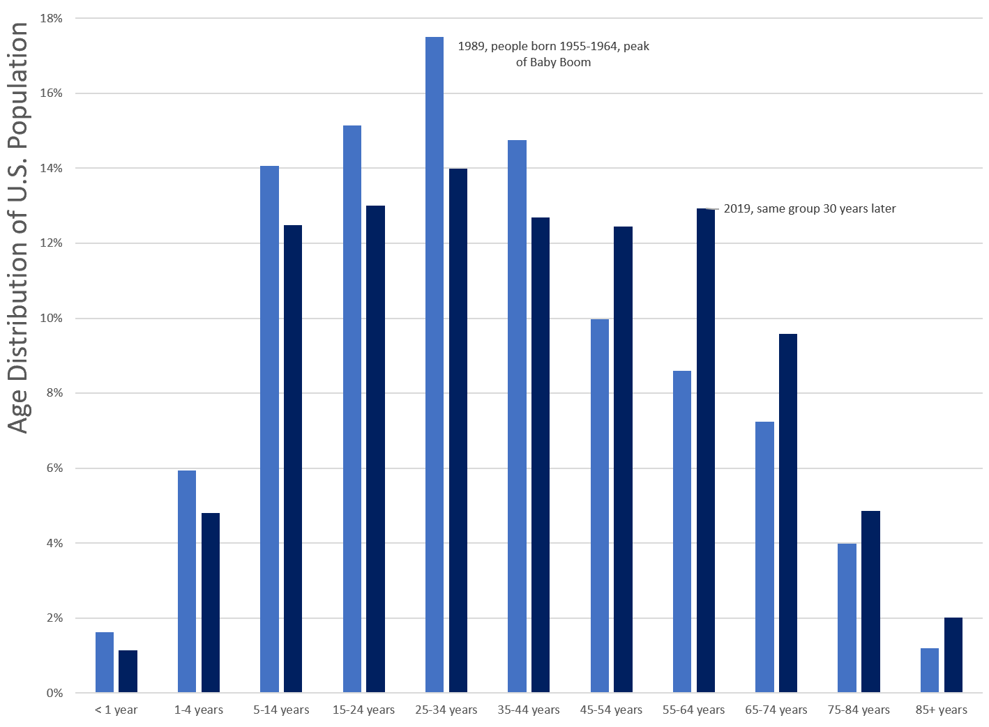
Oh look. The Boomers.
The main point, though, was that the population skewed younger in 1989 than in 2019. The median age in the U.S. was 38.4 in 2019. It was 32.9 years old in 1989.
In 1989, only 12.4% of the population was age 65 or older. In 2019, we had 16.5% of the population in that age bucket.
The changing age structure means that one can have mortality rates trending down for all ages, but the crude death rate climbs because the population is getting older. It’s definitely driven by people living longer (due to those lower mortality rates), but also driven by fewer babies being born.
Age-adjusted death rate = weighted average of death rates, using the same weights by age over time
The concept for age-adjusted death rates is that you divide the population up into age buckets, and calculate the death rate for each age bucket for that year.
And then you take a weighted average (weights are all positive and add up to 100%), where the weights are determined by age bucket. The same weights are used for each year. That’s the age-adjustment.
So if we look at the 1989 vs 2019 example above, we’d fix the issue that the 2019 population is “older” than 1989’s population by picking an age distribution we impose on each year. As noted in my graph, and in my text above, the reference year in the CDC WONDER database is 2000.
Ideally, the reference year’s crude rate and age-adjusted rate would be exactly the same, but there are reasons they don’t (namely picking the weights occurs before you have final Census numbers for the population. And some other approximation issues. They are about the same in our data set for the year 2003.)
Simplified example of age-adjusted death rate calculations
I’m going to greatly simplify the following, so that you can check the math yourself.
Let’s pretend we have two population age buckets: young and old. To start with, we’ll hold the death rate for each bucket to be the same between 1989 and 2019, while old has much higher death rates:| Death rates (per 100,000) | ||
|---|---|---|
| 1989 | 2019 | |
| young | 10 | 10 |
| old | 2,000 | 2,000 |
So, for our first thing to try out is what happens if the population percentages between young and old changes between the two times… and we’ll use a reference rate halfway between the two for our age-adjusted rate:
| Percent of population | |||
|---|---|---|---|
| 1989 | 2019 | Reference Weights | |
| young | 80% | 50% | 65% |
| old | 20% | 50% | 35% |
| 1989 | 2019 | Change | |
|---|---|---|---|
| Crude death rate | 408 | 1005 | 146% |
| Age-adjusted death rate | 707 | 707 | 0% |
Because of the “aging” of the population, the crude death rate goes up. Crude rate for 1989 is 80% (young percent) * 10 + 20% (old percent) * 2000 = 8 + 400 = 408. Crude rate for 2019 is 50% * 10 + 50% * 2000 = 1005.
But, as the death rates for each age bucket didn’t change, the age-adjusted death rates didn’t change. You’ve got the same weights multiplied by the same death rates: 65% * 10 + 35% * 2000 = 707.
Let’s do a little complication: let’s have mortality for the young bucket get worse by doubling (increase from 10 to 20) between 1989 and 2019. And let’s have mortality for the old bucket get better by 10% (decrease from 2,000 to 1,800).| Death rates (per 100,000) | ||
|---|---|---|
| 1989 | 2019 | |
| young | 10 | 20 |
| old | 2,000 | 1,800 |
What happens to the rates? Let’s also use the reference weights as before, but also use 1989 weights for both and 2019 weights for both:
| 1989 | 2019 | Change | |
|---|---|---|---|
| Crude death rate | 408 | 910 | 123% |
| Age-adjusted death rate (reference) | 707 | 643 | -9% |
| Age-adjusted death rate (1989) | 408 | 376 | -8% |
| Age-adjusted death rate (2019) | 1005 | 910 | -9% |
Notice that the age-adjusted death rate percentage changes weren’t all that different, though there were different weights for 1989, 2019, and the reference weights. The age-adjusted rates themselves are very different depending on those weights. But the percentage changes aren’t hugely different…. but I really didn’t push the weights to the extremes.
Theoretically, I could put all the weight on the young bucket (and then the age-adjusted death rate would have doubled) or I could have put all the weight on the old bucket (and then the age-adjusted death rate would have decreased 10%).
We usually use reference weights for age-adjusted death rates that are close to a reasonable population distribution so as not to get distorted.
So what? Do we really need an age-adjusted death rate?
You can probably understand why the media don’t want to write about age-adjusted death rates.
It’s bad enough that it’s a rate (regular people have trouble with plain percentages, and those are everywhere)… but now it’s a weighted average? And the big interpretation is the percentage change over a particular period?
No wonder they’d prefer to report that life expectancy dropped one year.
But yes, the crude U.S. death rate increased by 18% from 2019 to 2020, and the age-adjusted death rate (2000 standard U.S. population) increased 16%.
Any time you try to squish a multidimensional trend into a single number for each year, there will be distortions.
In general, actuaries will at the very least do a separation of trends by age and sex. For pension mortality studies, we’ll look at age, sex, disability status, profession or industry (usually broad categories, like blue collar, teachers, firefighters/police). We generally care about annuity factors more than life expectancy or age-adjusted death rates for pensions… and that’s for an entirely different day.
But age-adjusted death rates can really help you see the long-term trends, and give some perspective, to not have to wrestle with all the fiddly details actuaries like to look at.
A lovely dream
The 2020 age-adjusted death rates are at about the level we saw in 2003-2004. As noted before, that’s not good.
The good news is that the age-adjusted death rate for 2021 will be a lot lower than that of 2020… (unless… and no, not the frickin delta variant. That’s barely causing an uptick in deaths. I mean… unless we have something like the Spanish Flu again. It’s not likely, but it can happen.)
Here’s the beauty part: age-adjusted death rates can be applied not only to the overall population deaths, but you can also apply it to cause of death. You can apply it to all sorts of things to capture all sorts of trends.
We talk about mortality rate differences between sexes, races/ethnicities, smoking status, geography, etc. But we rarely talk about the mortality rate difference by age… because that is so obvious to us, we never think about it. Age is a much larger driver of mortality expectations that we explicitly adjust it out of the statistics.
Wouldn’t it be interesting to think if age weren’t such a driver of mortality? If all our Gompertz-Makeham fits flattened out?
Well, it’s something I dream about… and used to scare the folks at TIAA when I pointed out that if there were medical breakthroughs to extend life to beyond 150 years… and a thousand years…., it would be TIAA clients, a bunch of university professors, who would be first in line.
Yeah, actuaries have weird dreams.
Related Posts
Mortality Nuggets: Car Crashes, COVID Deaths, and the WONDER of the CDC
Mortality with Meep: The Sex Gap in COVID and Total Mortality
Preliminary look at 2022 U.S. Total Mortality - Continuing Excess Mortality
