Deaths from Heat and Cold: Deception and Update for U.S. 1999-2022
by meep
First, an attempt to deceive… or just incompetent graph-making.
A research paper in The Lancet seems straightforward enough.
Background
Heat and cold are established environmental risk factors for human health. However, mapping the related health burden is a difficult task due to the complexity of the associations and the differences in vulnerability and demographic distributions. In this study, we did a comprehensive mortality impact assessment due to heat and cold in European urban areas, considering geographical differences and age-specific risks.
Methods
We included urban areas across Europe between Jan 1, 2000, and Dec 12, 2019, using the Urban Audit dataset of Eurostat and adults aged 20 years and older living in these areas. Data were extracted from Eurostat, the Multi-country Multi-city Collaborative Research Network, Moderate Resolution Imaging Spectroradiometer, and Copernicus. We applied a three-stage method to estimate risks of temperature continuously across the age and space dimensions, identifying patterns of vulnerability on the basis of city-specific characteristics and demographic structures. These risks were used to derive minimum mortality temperatures and related percentiles and raw and standardised excess mortality rates for heat and cold aggregated at various geographical levels.
Findings
Across the 854 urban areas in Europe, we estimated an annual excess of 203 620 (empirical 95% CI 180 882–224 613) deaths attributed to cold and 20 173 (17 261–22 934) attributed to heat. These corresponded to age-standardised rates of 129 (empirical 95% CI 114–142) and 13 (11–14) deaths per 100 000 person-years. Results differed across Europe and age groups, with the highest effects in eastern European cities for both cold and heat.
I bolded one part. They came up with a modeled excess mortality estimate.
The number may look odd, but their modeled estimate says about 200,000 extra deaths due to cold and 20,000 due to heat for a 20-year period.
So about 10,000 per year due to cold and 1,000 per year due to heat.
In any case, my dispute isn’t even with their results, which may be reasonable.
It’s this:
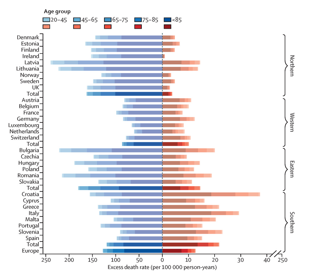
There are so many things wrong with this graph.
Perhaps I will do a video critiquing this graph, because what I’m about to show you, while one of the worst things about the graph, is far from the only thing wrong with this graph. The data are available here, so perhaps I will circle back and redo in the future.
But I will use U.S. data in a moment with 50 states, which is much more than the few countries represented above, so let us move on.
Bjorn Lomberg fixed one of the worst features of the above graph in the graph below:

Did you catch that?
The two sides of the graphs had unequal horizontal scales. This was incredibly misleading, because one would assume, the way these were lined up, that you were able to make eyeball comparisons of heat and cold deaths.
If you read the words in the summary results above, you would notice that the modeled results were 10-to-1 in ratio.
But the point of a visualization is that you can SEE to make visual comparisons. If you were going to make unequal scales (which I will be doing below), you do it in two separate figures. Not one.
U.S. Heat and Cold Deaths
What I’m going to show below is very different from what they were estimating above.
I hope.
I am updating a prior post, Cold Kills: Some Comparisons of Heat and Cold Deaths, 1999-2020, and improving some of the comparisons. This is looking at direct deaths due to excessive natural heat or natural cold. (ICD-10 codes are X30 (heat) and X31 (cold)).
What they were doing in the above research project was trying to estimate the mortality impact of hot/cold weather. For example, an extra cold winter may lead to additional respiratory diseases and deaths among the elderly. That’s different from what I’m about to show, which would be something like somebody freezing to death in their home due to insufficient heat during a winter storm.
Annual Trend
Let’s start simple, with total death counts by year.
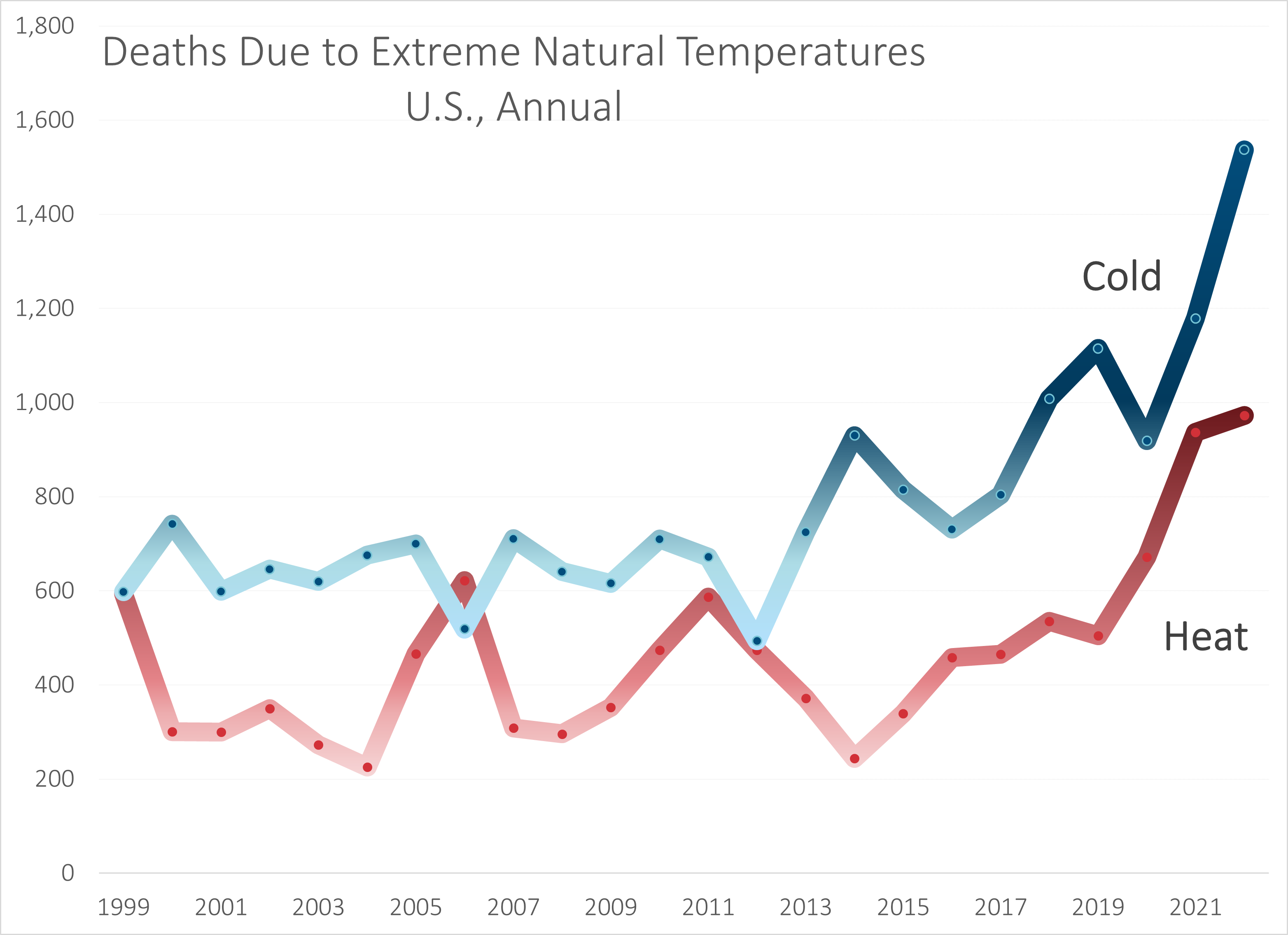
There are more deaths due to cold each year in the U.S. (except in 2006), but not at a 10-to-1 ratio, obviously.
Let’s switch to the death rate for a moment:
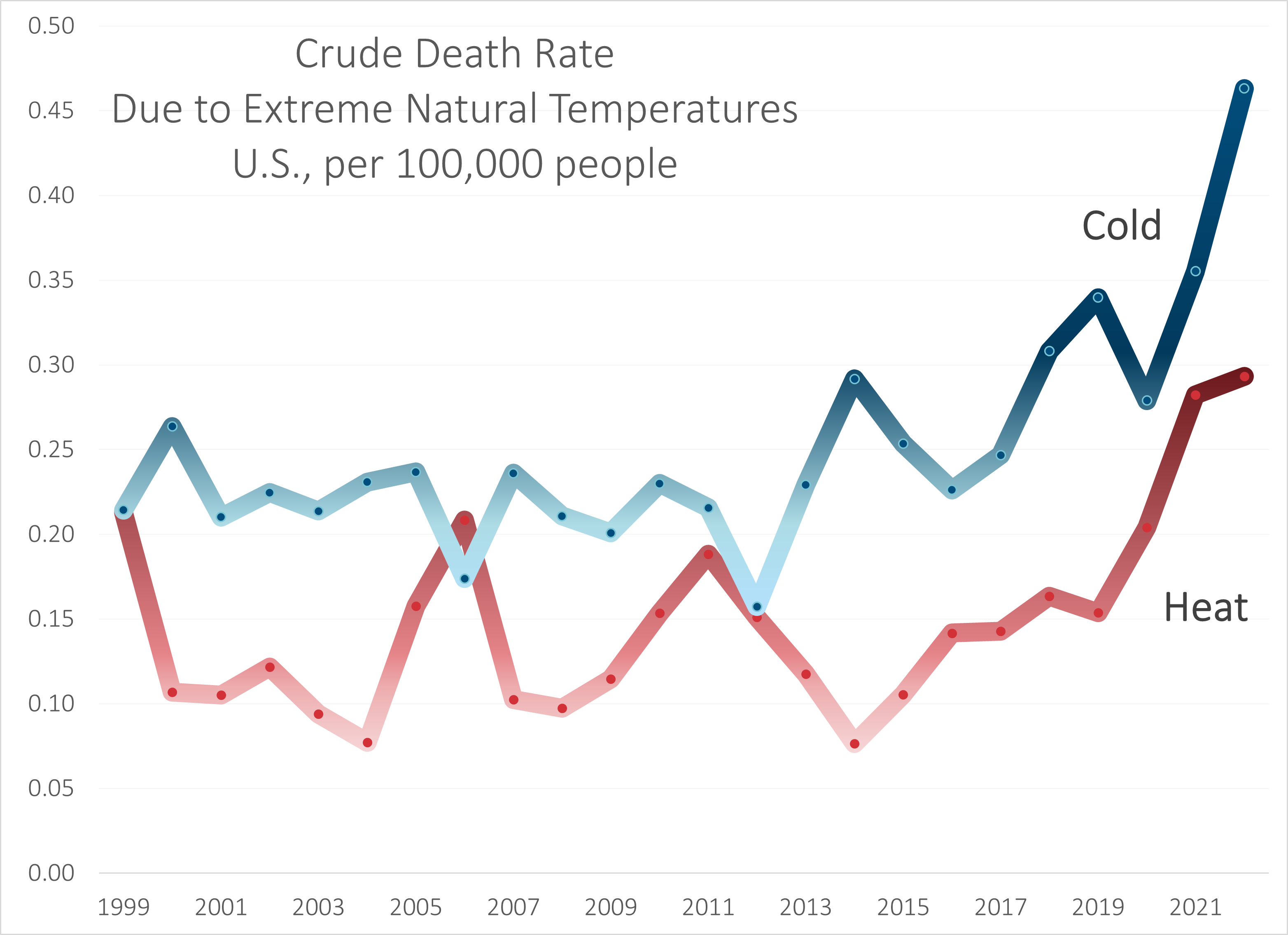
These are very low rates – death due to natural heat/cold exposure is not common.
The increasing rate for both the heat and cold deaths could potentially come from many things. Let me show you something below and I’ll give you some potential interpretations.
Age distribution
Let us see who dies by these causes by age.
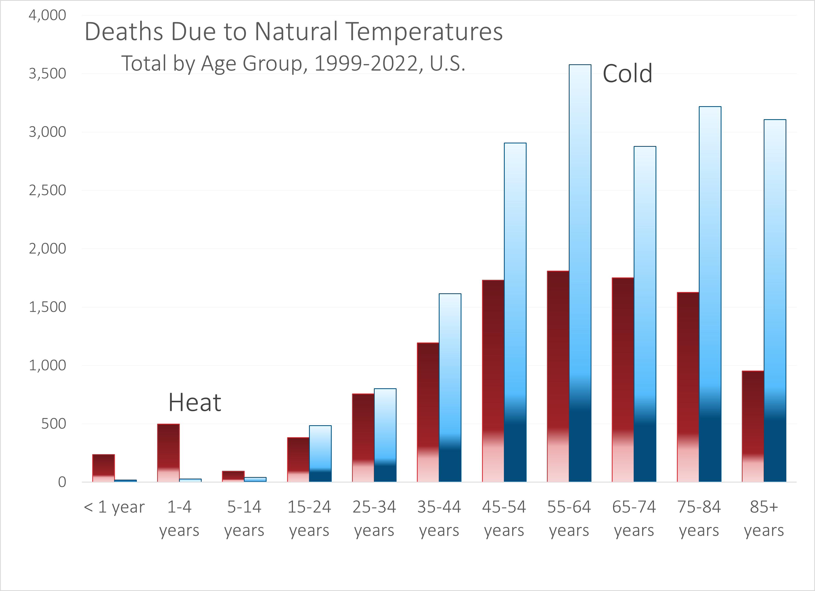
Obviously, there is some influence based on how many people are in each age group, so let us switch to death rate by age group.
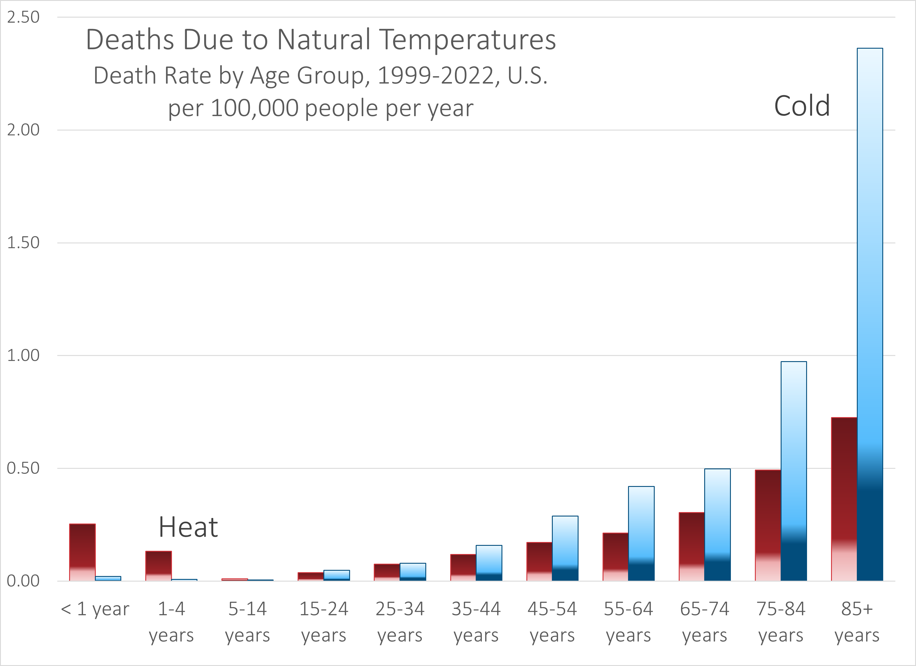
Perhaps I should’ve switched to a logarithmic vertical scale, but I’m getting fancy enough here.
I will note that the elderly are the most vulnerable to both heat and cold deaths… except that infants and toddlers are also vulnerable to deaths by heat. One can think for a moment about stories of small children who die due to heat from being left in vehicles, and that’s enough thinking about that.
But let us think about the elderly being the most vulnerable to both cold and heat deaths.
One of the reasons the rate of both types of death were increasing could be an increasing number of very old people… especially old people who don’t have anybody to care for them. They may be helpless to care for themselves, and then die in the cold or the heat.
I can imagine that many elderly people lost their caretakers during the pandemic.
Geographic footprints
Note: I am using different color scales – not just red versus blue, but different cut points.
Because the heat deaths are lower in rate in general, I used lower cut points:
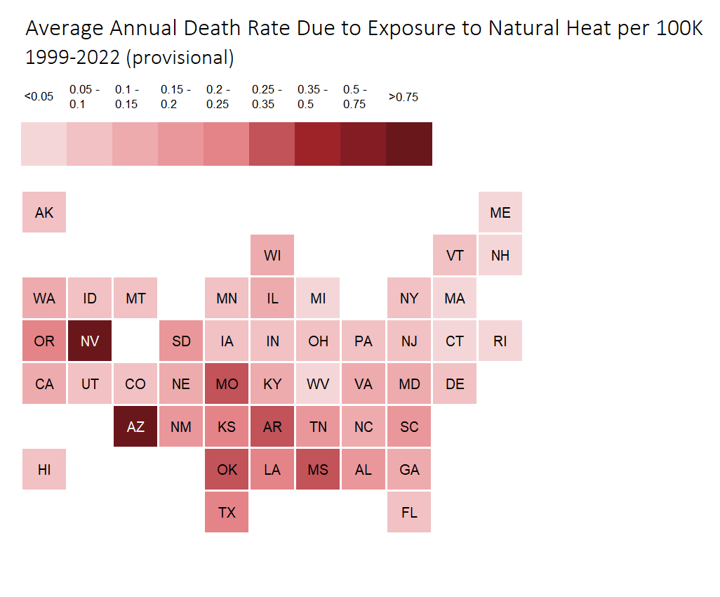
Unsurprisingly, Arizona and Nevada had the highest rates.
THEY’VE GOT DESERTS, Y’ALL.
(and I understand some people have been doing stupid stuff in U.S. deserts recently)
The states that are missing from the map above simply did not have enough heat deaths recorded to show up in the statistics.
Cold deaths:
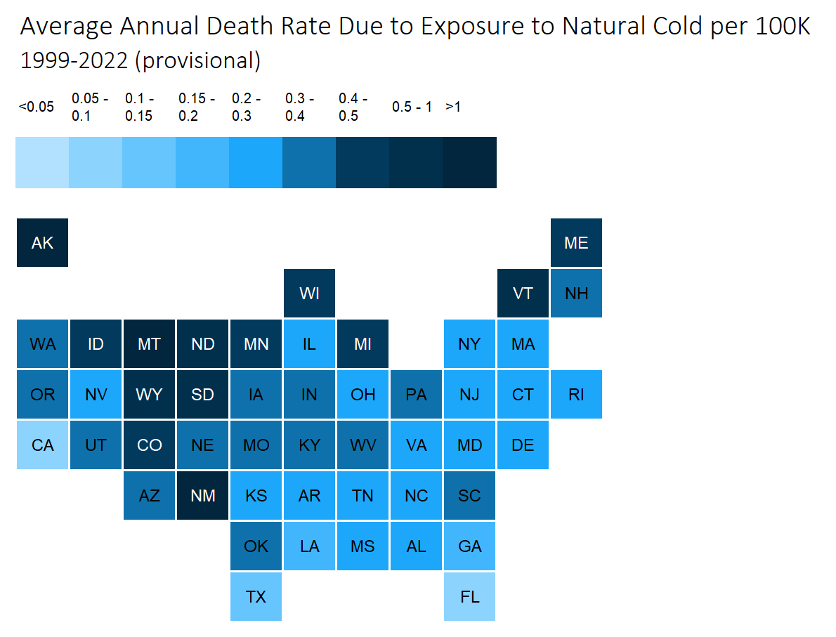
The only state with insufficient cold deaths (that is, fewer than 10) was Hawaii. What a surprise.
The futility of deception with graphs
Look, maybe the people just sucked at making graphs.
Given that they did the scale with the ages, and I can barely tell the different age groups apart in those stacked bars, maybe they thought the different scale and then a broken scale would have been just fine.
People assumed that the researchers were trying to be deliberately deceptive about their results, linking them to global warming. In the introduction they wrote: “The associated health burden is expected to increase with climate change, especially under the most extreme scenarios of global warming.”
But a large part of their argument was that extreme cold was also a burden. They wanted to link climate change results to both sides of extreme weather.
I think they got enamored of their “cool-looking” graphs, and they didn’t worry about how the graphs might be interpreted by others. That others might consider it intentionally deceptive.
I’m willing to bet somebody wrote some code in R that they were really proud of, that made cool graphs, and they are currently annoyed other people thought they were being deceptive. THEY SAID THE NUMBERS IN THE PAPER UP FRONT IN THE SUMMARY! CAN’T PEOPLE READ?!
But let us assume for a moment that they were deliberately deceptive. What’s the point? How would it help “the cause”?
You would think people would have learned by now.
I don’t know these researchers.
But I do know people get too enamored of overly complicated graphs.
Simple can be best
How about this other graph for size? It’s a different one from Bjorn Lomborg.
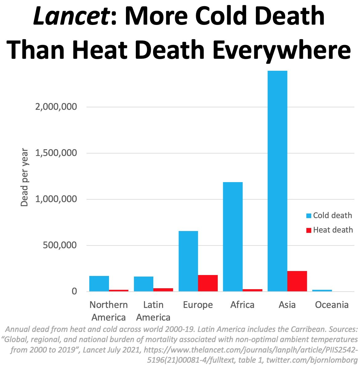
Just a simple column graph.
Pretty impactful, don’t you think?
Also…. put on a sweater.
Well, maybe not in July. In North America, at least.
Spreadsheet
Related Posts
More on the Mystery Death Spike of CT and NC (that is totally bogus)
Excess Mortality For Working Age Adults Way Up in Third Quarter of 2021, Driven By Covid and Drug Overdoses
Mortality Nuggets: "Young People", Actuarial Club Meeting, and Disparate Results Pre-Pandemic
