Setting the Stage for 2017: Mortality Trends
by meep
This is the last “setting the stage” post for 2017. After this the stage is most assuredly set.
The prior posts:
- Social Security issues
- Multiemployer Pension Plans
- The asset side of pensions
- The liability side of pensions
Again, I will be covering other things as they pop up in the news, but I will have these themes throughout the year, whether they make the news or not.
This last one is a bit different. I had been thinking of starting a separate blog called “I Count Dead People”, but:
1. Jeez, I already have this blog
2. And my livejournal
3. and facebook
4. and LinkedIn
5. and twitter….
(and some defunct/merely sleeping sites)
Just because this topic doesn’t fit in directly with the other stuff… why not?
Also, I’ve written about these issues before.
MEMENTO MORI
Here are a few of my prior posts about mortality rates and trends:
- Causes of Childhood Death (and Dickens)
- RIP, Boomers: Death Comes For Us All
- Death Comes for Us All, Part 2: Expect the Wave (that will take decades)
- Comparing Murder Rates: Fact Check
- Good News for Wednesday: The World is Getting Better
Before I get into the more traditionally morbid stuff, I want to point out not all the mortality stories are bad news.
Here are a couple of amazing trend graphs:


Child mortality, that is cumulative death rate for those under age 5, has been continuing to decrease, even in developed nations. That’s fabulous.
But back to the more depressing stuff:

Most deaths occur in the winter in the U.S. To be sure, the numbers should start coming down, but this is the time to have people like Debbie Reynolds pop off. It’s a time of great vulnerability for old people in particular, who are often felled by pneumonia.
[oh jeez, Stu just texted me that somebody died…as an aside, STUMP is for Stu & MP (that’s me). Stu is my husband]
As I mentioned last year, when people were starting to say OH WOE over celeb deaths in 2016, you ain’t seen nothing yet. The thing is we’re on a projected upswing of loads of deaths because the demographic phenomenon of the Baby Boom. The oldest boomers are turning 71, and death rates really accelerate in that decade, no matter how rich you are. Yes, most people now die in their 80s, but even a small percentage of huge populations can make for a noticeable trend.
BAD TRENDS
I’ve been keeping track of mortality trends making the news over at the Actuarial Outpost, and the news that caught many people’s eyes in recent years is the horrible trends for middle-aged white folks, specifically lower income middle-aged white folks.
Here’s a recent piece from the Washington Post: Nine charts that show how white women are drinking themselves to death
I’ll pull two of the graphs:


Yeah, those aren’t good trends.
Here’s a different trend, but it’s for Social Security disability claims:
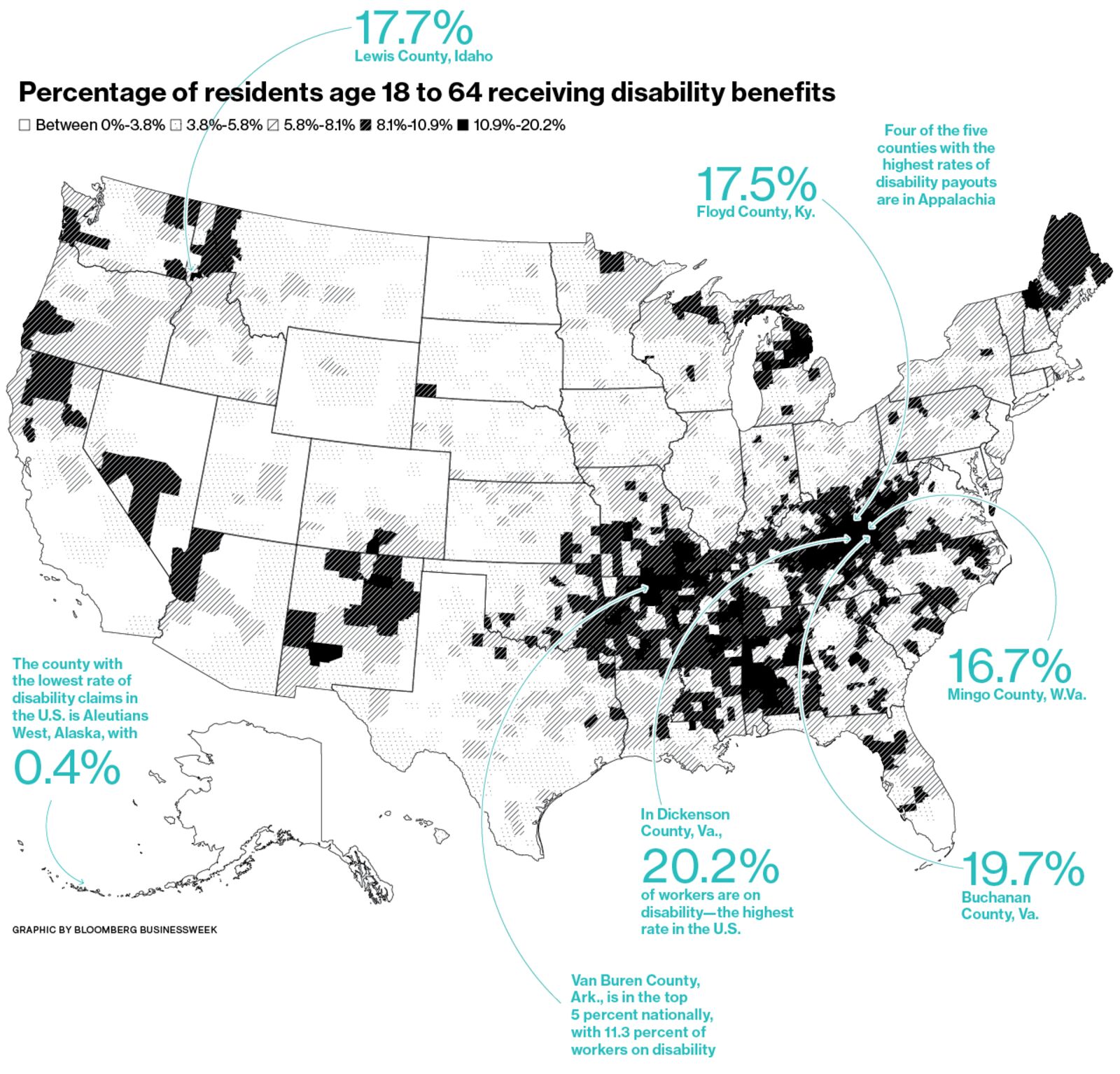
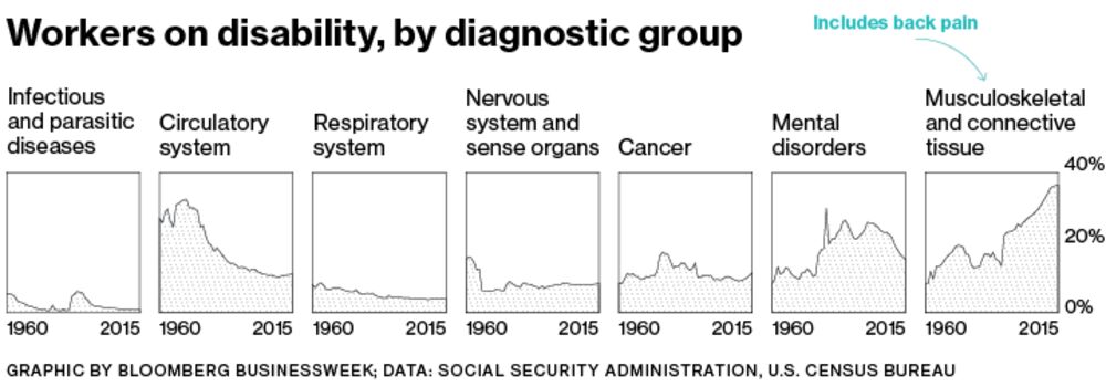
There’s the ole gloom n doom.
Want to get more depressed? One of the sites I “like” to check is Hey Jackass! which keeps track of Chicago shootings.
Here are the final numbers for 2016:
Final 2016 Totals
Shot & Killed: 713
Shot & Wounded: 3665
Total Shot: 4378
Total Homicides: 795
From their 2016 Year in Review:
Around this time every year, we make a poor attempt to summarize the previous twelve months. This time around we can easily sum up the previous year with a simple phrase, massive shitshow.
…..
2017 isn’t looking much better than 2016. In fact, we believe it’ll be worse as the CPD will continue to stay fetal and let the Strategic Subject List(ed) jagoffs ventilate one another. 850 homicides with an additional 3850 shot and wounded very well may be the tally come December 31st, 2017.
The long-term Chicago homicide trend is here:

Yeah, that’s not because Chicago population expanded all of a sudden in 2016. You can say “but murders were much higher in 1974!”, well, Chicago’s population was much higher in 1974.
LIFE ACTUARIES THINK ABOUT DEATH
In talking with my actuarial science students, every so often one complains about how morbid or depressing the life contingencies class is (you know, the one where we use death rates to calculate everything). I tell them that there’s nothing happy about insurance, other than trying to help people recover from a loss.
I’ve had to look over death claims files, and look into suspicious claims (mind you, what counts as suspicious claims in life insurance tends to be with regards to the original underwriting, not outright fraud. The P&C side has some doozies) and when you’re looking at the claims for those under age 50, it gets extremely depressing. It was almost all cancer and suicide, when we had to investigate. We didn’t worry about car accidents, though that would have been the major cause of death in that age group.
Even annuities get a bit morbid in that we don’t want people to live too long…. when I worked in annuities, we used to joke about hiring hitmen to “take care of” our very long-lived annuitants (guys, it’s just a joke.)
But I do find this stuff interesting. What really makes it interesting is my last point.
NOT ALL TRENDS ARE SIMILAR IN TRAJECTORY AND AVERAGES CAN MISLEAD
We can already see that, in that childhood mortality is doing very well, and middle aged white women seem to be drinking themselves to death (it’s not really a high rate, but that’s for a different time).
I’ve been following mortality trends on the Actuarial Outpost, in a few different threads, and I’ve not been surprised to see that there are different subpopulations following different trajectories.
When actuaries develop mortality tables, we use very different tables depending on the purpose — is it for life insurance or annuities? Individually underwritten or group policies? Pensions — what kind of occupation? Public pension or private?
We also look at trends of how these mortality rates change.
But here’s the deal: most of the time, in the news, mortality trends are explained in terms of life expectancy. But movement in life expectancy is very sensitive to changes in particular parts of the curve. A mild uptick in earlier age deaths can move the life expectancy a lot more than an uptick at older ages. Telling me how life expectancy changed doesn’t tell me if the whole death curve shifted or if only one part changed.
And then within subgroups – sometimes the change is due to a non-obvious trend. I’ve looked at mortality improvement rates by gender, and male improvement (at older ages) was much more rapid than female improvement (though female mortality remained lower at all ages). Some of that had to do with smoking behavior of the sexes — many more men smoked at their peak, but their peak smoking rate occurred in the 1950s and has been coming down since then. Women’s peak occurred in the 1970s, though that peak was much lower.
So when someone pointed out this change:
SOA Publishes Update to Mortality Improvement Scale
The updated improvement scale suggests U.S. mortality continues to improve, but at a slower average rate of improvement than previous years, which may decrease pension plan obligations slightly.The Society of Actuaries (SOA) released its annually-updated mortality improvement scale for pension plans, MP-2016, incorporating three additional years of Social Security Administration (SSA) data on U.S. population mortality.
The updated improvement scale suggests U.S. mortality continues to improve, but at a slower average rate of improvement than previous years, which may decrease pension plan obligations slightly.
MP-2016 incorporates SSA mortality data from 2012 to 2014 and a slight modification of two input values designed to improve the model’s year-over-year stability. The updated improvement scale indicates a slight decline in life expectancy as a result of the slower average rate of mortality improvement. For example, the life expectancy for a 65-year-old male declined to 85.8 years under the MP-2016 scale, compared to 86.2 years using the MP-2015 scale. Additionally, the life expectancy for a 65-year-old female is now 87.8 years under MP-2016, compared to 88.2 years based on the previous MP-2015 scale.
While general population mortality may help inform trends, you need to realize the population covered by pensions does not necessarily behave like the greater population.
You see those life expectancies? What’s the current life expectancy for someone age 65?
A man reaching age 65 today can expect to live, on average, until age 84.3.
A woman turning age 65 today can expect to live, on average, until age 86.6.
Notice that’s about a year less than what the MP-2016 scale applied to the RP tables says.
There are reasons for that. And those tables were developed from private pensions, not public ones. The SOA had a request for data from public plans, and if they get enough data, it should be interesting to see how the results compare with private plans. I don’t expect the results to be the same.
And there are reasons that the annuitants we saw at TIAA (mainly retired professors) had even higher life expectancies. (And I used to freak out fellow actuaries by pointing out that professors at research universities were the most likely to have longevity-enhancing research tried out on them first.)
So yes, some of those mortality trends will intersect with my interest in pensions, but some will not. I will try to make it clear in my blog post titles when I’m just nerding out over mortality trends, as opposed to talking about mortality trends and how they impinge on pension plans.
Related Posts
Mortality with Meep: Death Distributions and Survival Probability
The Return of Mortality Monday and RIP, President GHW Bush
Having Fun with Mortality: The Day Nobody Died, the Oldest People Keep Dying, and Don't Drink and Walk
