Meep's Data Visualization Evolution: Tile Grid Maps
by meep
Obviously, I’m a numbers nerd.
Most people aren’t, but humans have a powerful processor in the visual cortex in which we naturally can intuit all sorts of quantitative relationships, if only the data visualization designer does a good and honest job.
I’ve worked on becoming more effective in data visualization for many years, on this blog and in other work. Let me show you some of the things I’ve done, and how some things have changed in how I’ve approached visualizations.
In general, I have used Microsoft Excel for my visualizations (or Google Sheets), for accessibility, though you will see in a few cases all I did was make some really big text.
Today, I just want to talk about tile grid maps.
Tile grid maps
Tile grid maps are one of my favorite ways of showing data by state, as opposed to choropleths (or map charts, if you’re using Excel.)
I first came across tile grid maps at PolicyViz, which is site by Jonathan Schwabish, who has great dataviz resources for people like me — that is, people who have already done the analysis, and need to show the results and persuade other people about the results.
This 2016 post is what set it off for me, and I downloaded his files and went from there. I even paid for his file sets including the tile grid maps and books and more! He’s got fancier versions and you can see this really involved one here from January 2022. That’s a bit too busy for my tastes.
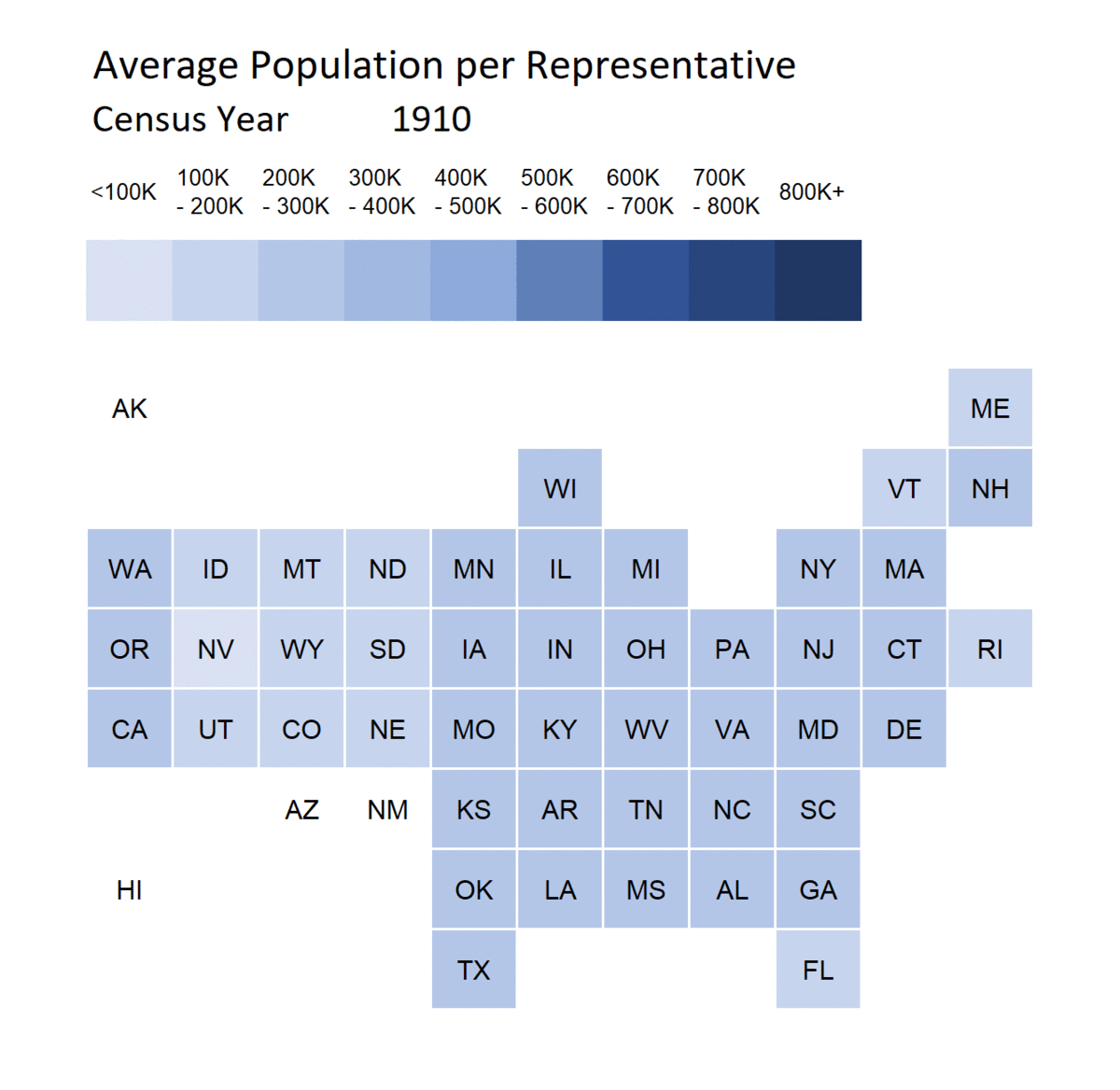
I’ve used tile grid maps galore, and I really liked using them in this March 2021 animation showing how the apportionment for the House of Representatives has changed from 1910-2010:
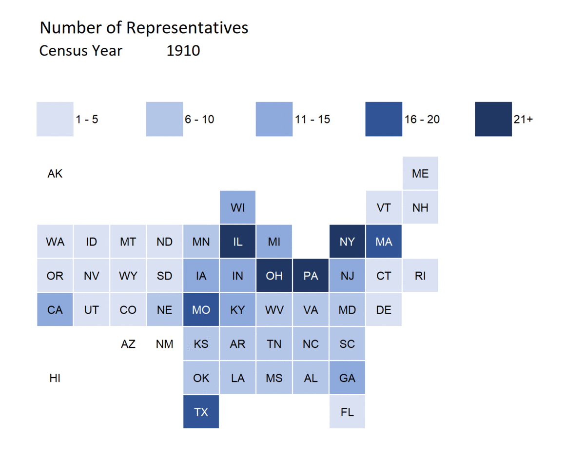
And you can see the strength of tile grid maps right here.
In a map chart, Montana is huge geographically, but it barely has any population and never has had more than one representative. Connecticut is geographically small, but it starts out with a decent number of representatives in 1910, before it drops down to a much smaller number by 2010, which you can see in the tile grid map.
The two states get the same visual weight in a tile grid map. In a map chart, Montana would outweigh Connecticut, though that’s not what we’re interested in. (And we wouldn’t be able to see Rhode Island at all)
Tile grid map vs Map chart
Let me show you what I’m talking about.
Both of the following were created in Excel using the same data. They show up in the May 2020 post Classic STUMP: Visualizing the Financial State of the States
Map chart version of a measure where black is good and red (“in the red” = owe money) is bad:
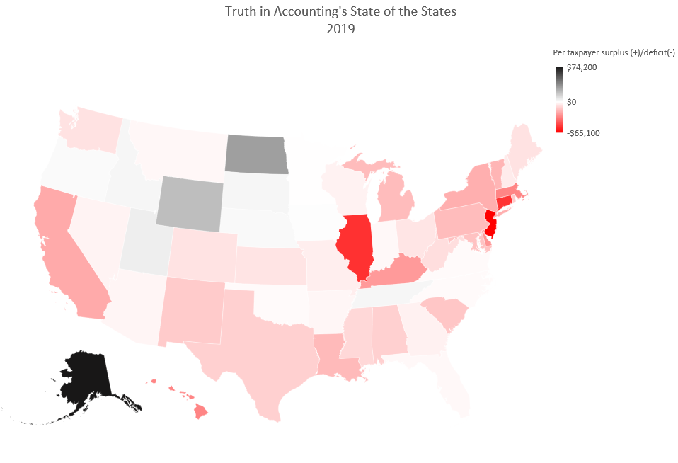
This is what Excel automatically generated with the specific data set with the red/black colorway I wanted, with 0 as white in the middle. You can’t really see the small states at all, and it’s difficult to make distinctions, except at the extremes, because of the scale of the red/black.
Tile grid map version:
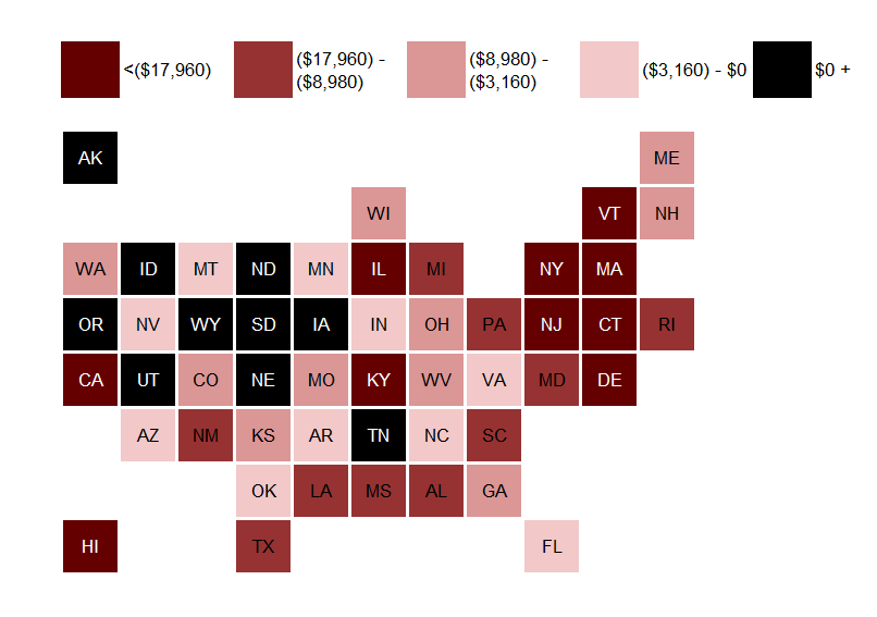
So, there are issues with this one as well (look, I got the arrangement from this site, and I’m too lazy to move the states around.
It’s discrete colors, and I had to explicitly pick where the breakpoints were for the color categories.
On picking breakpoints
I did a video on what is involved in picking the breakpoints for a tile grid map.
When Jon Schwabish did his original tile grid map, he was mainly plotting categorical data, where breakpoints weren’t relevant.
I’m usually dealing with continuous data, and I tend to use 5 colors in conditional formatting, and generally a monochromatic scale (so I don’t have to worry about issues of color blindness, or even misinterpretation for those who aren’t colorblind).
The file I used in the video above can be found at my dropbox here: https://www.dropbox.com/s/nz1pz52utl6z1tn/Alcohol-related%20death%20rates%20by%20state%201999-2020%20v2%20Testing%20Thresholds.xlsx?dl=0
More colors!
In non-Excel systems, like R, you can do a tile grid map with a continuous color scale. I would have to use VBA to do that here, so I’m using breakpoints.
I am not limited to 5 categories – I just have it set up that way for my standard Excel template for the tile grid map.
Going back to the apportionment post in March 2021, I really had some fun by expanding how many colors I used:
Count ‘em, nine different shades of blue! And I animated it!
[I did not animate this in Excel… I simply had a pull-down input for the year, did the look-up, saved the result as a picture, and then used an animated-gif-maker site]
How to make tile grid maps in Excel
Here’s my video, which shows how the tile grid map works with conditional formatting and special formatting in the cells:
Given I adapted Jonathan Schwabish’s original template to this more extended form, I also want to plug his book, Better Data Visualizations, which has a lot of great advice on… well, better data visualizations.

FWIW, I mainly use Excel for my data visualization, for a variety of reasons, and most of the best dataviz resources aren’t system-specific.
There are tile grid map code sets for R and python out there as well.
There is a place for choropleths (or map charts) — it’s where the actual geographic area is pertinent, such as if you were looking at, say, forest fires or land cultivation, or something not involving political boundaries. But too often human patterns of settlement are “clumped” into small areas (especially in the U.S.), and you don’t want to over-emphasize areas that are mostly empty,
Last video, where I plug Jon Schwabish’s book (and a few others):
Enjoy!
Related Posts
Geeking Out: Florence Nightingale, Data Visualization Pioneer - and Redoing Her Famous Graph
Mornings with Meep: Data Visualization
How to Lose Money Quickly: Trading in a Volatile Market
