Geeking Out: Fixing Fullerton, California's Popular Annual Financial Report
by meep
So Jack Dean of Pension Tsunami showed me Fullerton, California’s Popular Annual Financial Report, which is a skinnied-down version of the Comprehensive Annual Financial Report (which I love to read) so that normal people can actually read them.
HOWEVER! The display of the numerical information can use some work… and here I am to do it!
(Fullerton folks, I put this in a spreadsheet so you can use the graphs I made for you… free. Enjoy)
THESIS: VISUALIZING NUMBERS EFFECTIVELY IS AN EXCELLENT THING TO DO
Before I get into my recommendations, I want to explain why this is important.
I am a numbers person… meaning that’s my job (thinking about numbers, writing about numbers, talking about numbers), but also I have always loved numbers. I do this for fun. I can look at numbers and think about them easily… but I generally doodle my numbers. I graph them.
Because humans are very visual animals — we have a hyuge amount of cognitive machinery in the cortex dedicated solely processing visual information. When I was in grad school, I was trying to model what the visual cortex was doing (I did not finish this project, but that’s okay — there are loads of researchers who have been working on this for decades. It’s a tough area, and a really important one).
I could give you a table of numbers – like in a financial report – and you would likely have to look really closely to see how individual components moved, etc.
I did a webinar last year on advanced data visualization techniques as well as more basic one (focused on Excel). I wrote a series of articles on data visualization — the Why, Who,
Where, What, and How of Data Visualization. Yes, I got (get) paid for the webcasts (so hey, if that’s your thing – click on the links. They’re already recorded, so you’ll have immediate access if you pay) — but those articles are totally free. Check them out.
I noticed something while I was playing with the numbers in this financial report — some patterns popped out IMMEDIATELY when I had the proper visualization. I will share those with you.
The issue can be that effective visualization may mean that you have to change which charts you show each year, if you want to show the salient information, depending on what happened that year. So it’s not merely a template you can use every year. I’m sorry – that’s the whole point. In the full – COMPREHENSIVE – financial report, it’s okay to use a standard template… because the result will be over 100 pages.
But if you want to effectively communicate, you need to decide the story, and then pick the best way to tell that story. And that can change.
Now to the specifics.
PIE CHARTS ARE OF THE DEVIL
Okay, that’s not really true. I use pie charts from time to time, but there are loads of problems with them.
Here are the pie charts that appear in the report.


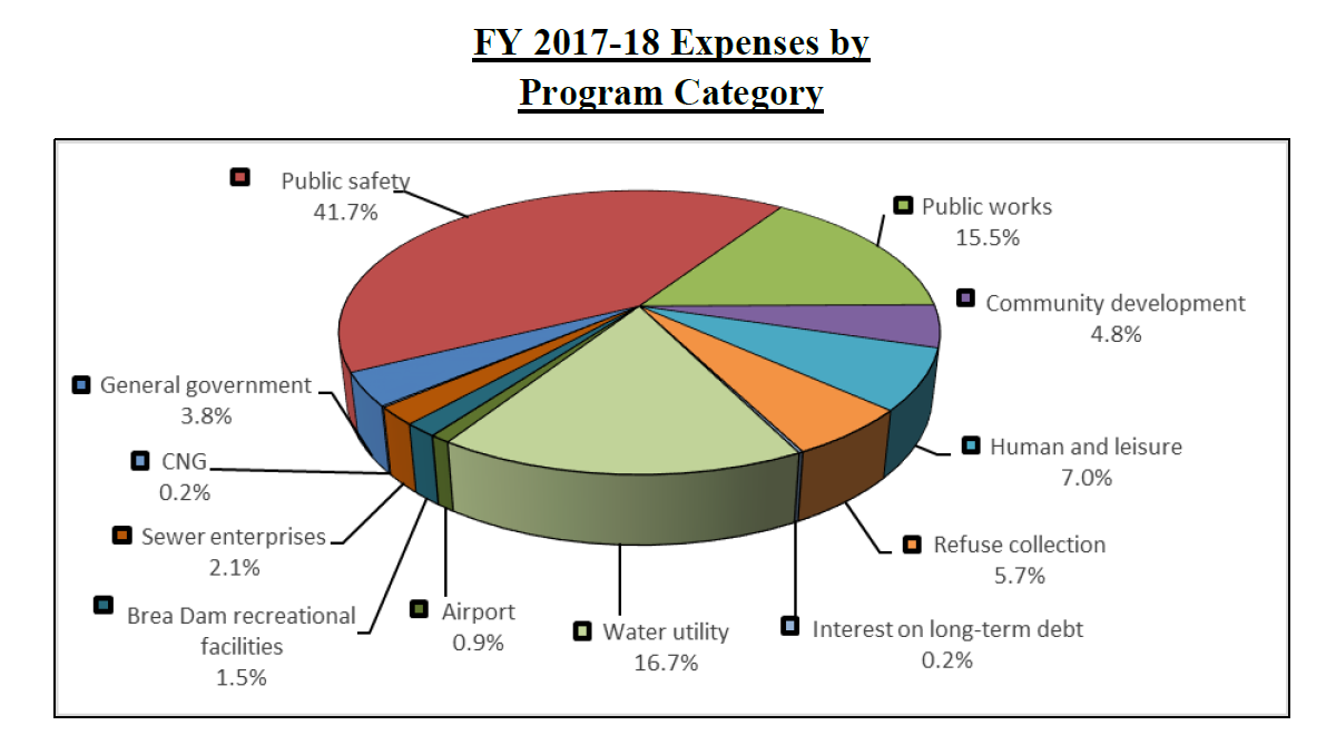
Oh, did I mention that they’re 3D PIE CHARTS?!
I understand the choice in at least one of the cases — the 3D pie chart will fit in a rectangle, and so you can have it take up less space on the page. But the real estate taken up by two on their actual pages would have fit a regular pie chart just fine.
I wrote on the suckitude of pie charts in my first article on data visualization: The Why on Data Visualization. There are legit uses for pie charts — but if you’ve got too many wedges, and too many are way too small (so you can’t even see them) – why?
Let’s just focus on the expenses information — I will redo the pie chart, and then show two other visualizations.
FULLERTON’S EXPENSES BY CATEGORY
Here is a redone pie chart:

You start to see the issue with the 3d pie chart that gets fixed by making this flat 2d: it is difficult to eyeball the wedge angles, because you’re looking at it on a tilt, as it were. It’s really difficult to see on the side, but now we can see how huge public safety is. (I got rid of the extra digit, because it clutters the graph)
Another change I made was to order the items from largest to smallest amount, as opposed to the willy-nilly ordering we saw.
There still is the problem of too many wedges, and do we really care about the little bits anyway?
So here’s the deal – that’s a snapshot of one year, but we’re given five years of info.
So let’s do a stacked column chart and see what happens.
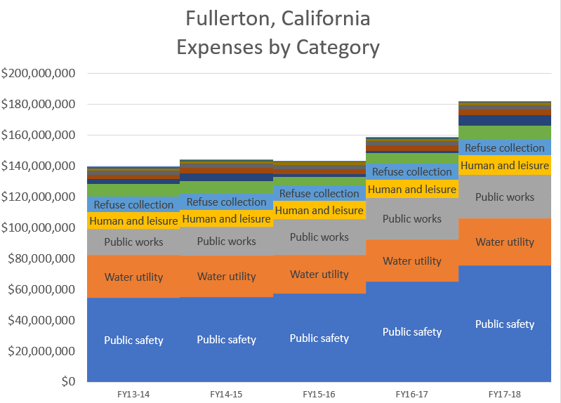
Ah ha! Now we’re cooking with gas!
Now we can see that the expenses went up a lot between FY16-17 and FY17-18… and that Public Safety was a huge chunk of that. I labeled only the 5 largest expense categories, and, again, I ordered them by magnitude.
But it’s difficult to see how the individual components are moving when you stack them like that — let’s do a line graph of the components.

Now you can really see that it was the Public Safety item that really increased… and you got some movements in the others, but not as drastic.
Final visualization — it’s called sparklines, and it’s a great way to show patterns in numbers within the spreadsheet itself — they live in the cells of the spreadsheet, not a special chart box.
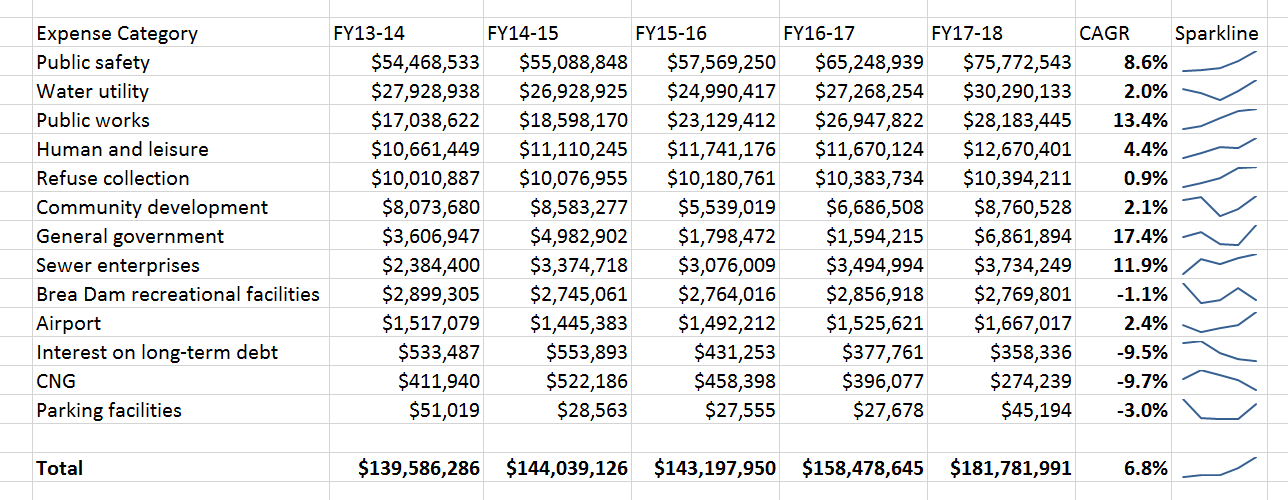
Sparklines could be added to the document easily, with an additional column to the right of the table. The little lines give relative trends. I also included a CAGR (compound annual growth rate) for each item.
ONE MORE BAD GRAPH
I just want to point out one other graph — comparing assets v liabilities:

There is no excuse for making this 3D. The point is to compare the heights, which can’t be done visually with this 3D excrescence. It should be a plain old column graph if you want to make the comparison this way.
CAN YOU SEE IT?
The whole point of visualizations is to make it wasy for people to see the patterns. The 3D effects make it very difficult for people to really see the patterns, because it brings in extraneous dimensions that actually have no connected data… and people see 3D best when they can manipulate the 3d object, or at least move one’s head to take advantage of parallax effects.
Note that I used sans serif font choice (no pointy bits), because it is easier to read in a chart — I even removed the grid lines in some of these to make the bits with actual information easier to see.
I didn’t even fix up the graphs all the way — if I were doing this for money, I’d fix the colors, make sure the font size was good (and consider font selection, but the default sans serif font is fine), and many other items. But you’re not paying me, so I’m just giving a strong hint to those whose job it is to create readable financial reports to think a bit more carefully about the charts they put in.
Here’s a good book with tips on graph design for communicating:
Storytelling with Data: A Data Visualization Guide for Business Professionals by Cole Nussbaumer Knaflic

Related Posts
How About Turning Around Hartford?
Taxing Tuesday: Time to Make the Donuts
Self-Driving Cars: Won't Anybody Think of the Poor Revenue-Hungry Governments?
