Mornings with Meep: Data Visualization
by meep
Here’s the video:
And, if you can’t see it there, here’s a direct link.
(By the way, my son came into the dining room when I was starting the second book, and you can see how that went here.)
DATA VISUALIZATION LINKS
First, here are the books I reviewed:
Storytelling with Data: A Data Visualization Guide for Business Professionals by Cole Nussbaumer Knaflic

Storytelling with Data book promo page – this has an hour-long video of a talk Knaflic gave on her topic.
And while I say pie charts suck, Knaflic goes waaaaay beyond me in that respect. Check it out. Highly recommend.
Example from her blog (not pie charts, obviously):

Show Me the Numbers: Designing Tables and Graphs to Enlighten Second Edition by Stephen Few

Stephen Few’s website — as I said, his prior site, Perceptual Edge, is no longer being updated, but you can go look at older stuff.
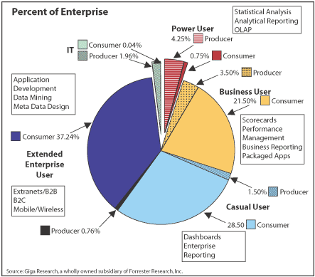
From Stephen Few – before he fixed it:
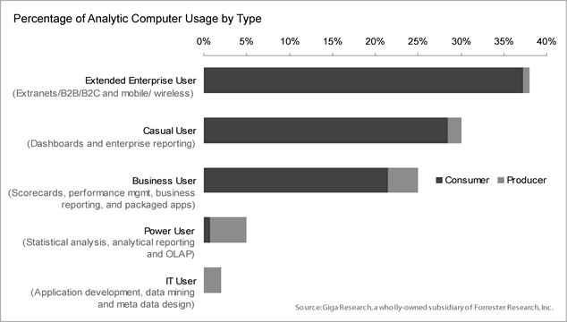
After Few fixed it:
Visual Explanations: Images and Quantities, Evidence and Narrative by Edward Tufte (I’ve had this book since 2005)

Edward Tufte’s website – which could really use a design upgrade. He works much better on paper than on digital.
And here’s the Napoleon graph I mentioned:
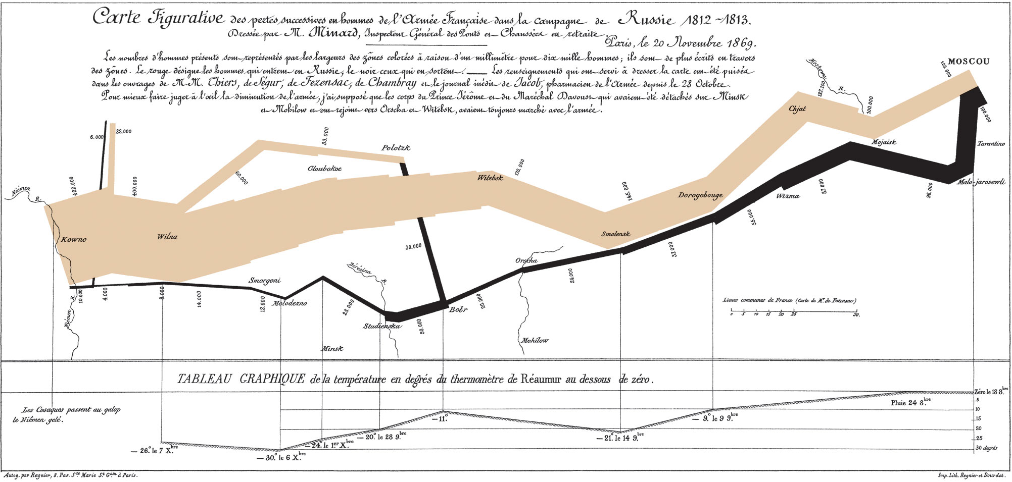
It’s a beaut, no matter what you think of Napoleon’s doomed campaign.
MY DATAVIZ LINKS
As I mentioned, I have a bunch of dataviz things I’ve done.
First, my five-part article series:
- The Why of Data Visualization: Questions to ask When Visualizing Numerical Information
- The Who of Data Visualization: Major figures and Books in Advocating Data Visualization Best Practices
- The Where of Data Visualization: Websites to Polish Your Data Visualization Game
- The What of Data Visualization: Software to Implement Data Visualization
- The How of Data Visualization: Specific Data Visualization Techniques to Consider in Actuarial Practice
My Actex webinars can be found here.
DATA RE-VIZ: CALPERS
In Thursday’s post on Calpers, I was trying to make the point of how important it was as a pension fund.
Using the example of using text aspects to “visualize” importance, here is the original:
I want to remind you that Calpers is the largest non-federal pension fund in the U.S.
Only the U.S. Federal Retirement Thrift fund is larger, but even so, Calpers is the 7th largest pension fund IN THE WORLD.
Okay? This is a very large, very important pension fund.
Here is my redo in “graphic” terms.

All I’m using is font size there. Obviously, I don’t want to use that technique often, but it has its place.
DATA VIZ: GAS PRICES
For many years, I worked in Manhattan, or from home, and barely drove. Then at the end of April 2011, I got a job in Hartford — and my miles really racked up. I knew that gas would be a large expense for me, so I started tracking gas prices with every fill-up.
Now, it took me a while to settle on a few gas stations to fill up at, and every so often I took a trip down South, where the gas is cheaper (because gas taxes are lower). Spikes up are when I couldn’t get to my preferred gas stations, and spikes down tend to be when I’m down south.
This is the resulting graph:

I noticed two large secular movements: last half of 2014, when gas prices plummeted, and from January 2016 til now, where the general trend has been slowly marching upward.
DATA VIZ: HOW MANY MILES MEEP DRIVES PER DAY
Similarly, I have keep track of my mileage, etc. I do an average over last 10 fill-ups to reduce some of the variability. Here is the resulting graph:

So I labeled a few spikes which were extra long driving trips over a short period of time, and then why my average dropped after August 2017.
But I did not mark start working at UConn in February 2014, because that pattern is harder to see… I could do more work on this graph to capture higher mileage during class being in session.
LAST WEEK’S POSTS
Fewer posts than usual last week because of an actuarial meeting and other deadlines I was dealing with:
- Memory Monday: Third Week of May 1918
- Taxing Tuesday: Boo Hoo, High-States Under More Pressure, Head Taxes, and More
- California Crazy: Governance and Management Problems at Calpers
See y’all next week!
Related Posts
Use Data Visualization Responsibly
Sunday Sumo: Some Winning Moves on the Middle Day
Data Visualization: People and Books in 1946
