Illinois Pensions: State Universities Retirement System (SURS) number-crunching
by meep
Yes, I know about the Chicago pension bill that passed the General Assembly. However, I’m waiting to see what Rauner will do. In the meantime, something at Wirepoints about what a bad idea it is to keep putting off the funding.
And speaking of undercontributing, here’s number 4 of the 5 Illinois state pension funds: State Universities Retirement System.
(Don’t everybody go wild at once)
FINANCIAL STATEMENTS
As with the others, let’s look at the most recent financial statements. Hmm. looks like it’s all slick, and there’s no nice little summary box like the other reports had.
The info is still in there. (looking at 25th page of PDF, numbered page 23 of this document)
First, benefits paid from the DB plan: $2.1 billion (yes, billion – they’ve got a lot of retirees, and we’ll see that some get very high pensions.)

Contributions made: $1.8 billion.
To be sure, the net investment income of $2.7 billion alone would cover the benefits portion… but it was a good investment year. The contributions are less than the benefits, which can indicate a problem with a pay-as-you-go approach.
Let’s look at the benefits paid more closely.
BENEFITS PAID
Pension 360 has a nice visualization of the most recent full year of retiree benefits:
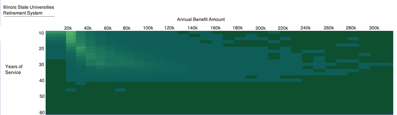
It can be difficult to read a heatmap like that, but it looks like a peak of about $20K for few years of service. Thanks to Ted Ballantine of Pension 360 for sharing the data behind the graphs, so I can make my own. Let’s look at a histogram based on pension amounts:

So a lot of people are getting small amounts. But I’m not including the dimension of years of service, which is important. So let’s try looking at the average pension for ranges of years of service.

So, unsurprisingly, you have a lot of people with few years of service (that’s the blue line), and as years of service increases, the average pension increases. That seems reasonable.
But I’m only showing you the average. How about the range of benefits?

What you’re seeing here, in the blue box for each range of years of service is the 25th percentile to 75th percentile pension amounts. The thin line for each runs for the minimum benefit (which was $60 for the whole year, for someone who had very little service time) up to the maximum benefit (which was more than $450K.
So yes, the bulk of the pensions are of modest amounts, but there are some outsize pensions in there. Remember that universities often have not only highly-paid administrators at the top, but also highly-paid medical specialists. If you’re running a medical school with a teaching hospital, you’re going to have to pay the people in charge of, say, neurosurgery a lot of money. And they accrue similarly large pensions.
CONTRIBUTIONS AND FUNDED RATIO
What has the contribution history been?

That 2004 spike is from pension obligation bonds (as per usual). That underfunding gap looks high, and of course, the percentage of payroll climbing like that, and being almost 44% in 2013, is really high (compare to the yellow line showing the rest of the country)
How has the funded ratio done?

Yeah, 40%. Not as bad as some of the Illinois plans, but when you’ve got 200K participants, and 58K current retirees, that’s not very good. How bad 40% fundedness is does depend on the mix of retirees vs. actives — people having been bitching that funded ratios were this low 30-40 years ago and things didn’t fall apart then! …forgetting that extremely little of the liability then was for people already retired. I will write more about that in a different post.
UNFUNDED LIABILITY DEVELOPMENT
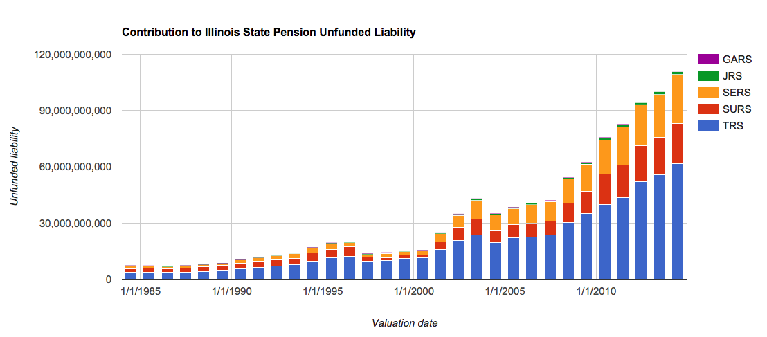
So now, the moment of truth: how has the unfunded liability developed?

Unsurprisingly, as of 2014, the vast bulk of the unfunded liability for SURS is due to the undercontributions, at 53% of the whole.
As we saw with the other plans, the only time the unfunded liability went down was for the year they issued pension obligation bonds and made a fake contribution from those (yes, it’s a real contribution to the fund, but it’s just one more liability for the state.)
And remember: out of the five plans, SURS is the third-largest contributor to the UL for the state. SERS is in second place at 24%, and TRS is in first place at 55% of the total unfunded liability.
I have saved the “best” for last. Stay tuned….
Related Posts
Geeking Out: Census Numbers for Apportionment Released -- Let's Visualize!
Sunday Sumo: Some Winning Moves on the Middle Day
Meep's Data Visualization Evolution: Tile Grid Maps
