On information, the lifeblood of bloggers
by meep
Everybody has an opinion.
I’ve got lots of opinions. I think string theory is bullshit. Mozart is the best opera composer. I prefer Ted Cruz over other candidates in this election. Men look better with beards.
Okay, that last one is a fact. Don’t take my word for it. Are you against empirical evidence?
My point: I am not interested in blogging only about my opinions. There’s nothing special or particularly unique about them. I prefer looking at data, thinking about it, looking for patterns, and passing along that analysis.
But I need somebody to supply me with the data.
Today I praise those who have provided info, for free!
BUT FIRST, A WORD FROM OUR LINKERS
I want to thank my top referral places before I go down the data list.
- Wirepoints with Mark Glennon. Check out Mark’s piece on what Illinois can learn from New Jersey’s experience
- Pension Tsunami with Jack Dean. Subscribe to his site to get notifications when he updates.
- The Other McCain, where wombat-socho (Kevin Trainor) includes me in his links. Check out Kevin’s books: What Did You Do in the Cold War, Dad? and The Last Falangist: Essays on Culture and Politics in America
and holy moley, somebody posted my Kentucky update on facebook somewhere, because I got a bunch of hits from there — but I can’t figure out where on facebook it was. Thanks to whoever!
MY BIGGEST DATA SOURCE: PUBLIC PLANS DATABASE
My go-to place for public pension info is, of course, the Public Plans Database.
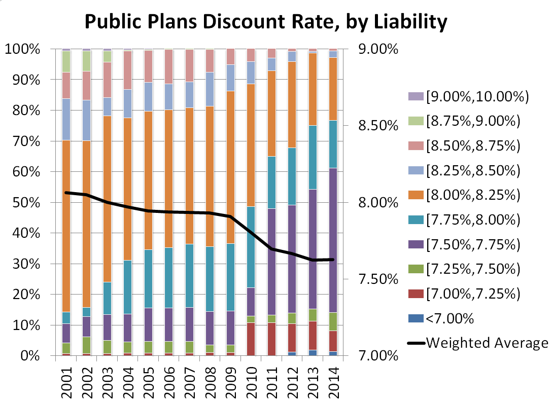
I use their graphs directly, but also use their data to make graphs like this:

I like having a single source of data for U.S. public pensions, because it makes the data comparable. One of the things I have been looking into recently was how funding choices led to fundedness ratios.
Well, it got quite ugly.
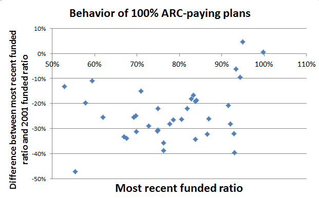
So I decided to restrict it just to plans that claim to 100% fund (that is, make the full “required contribution” every year…that exists in the database.) So I decided to look at two variables: what their last funded ratio was, and the difference between that funded ratio and their funded ratio in 2001.
Here’s the graph:

Things to note:
- only one plan is really at 100% funded (and it’s a weird plan)
- almost all of the plans saw a decrease in funded ratios since 2001 (that’s the negative vertical coordinates showing fundedness decreases)
But maybe this was an unfair comparison. There’s been ups and downs. Why not compare against 2009, which was right after the market crash?

Well, at least we have some positive changes here.
But the point I have here is that these are plans that are supposedly doing everything they should do — making a full contribution every year — and yet so many have shown a decrease in fundedness since the bottom of the market.
Just something to tuck in your mind for later thought. I will come back to it another time, because something I read recently made me look at it.
Pension 360 also has some public pension data that is not in the PPD — like the salaries of those working for pension funds. All sorts of interesting things to analyze.
CHICAGO STUPIDITY STATS
This isn’t my usual data source, but I like it.
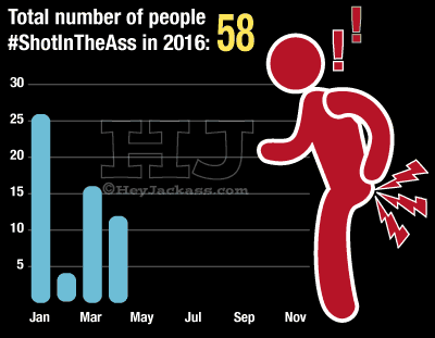
Well, if I can call this the stupid period:
Then Hey Jackass! can call this a 30-day stupidity trend:

And here’s a longer-term trend:

I may go back and dip into the site stats, but there’s loads of lovely trackers there, like this one:

I think that one’s self-explanatory.
ON CREATING ONE’S OWN STATS
University Professor Asks: How Accurate and at What Cost is BLS Data?:
Here’s the interesting set of questions from the “Mish Mailbag” summarized as follows: How Accurate and at What Cost is BLS Data? Why isn’t there a private industry alternative?”
….
BLS – CPI Reporting DiscussionEvery month, when the BLS produces its CPI report I wonder why the labor division collects the data, and not the BEA, Bureau of Economic Analysis.
The best answer I can come up with is “We are dealing with the government. Things do not have to make sense, and they usually don’t.”
As to why private industry does not measure prices aside from things like the “Big Mac Index” the best answer is …
-There is no reliable basket of goods and services
-No one can agree on what the basket should be
-It cannot be doneThe basket of goods and services for someone with kids in school is dramatically different than someone retired. Does it really make sense to average that out?
The BLS does a substitution of goods. For example, if the price of beef is up, the BLS says consumers will buy more chicken. Does one want to to duplicate that nonsense, or report what’s really happening.
….
In light of the above, my simple position is that a basket of prices cannot be accurately measured, any such basket fails to consider asset prices, and there is no such thing as an aggregate basket in the first place.
Fair enough.
I have a price index myself, though. I drive about 35K miles per year. So here’s a graph I made:
I gas up about 3 times a week, and it’s generally at one of two gas stations in CT that have similar prices. I smooth over 10 fill-ups to remove the effect of road trips, etc.
Anyway, gas prices really fell over 2014/2015.
RANDOM DATA SITES
Not exactly random, but ones I’ve come across and have been playing with.
Kaggle is known as a data science modeling competition site, but they also have some data sets to noodle around with just for fun. Also, people share their scripts that they used to do number-crunching.
The 2013 American Community Survey is my type of dataset, but I really like looking at what people have found in the ship logbook set, like this animation of Captain Cook’s travels.

TrendCT has a bunch of Connecticut-related data. I work in Connecticut, so I find this of interest. You can also check out their github repo, a best practice for public data sharing.
Speaking of, while 538’s projections may not be all that hot, they also share their data and scripts on github.
GOVERNMENT DATA
There’s loads of government data, too. data.gov is an index of sorts of all sorts of sets (it will take you to the appropriate site… doesn’t look like it holds any of the data itself.)
One of my fave government data sets are migration info in the U.S. via tax filings.
There’s an explosion of government transparency sites as well, usually focused on salaries and pensions for state employees.
Loads of states: Open the Books — which has a cool map function. Check out this map of Illinois teacher retirees with $100K+ pensions. You can click on the pins and get some info.
California: Transparent California, By the Numbers, from the state controller
Illinois: The Ledger from the state comptroller
New York: See Through NY from the Empire Center
There’s loads and loads more out there — I love it when groups provide the complete data set (downloadable). They’ve got to know most of us out here are not wanting to replicate their sites, but would like to do independent analyses of data.
Got any other sites I should know about? Please email me at marypat.campbell@gmail.com
Related Posts
Checking the Numbers: How Much are Social Security Benefits?
Labor force participation rates, part 2: Younger Years (under 25) - Bad news?
Geeking Out: Florence Nightingale, Data Visualization Pioneer - and Redoing Her Famous Graph
